This week brought a wealth of new readings on the economy with the nearly simultaneous release of the first estimates of GDP for the third quarter from the BEA and the October Employment Situation report from the BLS. Both showed an economy that is steadily improving in spite of significant obstacles created by the global economic environment and by the political environment in Washington. We begin this post with a summary of the the labor market data, followed by the estimates of third quarter GDP. We finish with an updated estimate of the costs of this recession to date. The size of the loss is the most sobering information in this post.
The Labor Market
As we reported last month, the Great Recession continues to cast a long shadow over the U.S. labor market. Moreover, the government shutdown has made it difficult to interpret some of the numbers. Employment increased 204,000 (evidently much higher than expected) and private sector employment was up 212,000. While employment provided an upward surprise, both the employment/population ratio and labor force participation rate fell. As we noted in an earlier blog, the weakness in the labor market continues to play against the Federal Reserve’s earlier attempts to provide forward guidance about asset purchases and interest rates based on thresholds for the unemployment rate. As the figure below shows there were upward revisions to the two prior employment reports. Two hundred and thirty eight thousand jobs were added in August and one hundred and sixty three thousand in September.

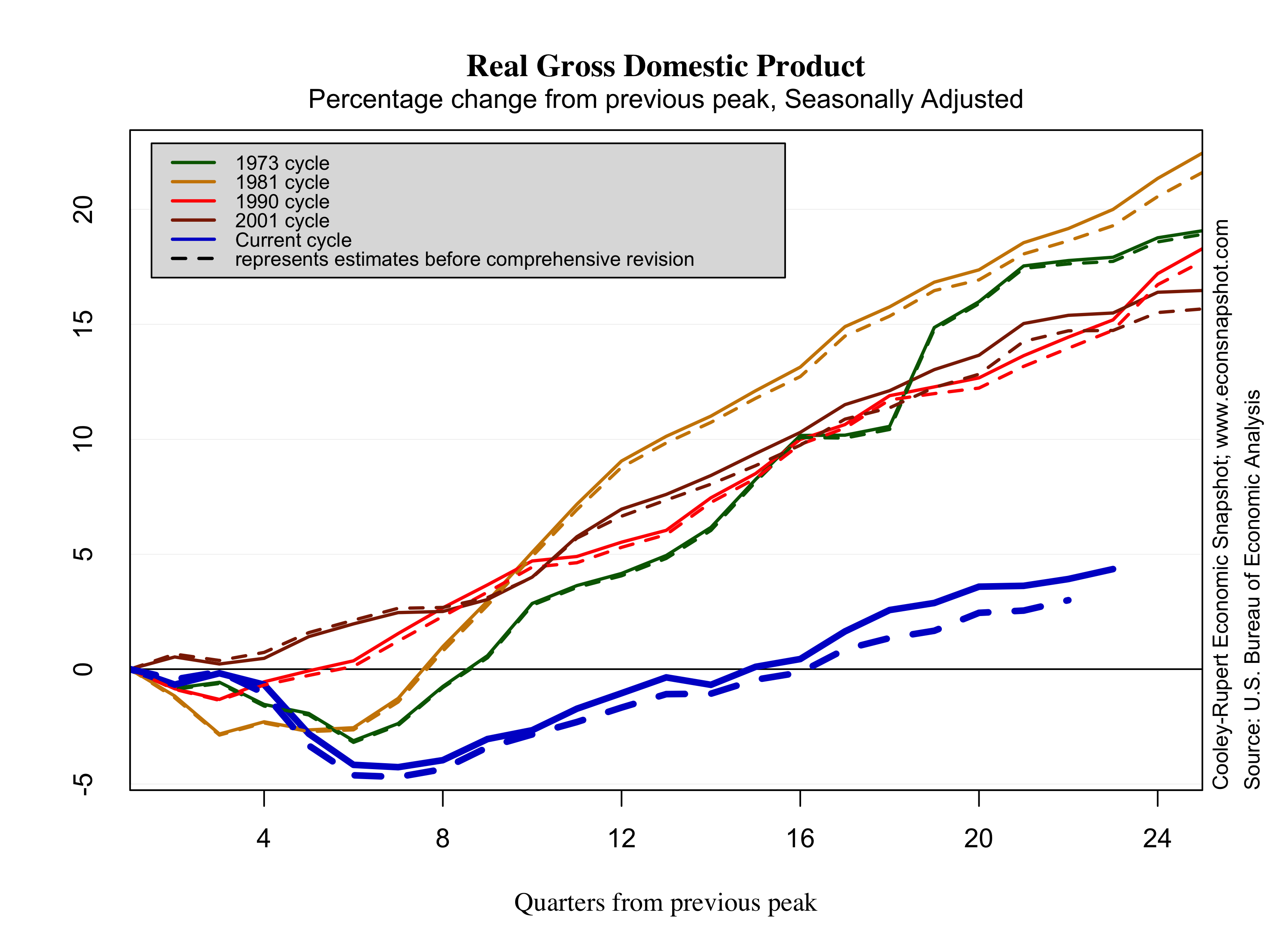
Employment continues to crawl slowly toward the level it attained in December of 2007.

The unemployment rate in October ticked up slightly from 7.2% to 7.3%. Initial claims, obviously affected by the recent shutdown spiked up, but the trend down is also indicative of an consistently improving labor market.


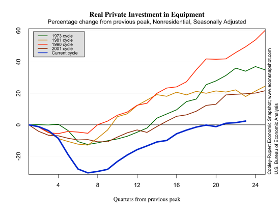
Interestingly, labor productivity measured by total output divided by the total number of labor hours looks very similar to all previous recoveries except for the 2001 cycle. Even as employment fell 5% below its peak level, productivity continued to rise.

At some point in the past year the Fed indicated a threshold target for the unemployment rate of 6.5%. They had previously specified a target of 2% for inflation. If these targets were hit exactly, the Taylor Rule would imply a Federal Funds Rate of 4%. Currently, the Taylor Rule with these thresholds indicates that the federal funds rate should be significantly higher than its current level. The rule prescribes an interest rate policy of around 2%, well above the zero bound where the fed funds rate has been since 2010.
Because these implications have made bond markets jumpy – they view interest rate increases as imminent – the Fed has begun to try to walk this back a bit. A research paper released this week suggests that a thresholds should be set so that Rules don’t imply an early departure from the fully accommodating levels of the funds rate.

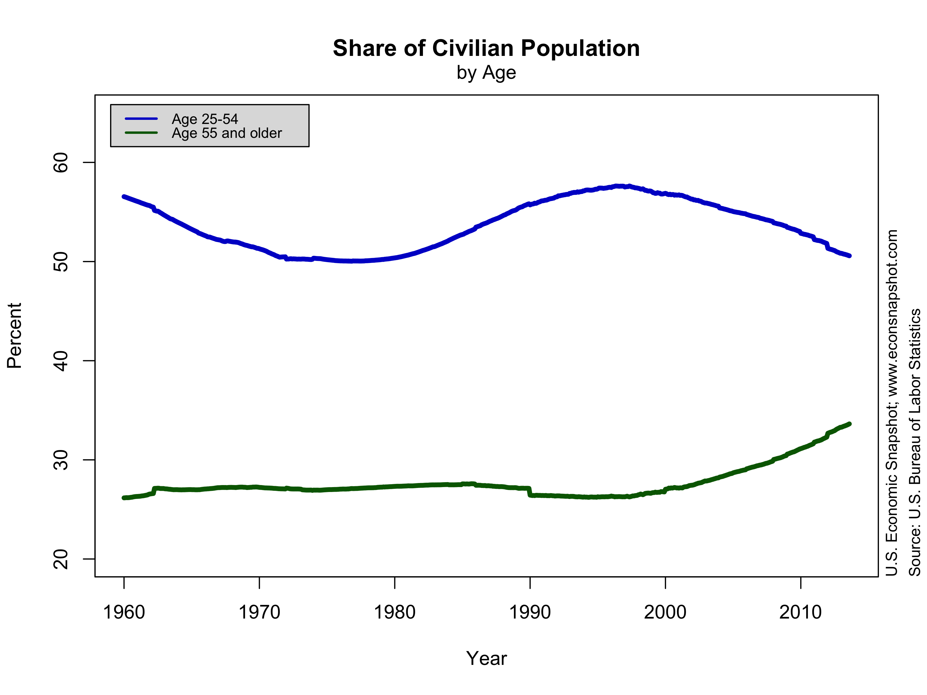
The employment/population ratio continues to be historically low compared to all other recoveries. It fell nearly twice as much and has shown very little recovery, as mentioned above, it fell again in October to 58.3%.

Indeed, the ratio is now about what is was back in the early 1980’s. Some of this has to do with demographics, to be sure.

Below we plot the vacancy-unemployment relationship, the Beveridge Curve, since 2000. The variables moved down and to the right during the previous recession as job vacancies fell and unemployment rose. During the recovery it has shown a counter-clockwise loop as it moves back up to the left. This movement is not unexpected as noted by the Diamond-Mortensen-Pissarides workhorse model of search unemployment. The vacancy data in this graph come from JOLTS, however, these data only started in December of 2000.

Third Quarter GDP Growth
The first estimate of GDP for the third quarter was reported on Thursday. At first glance it looks like excellent news because Q3 GDP increased at a 2.8% annualized rate in spite of the ongoing effects of the government sequester. Personal consumption and investment both increased as well. But, the 2.8% increase may not be cause for rejoicing. A big part of this was a change in business inventories which increased $86 billion in Q3 and added nearly .8% to the Real GDP growth rate in Q3. Typically growth driven by a spike in inventories creates some backdraft for future growth as businesses work them off. It is also especially worth noting that these estimates are based on partial data, likely rendered less reliable than usual because of the government shutdown.


The Costs So Far
This has been most protracted economic downturn since the Great Depression of the 1930’s. There are costs associated with this downturn that won’t be realized for years – the costs of disruption to the financial system, long duration unemployment, bankruptcies, collapsed household finances. We can, however, take a crack at estimating the aggregate loss in Real GDP as we did in an earlier post. To do this one has to take a stand on what the growth trend would have been had we continued on from the previous peak of the business cycle. Since this is unknowable we consider a couple of possibilities. This past quarter the GDP growth rate was 2.8% and this was the average rate from 1984 to 2013. Using that as a benchmark the cumulative output loss of the recession so far is 4,126.37 Billion 2009 $ or 26% of current GDP.

If we assume a larger long term growth trend – the average growth rate of 3.2% that prevailed from 1947-2013 – the cumulative output loss is even higher, at 9,345 billion of 2009 $ or roughly 60% of current GDP. This is a loss of more than 10% of GDP or roughly $14,000 for each US household per year of the recession.

Other conservative estimates of the cost of the recent recession are similar (see here for instance). While we can debate about the future long term growth potential of the US economy, the loss in output alone stemming from the financial crises 6 years ago is staggering. Even if the growth rate in the 3rd quarter of 2.8% is sustained, the economy will never reach its previous growth trend, a fact that has yet to occur in post-war business cycles.


