On January 25, the BEA released its Advance Estimate for 2024Q4 GDP. The key headline number: GDP grew at an annualized rate of 3.3% in the fourth quarter, down from 4.9% in the third quarter. The recent number, though down from the fourth quarter, was the largest since the first quarter of 2022. Moreover, surveyed economists from the Wall Street Journal forecast 2% growth.
A useful way to think about this drop in output growth is in terms of the contributions of the major components of GDP. These contributions are the growth of a component multiplied by its share of GDP. The 1.6 percentage point decline in GDP growth is chiefly due to investment (contributing 1.4 percentage points, that is, falling from 1.8 to 0.4) with lesser contributions due to government spending (0.4 points) and consumption (0.2 points). Offsetting contributions were recorded by imports (-0.3 points) and exports (-0.1 points).
The quarterly personal consumption expenditures price index (PCE) fell to 1.7%, continuing an impressive decline starting in Q3 of 2022.
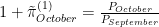
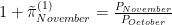
The BEA reports that the PCE price index increased 0.2% in December, up from -0.1% in November. At annual rates, these work out to 2.0% (December) and -0.8% (November). Our measure of trend PCE inflation rose, at an annual rate, from 1.4% in November to 1.6% in December. The earlier CPI report foreshadowed these increases. On a year-over-year basis, PCE inflation was essentially unchanged between November and December at 2.6%.
Our measure of trend core PCE inflation was up slightly, from an annualized 1.9% (November) to 2.0% (December). On a monthly basis, core PCE inflation shot up from 0.8% to 2.1% while the year-over-year rate fell from 3.2% to 2.9%. All in all, core PCE inflation looks to be settling into the Fed’s target of 2.0%. It will simply take a few months for the year-over-year rate to catch up with recent developments.
The December CPI (Consumer Price Index) report, released by the BLS (Bureau of Labor Statistics) is bad news on the inflation front. By almost any measure, CPI inflation is up. By our recently discussed “constant gain” measure of trend inflation, it rose by 0.4 percentage points for the overall CPI, and by 0.15 percentage points for core CPI (excluding food and energy). On a year-over-year basis, overall CPI rose 0.2 percentage points while core CPI fell by 0.1 points. The figures below show that the one-month annualized inflation rates are also up.
For monetary policy, what presumably matters is not what’s happening with CPI inflation but rather PCE (Personal Consumption Expenditures) price inflation since core PCE inflation is what the Fed looks at. Although it is probably the case that the CPI works to influence the policy makers. The PCE data won’t be released for another two weeks. However, given the broad similarity in the goods covered by the CPI and PCE deflator, it’s a reasonable guess that (core) PCE inflation will also be up. If so, the Fed will be faced with some difficult choices: Do they treat December as (maybe) an aberration and stand pat, or will they view December as the harbinger of another inflationary pulse? Or, cognizant of the long and variable lags associated with the effects of monetary policy, will the Fed leave rates unchanged since they’re already added enough tightening? Having said that, the “trend” line has not risen by much and for the core is basically flat. Therefore, from a long and variable lag perspective it seems doubtful that the Fed will alter their current stance at the meeting at the end of the month.
One of the challenges over the past couple of years has been measuring trend inflation. As shown in the figure below, monthly inflation rates are volatile; 12-month inflation rates are much smoother, but only slowly reflect changes in trend inflation. Previously, we’ve focused on the 3-month inflation rate.
As shown below, the 3-month inflation rate is approximately the average of three 1-month inflation rates. This means that each month, the 3-month inflation rate adds the current 1-month inflation rate, and drops the 1-month inflation rate from 4 months ago. Consequently, the 3-month inflation rate can drop precipitously if the inflation rate being dropped is relatively high.
A different way of putting the issue is that the calculation for the 3-month inflation rate assigns a weight of 1/3 to each of the past 3 months’ inflation rates, and a weight of 0 to inflation rates 4 or more months ago. Why such a discrete change in weights? Why not a more gradual decline in weights?
The remainder of this post gets into the guts of an alternative measure of trend inflation in which the weights on monthly inflation rates decline with their age. Readers uninterested in the details should feel free to jump to the end which presents our new measure of trend inflation.
The 3-month inflation rate as an average of 1-month inflation rates
Consider the calculation of the gross 3-month (non-annualized) inflation rate for November,
where is the price level (for a given month), and the superscript indicates the horizon over which the inflation rate is computed (3 months in this case). The `tilde’ over indicates that the measure of inflation is not annualized. Similarly, 1-month (non-annualized) inflation rates are given by
From the above, it follows that
The gross 3-month inflation rate is the product of the three immediate past 1-month inflation rates. Taking the natural logarithm,
we obtain
where the approximation arises from for close to zero.
If we wish to work with annualized inflation rates, then
Again taking the natural logarithm, we obtain
The 1-month inflation rates will have “12” in the place of “4”. We now have
In other words, the 3-month annualized inflation rate for November is (approximately) the average of the three 1-month annualized inflation rates.
A related problem: computing an average
Given 3 observations on some variable, the sample average or mean is
Now, if we add a fourth observation,
However, computing as above discards the “work” done in calculating . From the calculation of ,
Substituting into the formula for ,
or,
This leads to a well-known formula for recursively computing an average:
where t is the number of observations. It says that the mean at date t is a weighted average of the previous mean, and the current (date t) observation.
This is all well and good if the population average is constant. But what if the population average changes periodically. If we knew when these changes in population average occur, we would simply discard all the old observations, and start computing the average afresh. When we don’t know when changes in the population average occur, an alternative approach is to apply a constant “gain” or weight to new observations:
where is the constant weight.
Application: Trend inflation
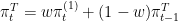
The discussion above suggests measuring trend inflation via
In words: trend inflation is a weighted average of the current one-month inflation rate (with weight w), and the previous trend inflation rate (with weight 1-w). Solving this equation backwards gives
That is to say, the measure of trend inflation at t is a weighted average of all past inflation rates, and that the weights decline geometrically with time. Put differently, there is a smooth drop off in the importance attached to previous inflation rates. By way of example, for w=1/3, the weight associated with the current inflation rate is 1/3 = 0.333; with the previous month’s inflation rate, 2/9 = 0.222; with the inflation rate 2 months ago, 4/27 = 0.148; and with inflation 12 months ago, roughly 0.00257 — very small.
Our new measure of trend inflation
The figure below plots our `constant-gain’ measure of trend core PCE inflation for a weight of 1/3 on the latest observation, along with the monthly, 3-month, and annual inflation rates. Relative to the 3-month inflation rate, this measure of trend inflation is somewhat smoother while still responding in a timely fashion to apparent changes in trend inflation.
The BLS announced that payroll employment increased 216,000 between November and December, the private sector contributed 164,000 to the total. Private service producing jobs accounted for 142,000 of the total, despite a 33,300 decline in temp workers and a 22,600 decline in transportation and warehousing jobs. October employment was revised down 45,000 and November down 26,000.
Average weekly hours fell from 34.4 to 34.3 and with the 142,000 increase in private sector employment, total hours of work fell 2.0%.
Average hourly earnings increased 0.4%, from $34.12 to $34.27. Earnings growth has been outpacing price growth over the past few months with the big declines in inflation even though wage growth has slowed somewhat.
A different way to visualize what’s happening to hourly earnings relative to prices is to plot both in logarithms. For current purposes, there are two useful facts regarding logarithms. First, a straight line represents a constant growth rate. In other words, if the Fed hit its target for core PCE inflation, then when core PCE is plotted in logarithms, we would see a straight line. As shown in the chart below, core PCE inflation may have been constant between 2011 and 2015, and again from 2016 to 2020. The second useful property of logarithms is that a constant gap between two lines means that they are growing at the same rate. Of particular interest is comparing the gap between average hourly earnings and a price level since this gap represents real average hourly earnings (that is, after accounting for changes in the price level). In the chart below, the gaps between average hourly earnings and either the CPI or PCE were roughly constant from 2011 to 2013 which means that earnings grew at about the same rate as prices. Perhaps more interesting is these gaps are changing. By way of example, from 2015 to just prior to the pandemic, the gaps between earnings and the price levels increased meaning that real earnings (the quantity of goods and services that can be purchased) increased. During the pandemic-induced recession, real earnings blipped up as nominal earnings rose and prices fell. However, starting in mid-2020, prices grew faster than earnings: the gap between the two shrank. Then, starting in 2022, the gaps between earnings and prices started opening up again. In other words, despite all the concern about inflation, real earnings grew. Indeed, as measured against the CPI, real earnings in late 2023 were close to what they were just prior to the pandemic; against the PCE, real earnings are higher.
The household survey paints a much different picture of the December employment situation. The labor force participation rate fell from 62.8 to 62.5. Employment declined by 683,000 leading to a 0.3 percentage point decline in the employment to population ratio. The number of unemployed rose 6,000 and the unemployment rate rose slightly from 3.72% to 3.74%.
There are well known trends in male and female labor force participation, as well as by race. The chart below digs deeper into the overall labor force participation rate by looking at finer groupings. At the start of the pandemic, labor force participation fell across all groups. Looking since mid-2020, participation by white men has leveled off at a lower level; for white women, it’s hard to tell whether there has been a downward level shift. The participation rate for Hispanic men has trended down since 2007. More recently, their participation rate seems to be leveling off, with no obvious level shift. On the other hand, the participation rates for Hispanic women, Black women and Black men are all back to their pre-COVID levels.
Data for JOLTS (Job Openings and Labor Turnover Survey) were released on January 3. JOLTS gives information concerning worker flows in and out of jobs. As shown below, since 2021 the layoff rate has been fairly stable; since 2022, the rates for openings, hires and quits have trended down. Indeed, the hiring and quit rates are close to their pre-pandemic values.
JOLTS data is also useful because it allows us to plot the Beveridge curve, the relationship between vacancies and unemployment. Indeed, the Beveridge curve is central to Diamond-Mortensen-Pissarides search model of unemployment. In essence the Beveridge Curve is behind the notion of a “tight” labor market: high vacancy rates and low unemployment tend to lead to a growing, or healthy economy. In the figure below, we have color-coded points corresponding to: the Great Recession, pre-Great Recession, post-Great Recession, and since the onset of the COVID pandemic. Visually, the pre-Great Recession and Great Recession periods lie on a relatively stable Beveridge Curve. However, there is a shift in the Beveridge Curve after the Great Recession, and the pandemic period does not fit either of the previous periods. However, over the past couple of years, the unemployment rate has remained fairly stable while the vacancy rate has fallen (see also above). It’s hard to tell where the US labor market will end up, but recent observations are getting close to the post-Great Recession Beveridge curve.
Overall, the reports show a continued strong labor market. The latest reports shouldn’t change Fed calculus.


 is the price level (for a given month), and the superscript indicates the horizon over which the inflation rate is computed (3 months in this case). The `tilde’ over
  indicates that the measure of inflation is not annualized. Similarly, 1-month (non-annualized) inflation rates are given by


 for
for  close to zero.
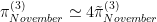
![\pi^{(3)}_{November} \simeq \frac{1}{3} \left[\pi^{(1)}_{September} + \pi^{(1)}_{October} + \pi^{(1)}_{November}\right]](https://s0.wp.com/latex.php?latex=%5Cpi%5E%7B%283%29%7D_%7BNovember%7D+%5Csimeq+%5Cfrac%7B1%7D%7B3%7D+%5Cleft%5B%5Cpi%5E%7B%281%29%7D_%7BSeptember%7D+%2B+%5Cpi%5E%7B%281%29%7D_%7BOctober%7D+%2B+%5Cpi%5E%7B%281%29%7D_%7BNovember%7D%5Cright%5D&bg=ffffff&fg=000&s=0&c=20201002)
![\overline x^{(3)} = \frac{1}{3} \left[x_{1} + x_{2} + x_{3}\right]](https://s0.wp.com/latex.php?latex=%5Coverline+x%5E%7B%283%29%7D+%3D+%5Cfrac%7B1%7D%7B3%7D+%5Cleft%5Bx_%7B1%7D+%2B+x_%7B2%7D+%2B+x_%7B3%7D%5Cright%5D&bg=ffffff&fg=000&s=0&c=20201002)
![\overline x^{(4)} = \frac{1}{4} \left[x_{1} + x_{2} + x_{3} + x_{4}\right]](https://s0.wp.com/latex.php?latex=%5Coverline+x%5E%7B%284%29%7D+%3D+%5Cfrac%7B1%7D%7B4%7D+%5Cleft%5Bx_%7B1%7D+%2B+x_%7B2%7D+%2B+x_%7B3%7D+%2B+x_%7B4%7D%5Cright%5D&bg=ffffff&fg=000&s=0&c=20201002)
 as above discards the “work” done in calculating
  . From the calculation of
  ,
,
![\overline x^{(4)} = \frac{1}{4} \left[ 3 \overline x^{(3)} + x_{4} \right]](https://s0.wp.com/latex.php?latex=%5Coverline+x%5E%7B%284%29%7D+%3D+%5Cfrac%7B1%7D%7B4%7D+%5Cleft%5B+3+%5Coverline+x%5E%7B%283%29%7D+%2B+x_%7B4%7D+%5Cright%5D&bg=ffffff&fg=000&s=0&c=20201002)


 is the constant weight.