How Trump Won

By Thomas Cooley, Ben Griffy, and Peter Rupert

At the start of Nov. 8th, most pundits would have been equally shocked by a Donald Trump victory as they would have been by Harry Truman rising from his grave clutching a newspaper celebrating his 1948 electoral victory. Almost universally, onlookers predicted a large, if not resounding victory for Hillary Clinton. And now a week later, many of those pundits have begun to acknowledge their own hubris in their predictions.

We take the opportunity to explore this and the past several elections, to see what differences might have driven such an unexpected outcome. What we find is interesting: Once we control for the level of education and unemployment in a county, the proportion of white men in a county was not predictive of a higher likelihood of voting for Trump. Counties with higher unemployment and less education were much less likely to vote for the Democratic ticket than they were in 2012, while all race and gender groups appear to have been more likely to increase their vote for Clinton once demographics were included. Additionally, counties that were heavily employed in manufacturing closer to the enactment of NAFTA swung their vote away from Clinton and may have decided the election.

To do this analysis, we combined county-level election results for the previous two elections, 2012 and 2016, with a number of characteristics of those counties, including race and gender, education, unemployment, and employment by industry (2-digit), for the most recent years available (most often 2015). We also include the percent of the county employed in manufacturing jobs for the year 2002 (the earliest year available at the county level) to assess whether a narrative about NAFTA and trade may have had a role in determining the outcome of the election. We further merge information on the counties previously covered by the Voting Rights Act (prior to the Shelby decision, 2013) to see what impact lifting the pre-clearance requirement may have had on the election.

As one might expect, there is a strong geographic component to the outcome of the election. The coasts strongly supported Clinton, while the center overwhelmingly supported Trump:

clinton_dist.png

obama_dist.png

An interactive version of the maps presented here, as well as instructions on how to use them are available at the bottom of the post. There are subtle, but important differences between the geographic distribution of votes in these two elections. Notably, Democratic losses were concentrated in areas that were strongholds as recently as 2012:

change_2012-2016.png

What drove these differences? There’s no doubt that the results are, at least to some degree, consequence of an undertow of racism, sexism, and homophobia, that voters were able to exorcise from the privacy of the voting booth. It’s also true Hillary Clinton was also an historically unpopular candidate, exceeding only her rival in popularity among presidential candidates. But it also seems that the economically dispossessed were willing to overlook these flaws to support Trump. The table below reports the marginal effect that a one percent change in a set of covariates had on the support for Clinton relative to Obama. We measure this change in support as the percent in a county voting for Clinton in 2016 minus the percent in that county that voted for Obama in 2012. The covariates are all the same scale, between 0 and 100, meaning that a 10 percent increase in the unemployment rate in a county implies a 5 percent decrease in support for Clinton relative to Obama in 2012 (see the number corresponding to unemployment in the table below). We also use state fixed effects, meaning that these results are relative to the average change in the state.

results.PNG

A quick read of this table reveals some interesting, and potentially surprising statistics. Counties with higher percentages of Hispanic and Latino voters turned out for Clinton, while counties with higher unemployment aligned with Trump’s populist message. The African American vote did not seem to improve Clinton’s outcomes, and we discuss some causes for this below. As has already been widely reported, counties with higher percentages of white men were more likely to support Trump, relative to 2012, which is shown by the cross-term in row 3 (remember that each variable is 0 to 100, so the cross-term ranges from 0 to 10000, potentially). There is an important subtlety here: once county-level demographic and economic characteristics are controlled for, counties with white men actually increased their vote for Clinton relative to how they voted in 2012, for almost all the combinations of percent male and percent white in the dataset. However, the cross-term in row 3 indicates that as either the percent white or percent male in a county increased, the margin got smaller, suggesting that highly white or male counties were less likely to vote for Clinton than their more diverse peers. Still, for all but the most white counties in the dataset, our model would predict that they would increase their vote for Clinton, relative to Obama in 2012. The dichotomy between what we see in our dataset and what we observed in the election is that the places that were overwhelmingly white and changed their votes to Trump also have higher rates of unemployment and higher percentages of residents with a high school degree or less. Nationally, the distribution of white males is shown below (counties in gray did not have the relevant data):

white_male.png

This seems at least geographically consistent with the narrative that white men swung the election for Trump. Our interpretation is that covariates that might be strongly correlated with certain geographic regions, like unemployment and education, are strongly correlated with support for Trump. As shown above, those with a high school education or less strongly decreased their support for Clinton relative to their support for Obama in 2012. That distribution geographically is displayed here:

HS_Less.png

Again, it appears that these groups are concentrated in states that had a substantial impact on the election, though not as densely as one might expect. Somewhat surprisingly, repeating the analysis above with a variable that represents the percent of counties with white men with a high school education or less does not yield significant results, that is at least partially suggestive that the most common narrative following the election, that low-education white male voters swung states from Clinton to Trump isn’t consistent with the data. Again, this is probably because there is a strong correlation between these groups and other characteristics. The result that we find most interesting comes from the variable labeled “Percent Employed in Manufacturing (2002),” the earliest year for which employment by sector is available at the county level. This means that counties with higher percentages of their workers employed in manufacturing sectors in 2002 were substantially less likely to vote for Clinton than they were for Obama just four years before. This could of course simply be correlation, but it’s also possible that these workers still hold the Clinton’s responsible for declining job prospects as a result of NAFTA in 1994. Where were these industries located? See below:

manufacturing_pct.png

We see that the percentage of individuals employed in manufacturing is fairly evenly distributed among states in the Midwest and the South. Remember that several key states in the election, Pennsylvania, Wisconsin, and Michigan, were decided by about 1.5 percent or less of the total vote, meaning that the shift in voting in these manufacturing heavy counties could have played a large role. Equally as important as the percent employed in manufacturing is the number of potential voters who were employed in these industries, and where they were located:

manufacturing_total.png

Unfortunately, many counties lack data on share of manufacturing from the 2002 data source. From the data we can obtain, counties that switched votes from Democrat to Republican, those in the Midwest had higher percentages of their workforce employed in manufacturing, and larger numbers employed in those industries as well. Furthermore, these industries were highly concentrated in the “Rust Belt,” the states closest to the Great Lakes. These states had been traditional Democratic strongholds, but swung to the Republicans for the first time in several elections. With this data, we can only conjecture about whether this was a cause, but it does appear that counties with jobs that were more likely to leave following the adoption of NAFTA shifted their votes in large quantities to the Republican ticket.

Another interesting and important narrative in this election is the removal of the Voting Rights Act as a protection against impeding voter participation. Could this also have played a role in swinging the election? Prior to Shelby County v. Holder (2013), which ruled the pre-clearance requirement unconstitutional, there were a number of jurisdictions under the purview of Section 5 of the Voting Rights Act (link). When we repeat the same exercise as before, predicting the percent change in Democratic support within a county between 2016 and 2012, we come to an interesting and perhaps counter-intuitive conclusion: support for Clinton was higher in previously covered counties than for Obama in 2012, at least as a percentage of those voting. Doing the same analysis as above, but including an indicator variable for counties that were covered by the Voting Rights Act yielded the following:

vra_results.PNG

What this suggests is that voters in counties that had previously been under the protection of the Voting Rights Act increased their support for Clinton by 2 percent relative to 2012. Some of this could be a result of much negative rhetoric on the Republican side being targeted at the minority groups that were previously protected by the Voting Rights Act.

vra_results_total.PNG

Note that this is not the difference in the total number of ballots cast for the two candidates in this election, but the change in the number of ballots cast in total between 2012 and 2016. Thus, Given that the average number of ballots cast in a county was around 40,000, this decrease in counties that had been covered by the VRA is substantial. Overall, the number of ballots cast increased by an average of about 1,000 per county between 2012 and 2016, suggesting that the turnout was substantially depressed in counties that were previous covered by the Voting Rights Act, though per our analysis, this didn’t seem to translate into a higher percentage of votes for the conservative on the ticket. And, at least graphically, it doesn’t seem like these differences could have swung the election:

vra.png

Given the geographic location of these covered counties, it seems unlikely that it directly played a role in shaping the presidential election, though it may have impacted North Carolina, and probably did have an impact in down-ballot races.

It’s still not entirely clear what drove such an unexpected result, but we think that the narrative needs some clarification. Having delved into the data, it appears that a long-standing disaffection for free-trade may have driven a lot of Midwest voters to switch party allegiances they held as recently as 2012 and vote Republican. In places that determined the outcome of the election, states like Wisconsin, Ohio, Pennsylvania, and Michigan, a disproportionate number of people had been employed in industries (in 2002) that were most likely to be impacted by NAFTA.

Interactive Maps: To use these maps, click on the corresponding link. You will either automatically or be prompted to download an html document. After downloading this document, either double click or drag-and-drop into your internet browser. This will open the interactive data. This slightly convoluted process is because we cannot embed the graphics in WordPress.

Clinton Voting Distribution: link
Obama Voting Distribution: link
Change 2012 to 2016: link
Manufacturing (Percent): link
Manufacturing (Levels): link
Race and Gender: link
Education: link

Voting Rights Act: link

October Employment…Strong Enough?

By Thomas Cooley, Ben Griffy and Peter Rupert

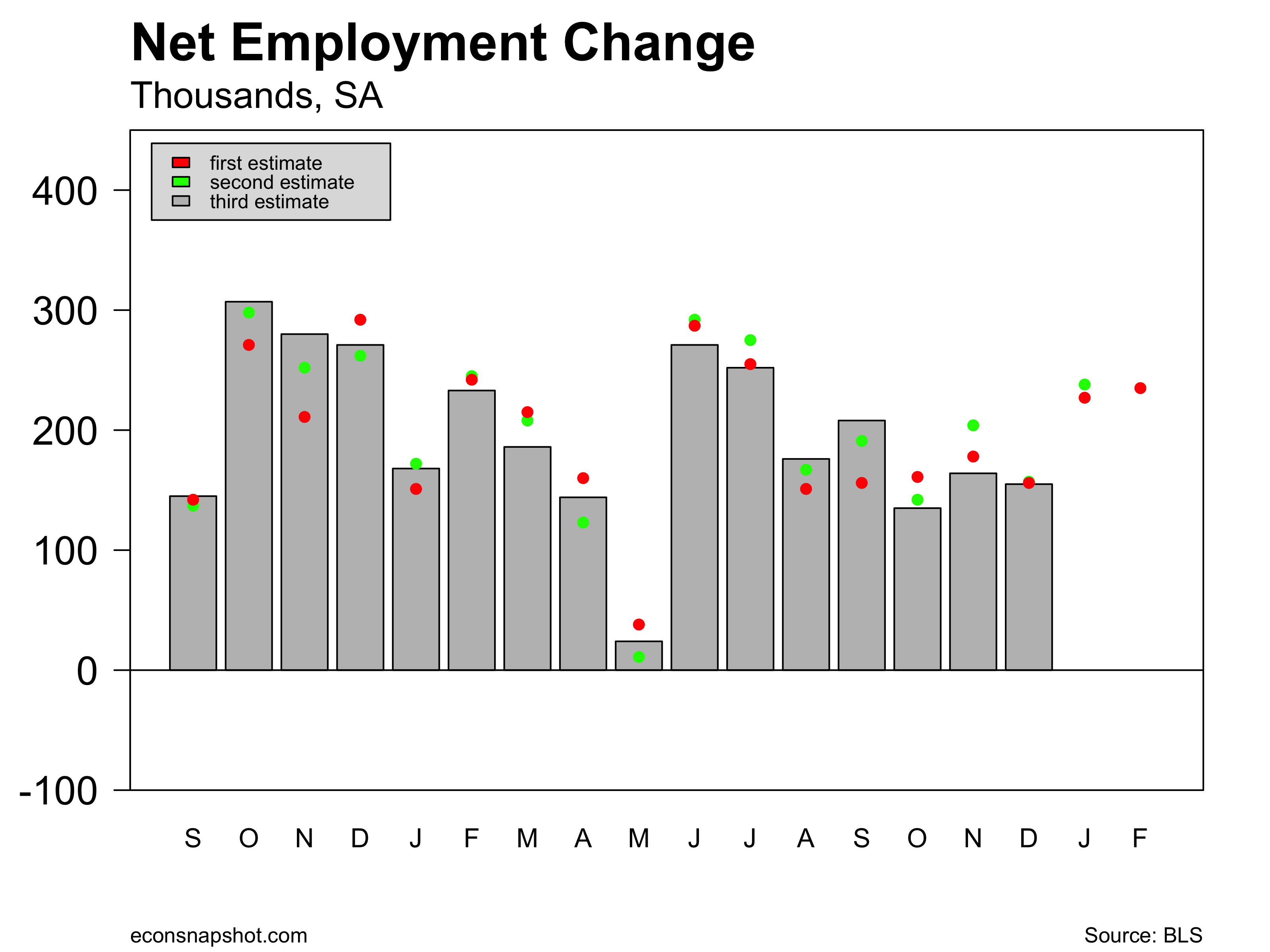
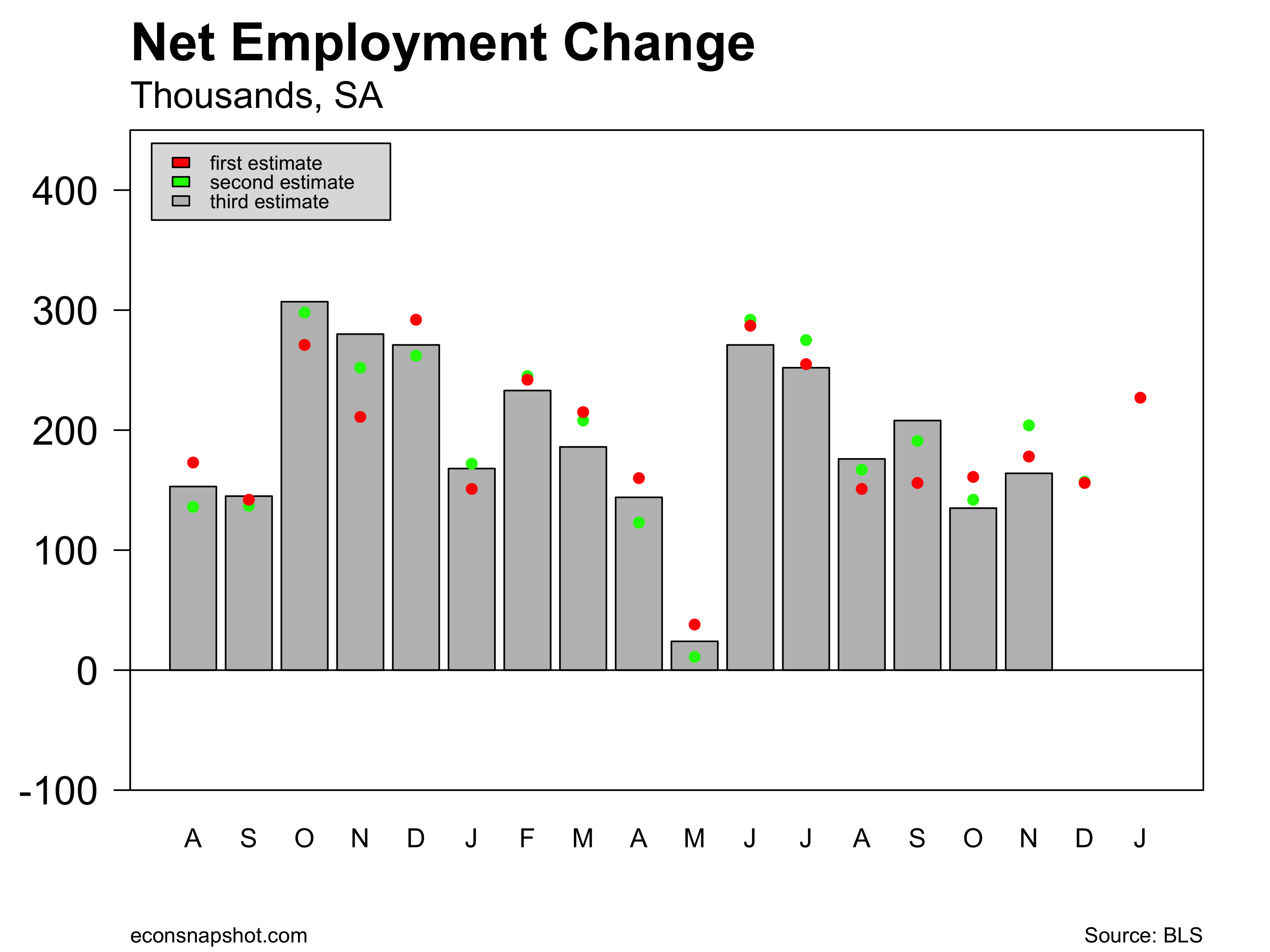
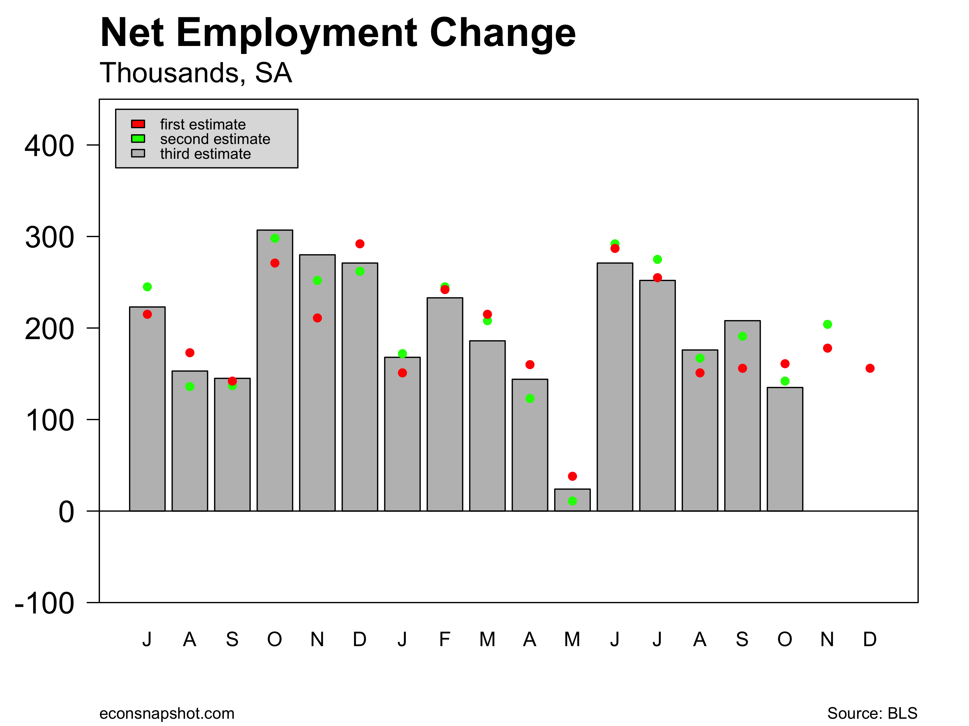
Today’s release of the employment situation by the BLS shows employment increasing by 161,000, as measured from the estalishment survey. Moreover, both August and September were revised up. For August, the third (and final) estimate has employment 9,000 higher than the second estimate. For September, the second estimate is 35,000 higher than the first. Here you can find revisions going back to 1979.

empchgm-2016-11-04

Private sector employment increased 142,000 and all of that came from the service producing sectors as the net for the goods producing sectors was zero. Construction jobs increased 11,000, manufactuing fell by 9,000 and mining and logging (oil, mainly) continued to contract, down another 2,000 jobs.

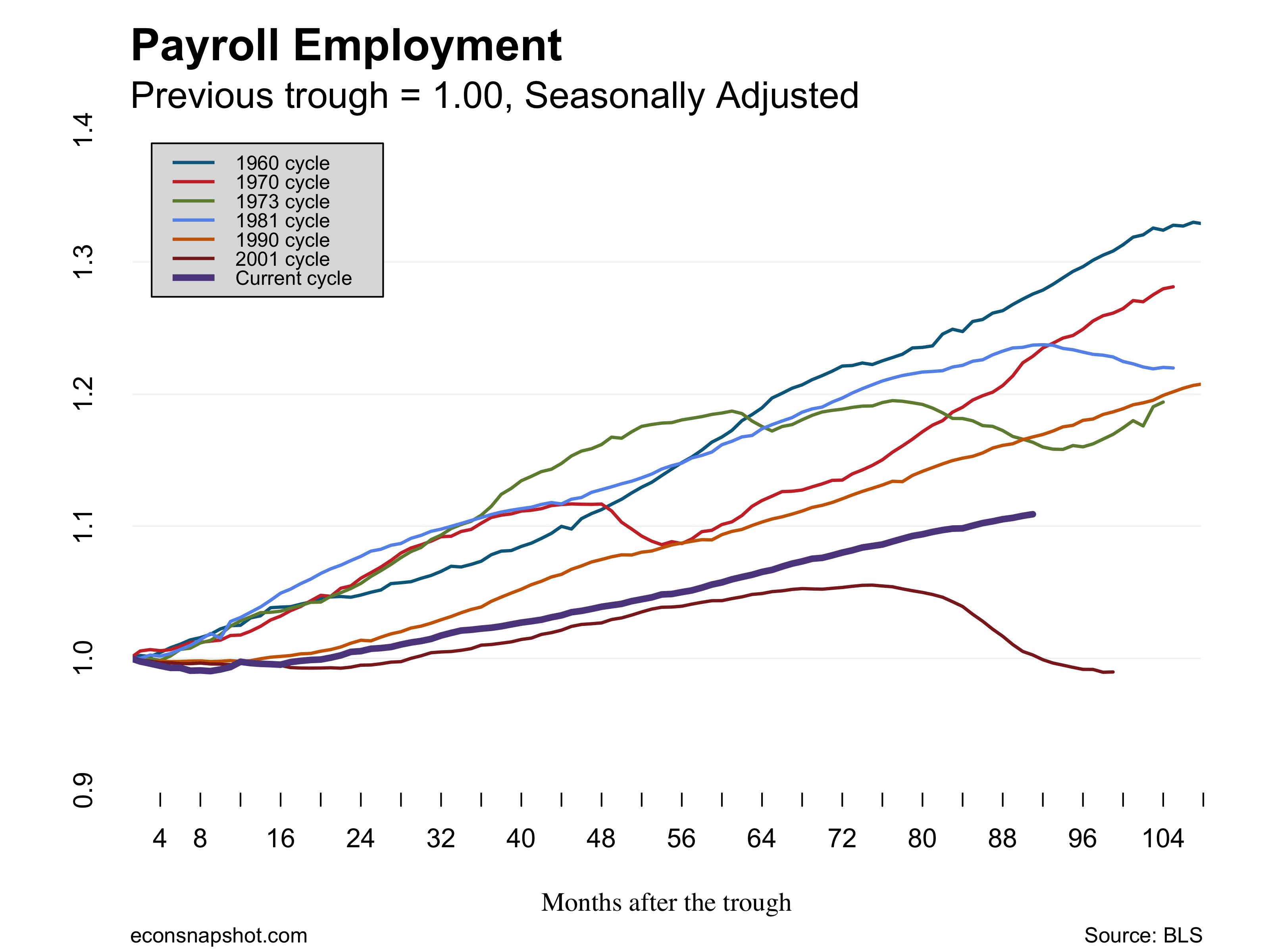
Since the trough of the great recession, dated June of 2009 by the NBER, employment growth has been steady…yet below all other expansions except for the 2001 cycle. emp-rec-rec-trough2016-11-04

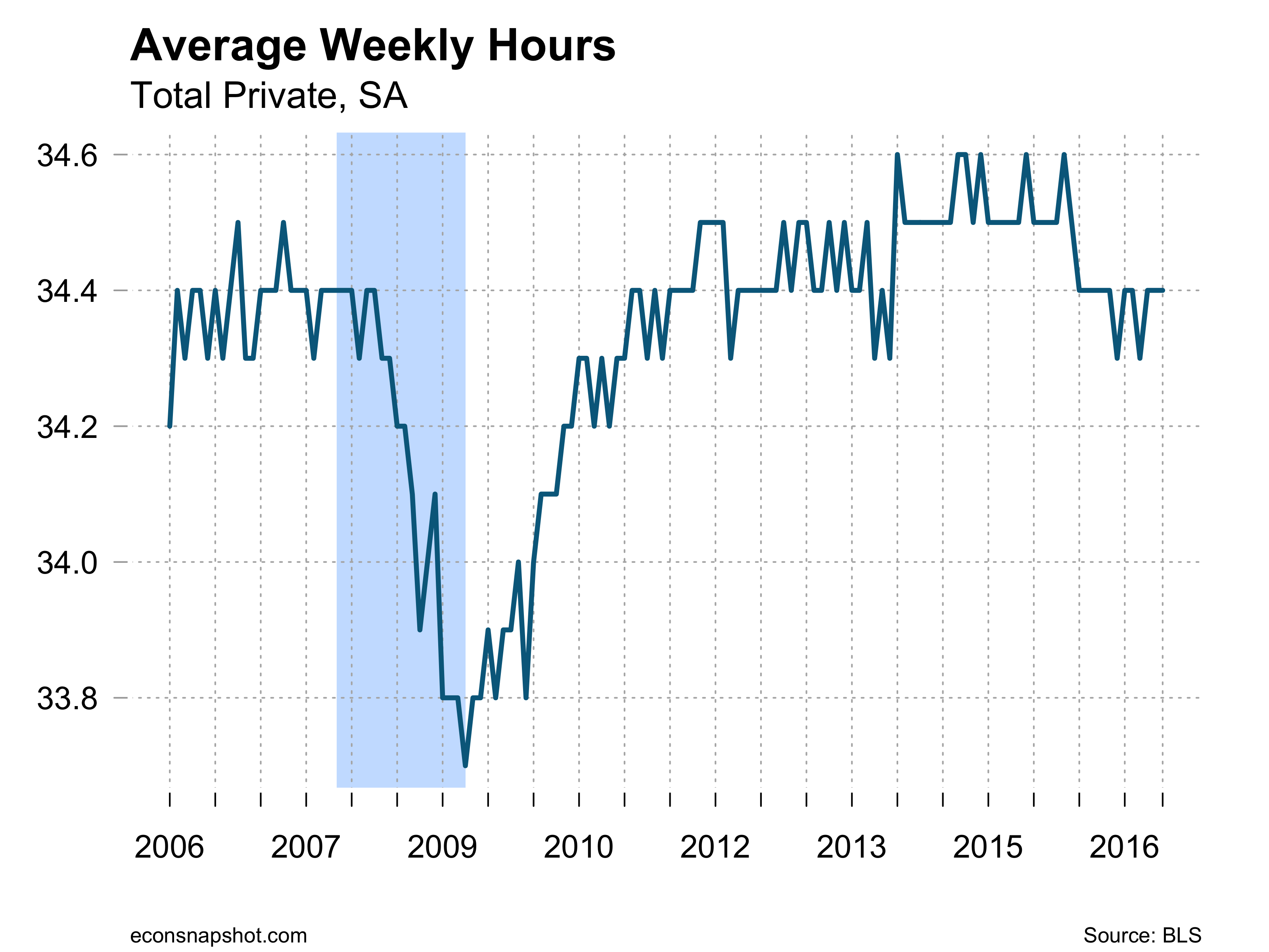
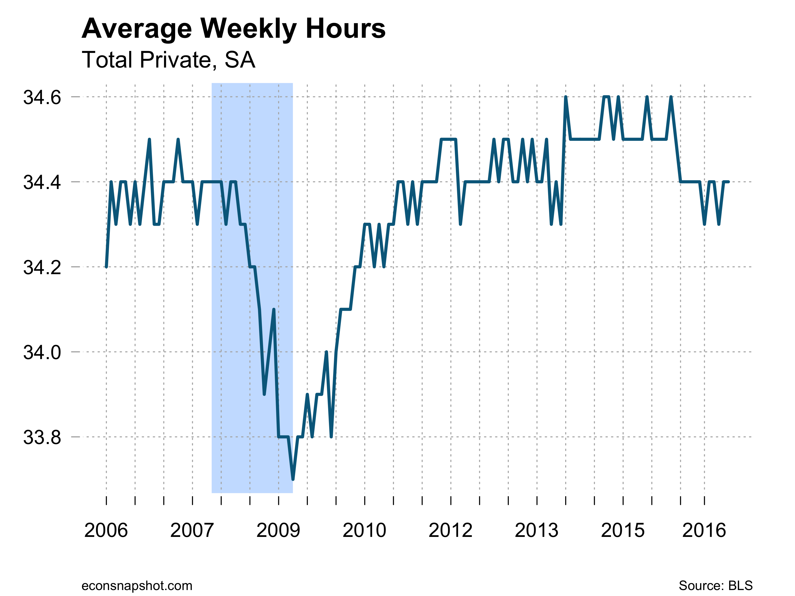
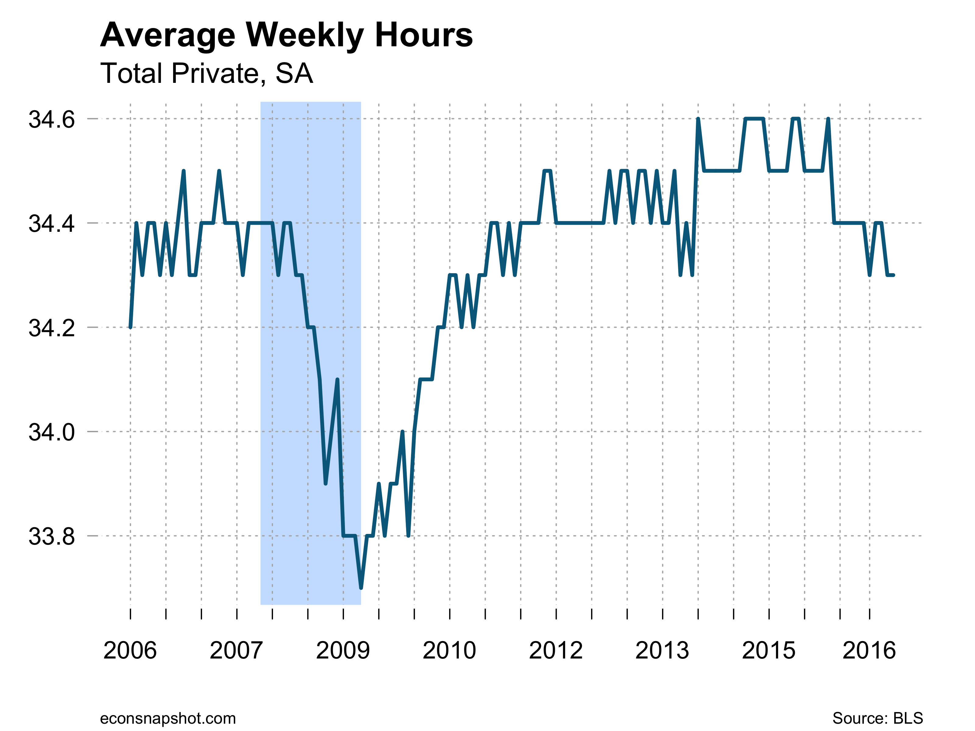
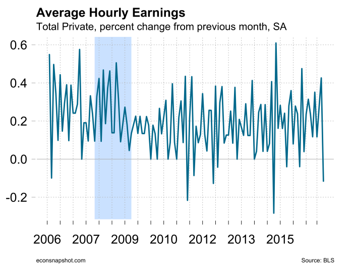
Average weekly hours were flat at 34.4 and average hourly earnings ticked up from $25.82 to $25.92.

avghours-2016-11-04

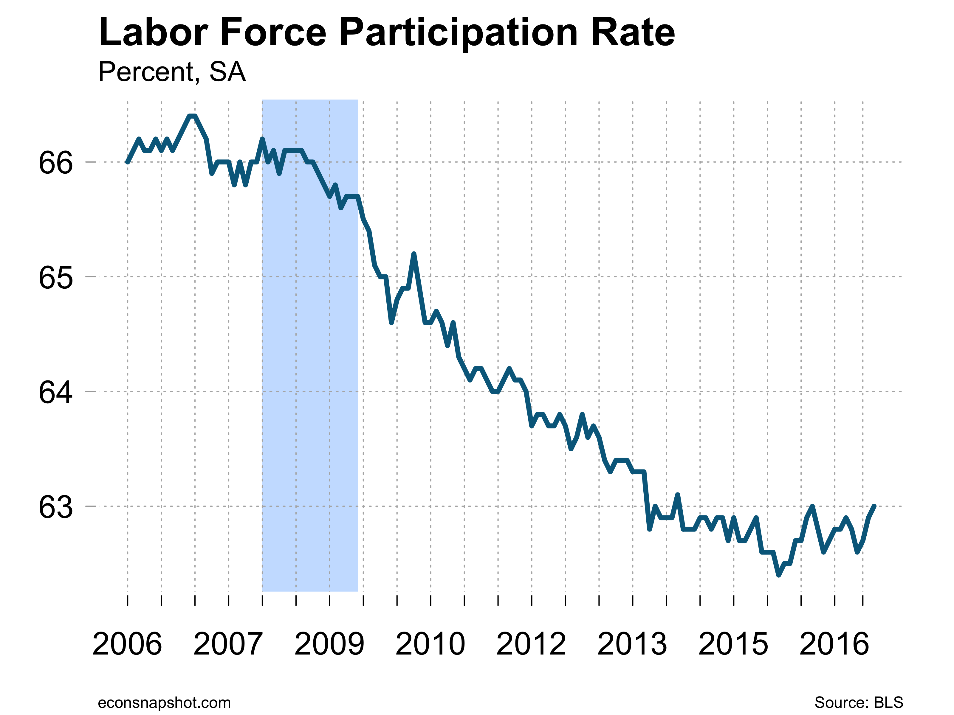
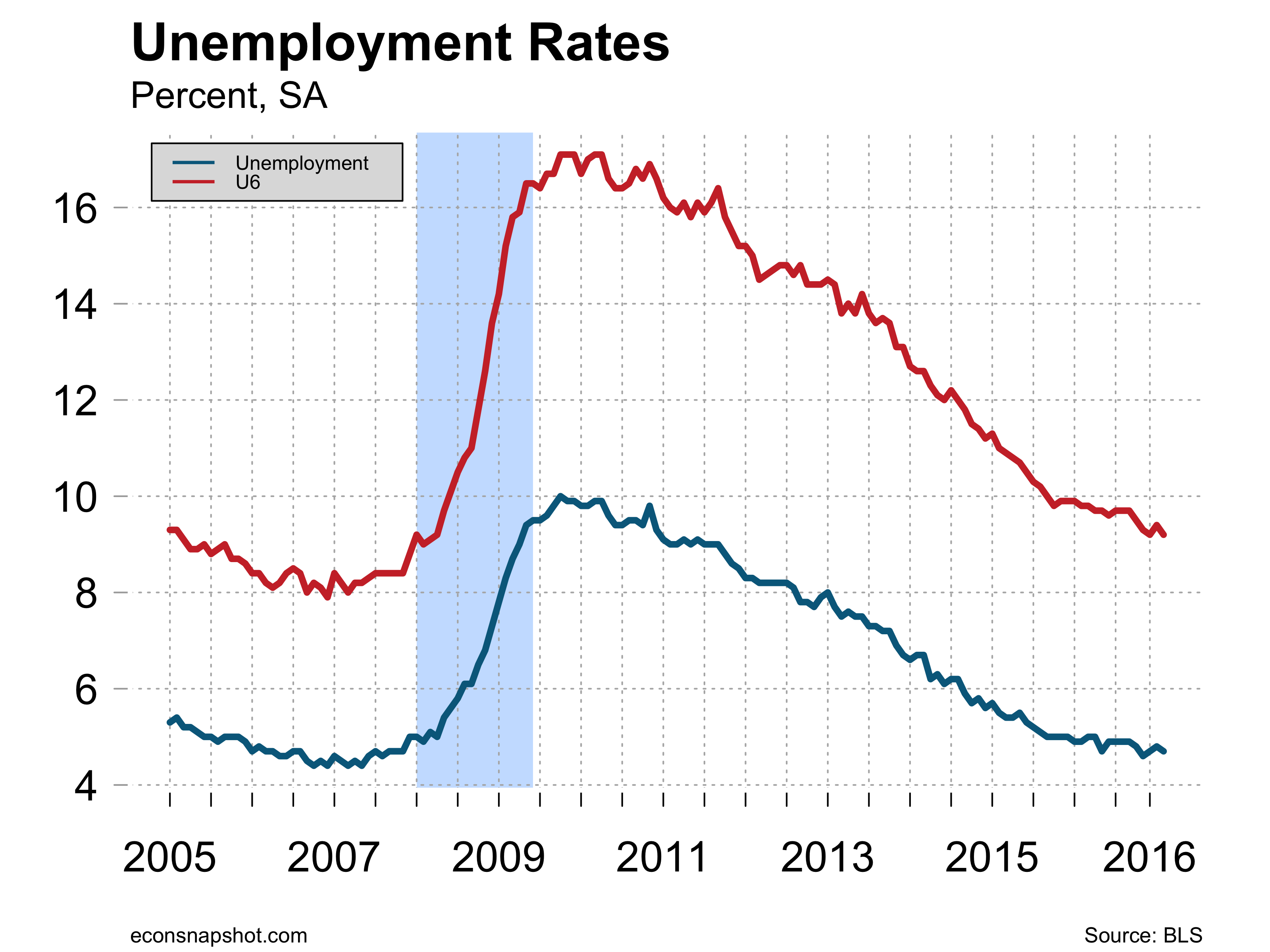
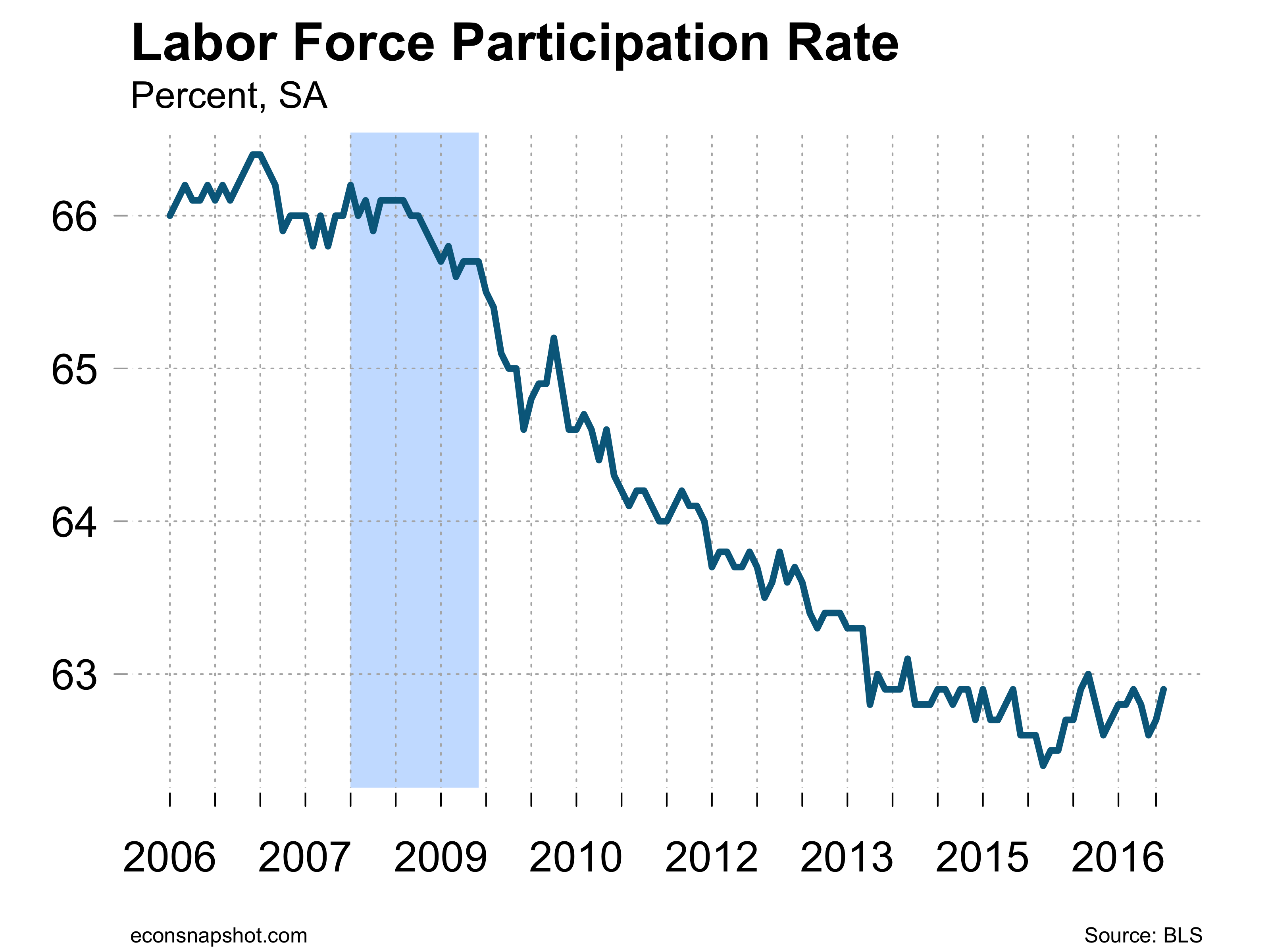
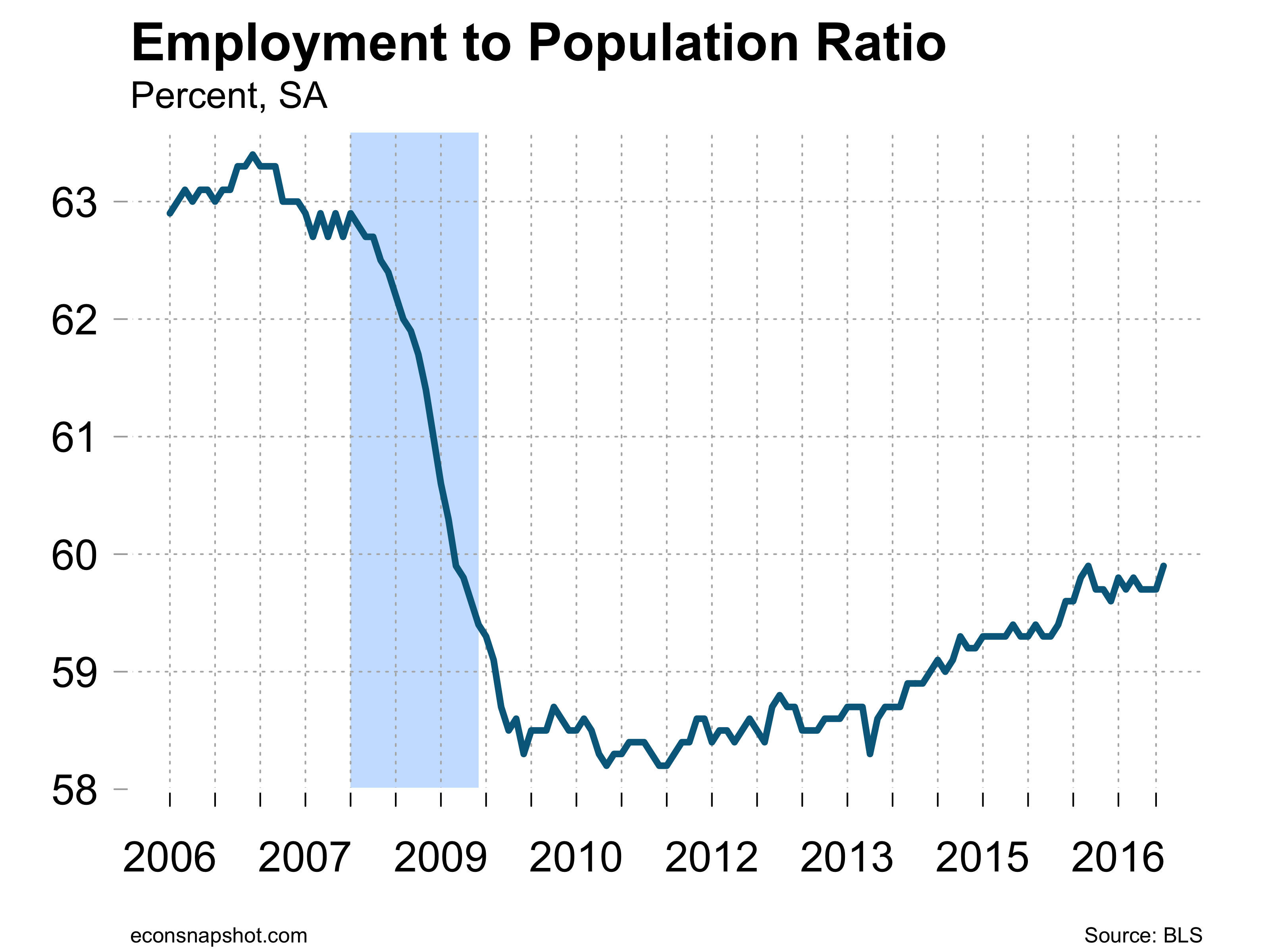
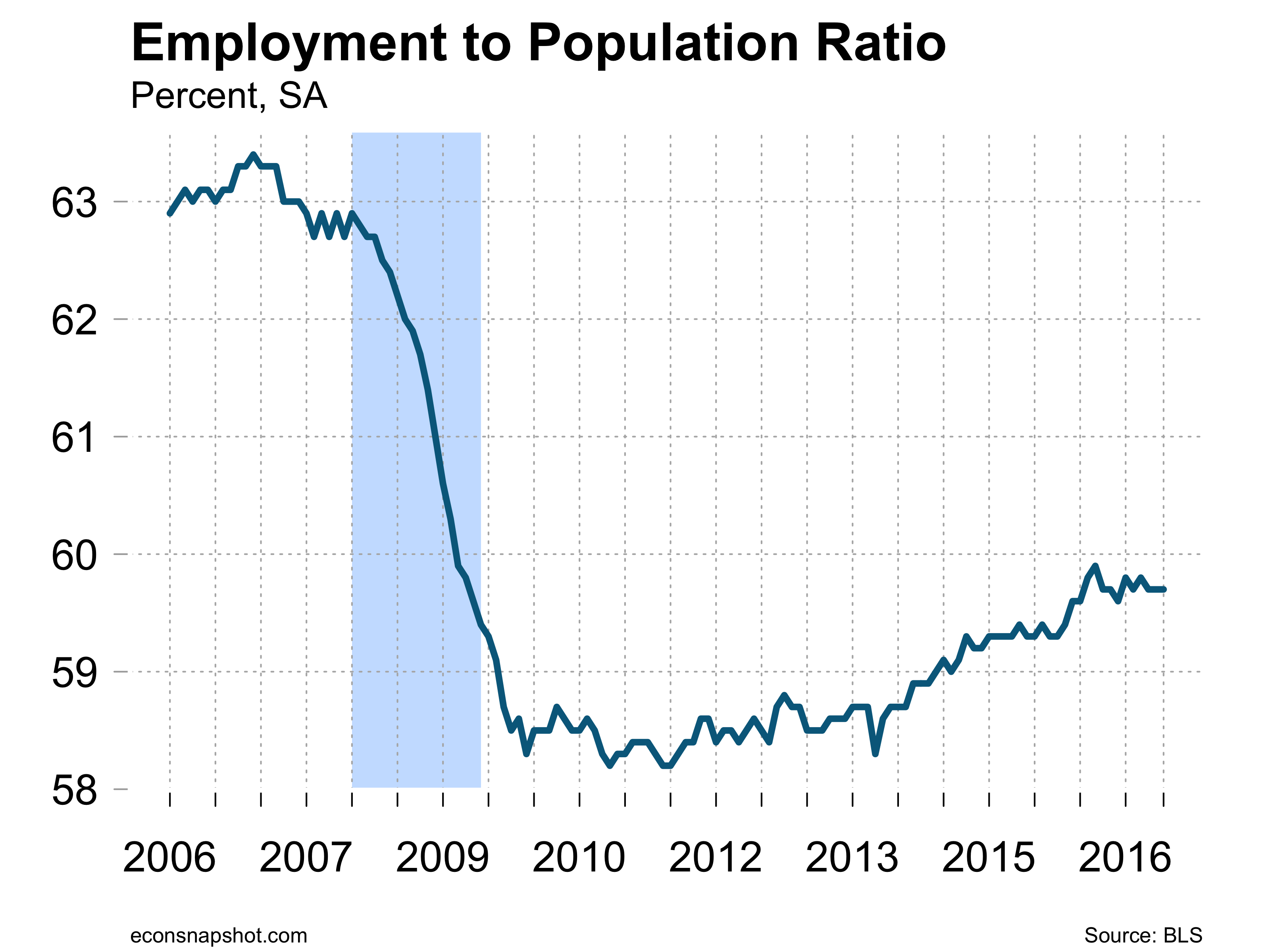
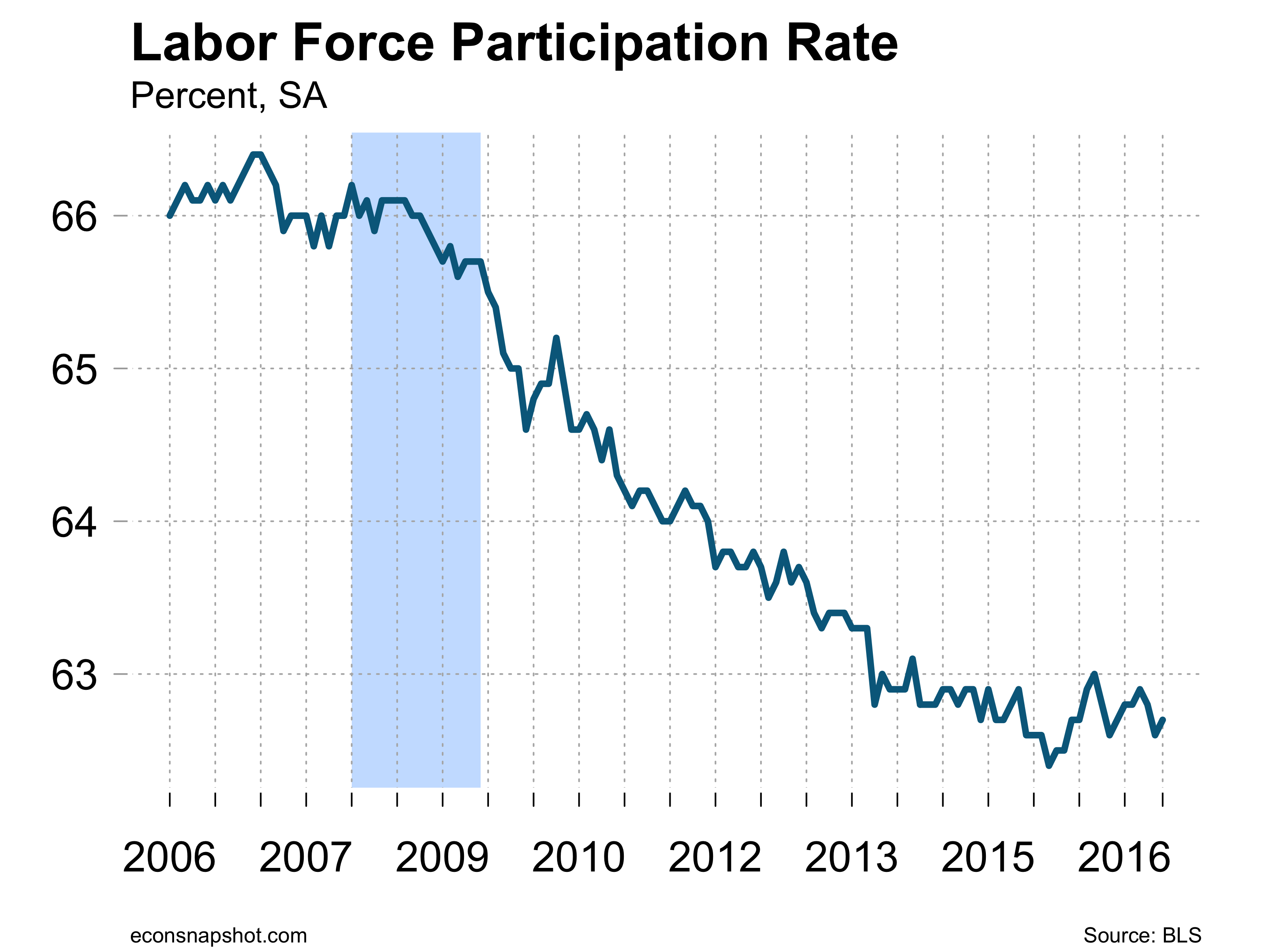
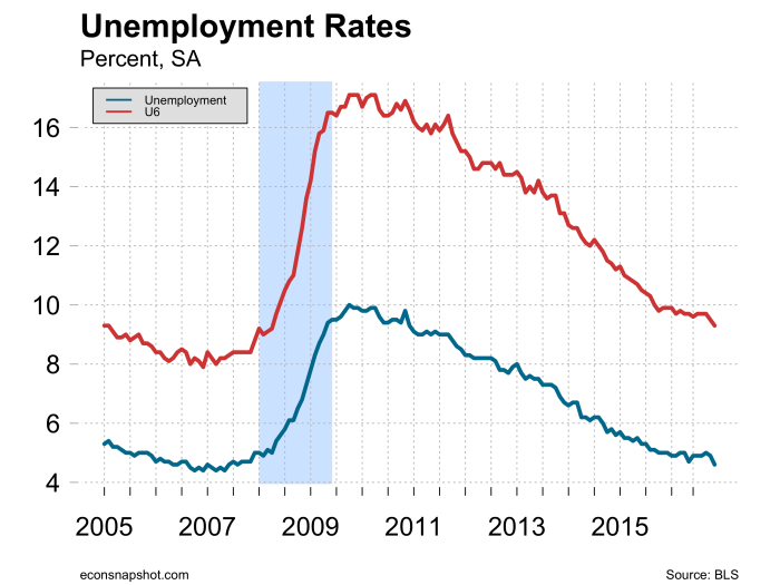
Data from the household survey showed a different picture, however. While the unemployment rate moved only slightly down, 4.96% to 4.87%, the number of those employed fell by 43,000 and the civilian labor force dropped by 195,000. The labor force participation rate dropped from 62.9% to 62.8% and the employment to population ratio fell from 59.8% to 59.7%.

epr-2016-11-04lfp-2016-11-04

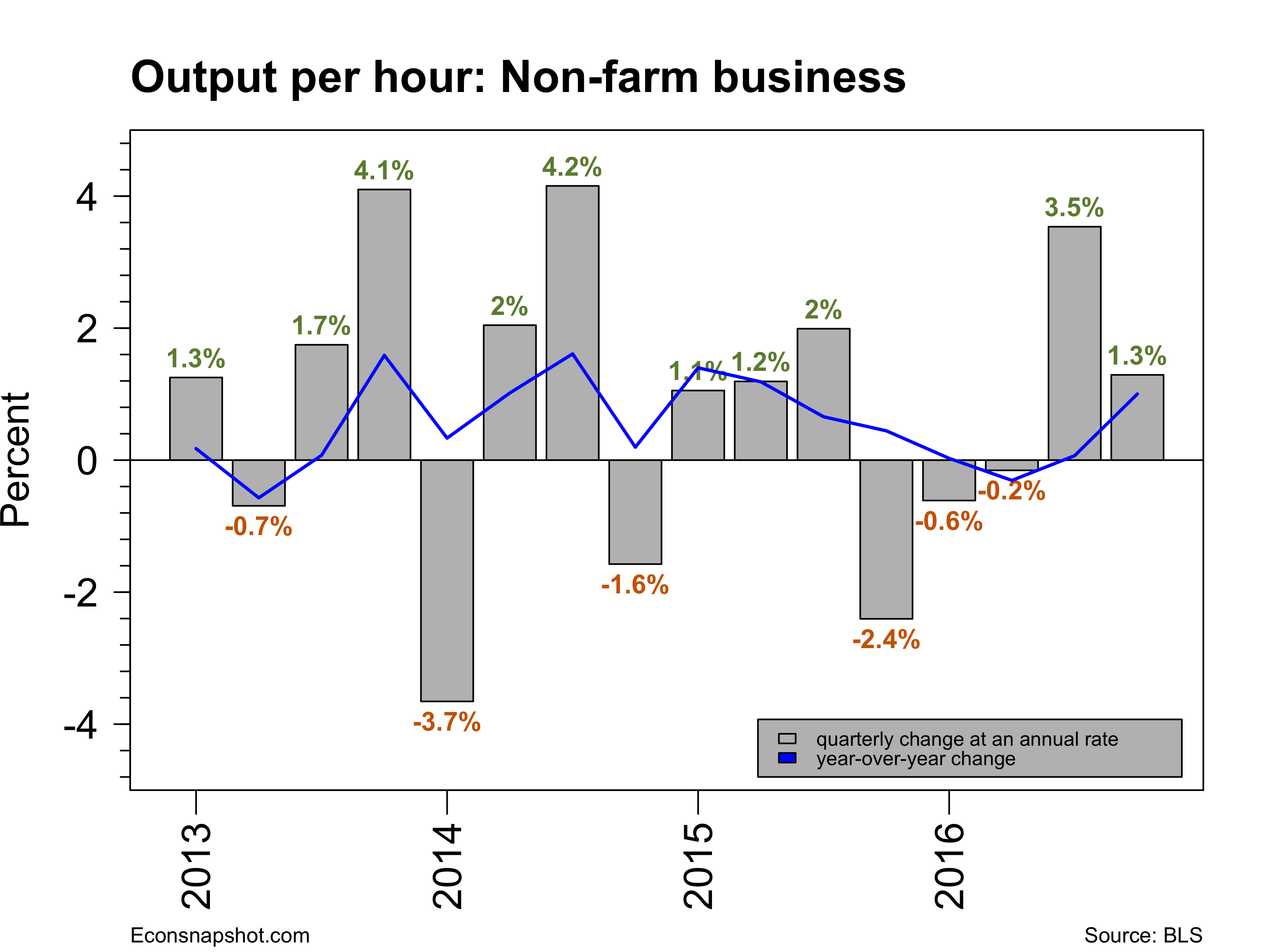
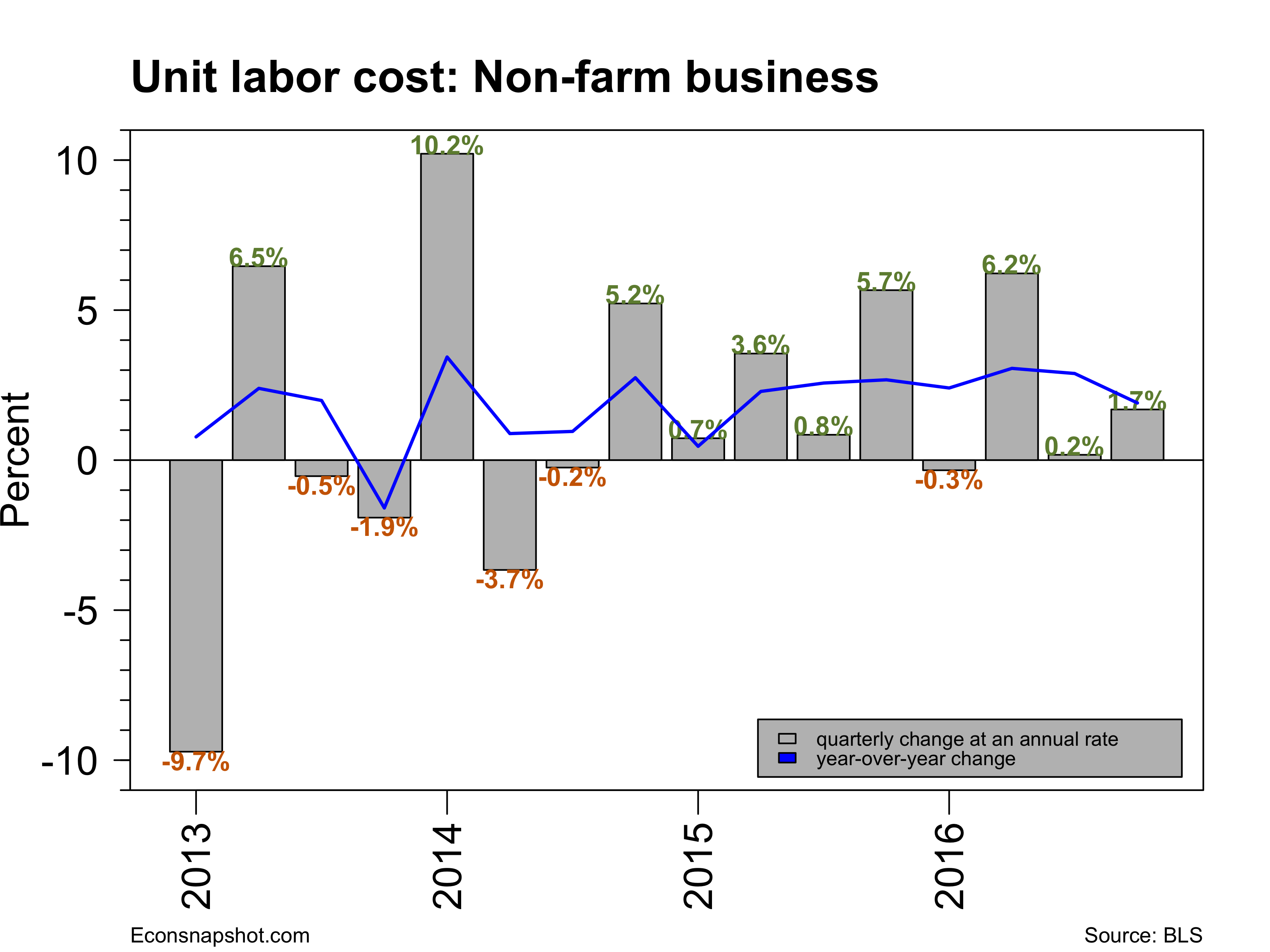
The productivity and costs report came out yesterday and revealed a 3.1% climb in productivity, with output increasing 3.4% and hours increasing 0.3%. In addition, second quarter productivity was revised up from -0.6% to -0.2%. Unit labor costs increased 0.3%, with a 3.4% rise in hourly compensation and a 3.1% rise in productivity.

prodbar-2016-11-04

While the labor market continues to expand it does seem that it has cooled off in some respects. Unemployment rates have stopped declining, labor force participation is down, hours of work are flat and productivity has only recently increased after three quarters of decline. Evidently the FOMC thought so as they announced at their latest meeting earlier this week that they were maintaining their current stance of policy, with two members dissenting…both wanted an increase in the target rate to 0.5-0.75%. With one more employment report before the next FOMC meeting it remains to be seen whether they feel there is enough strength in the underlying economy to present us with another December increase.

Q3 GDP Grows at an Improved Pace

By Thomas Cooley, Ben Griffy and Peter Rupert

The Bureau of Economic Analysis release of the first estimate of Q3 GDP showed the economy expanded at a 2.9% clip at an annualized rate, the largest growth rate in two years. The 2.9% rate was more than double the 2nd quarter rate of 1.4%.  The solid GDP report, combined with a labor market that continues to provide new jobs, will give the Fed all the leeway it needs to increase rates in December.

gdprealchgm-2016-10-28

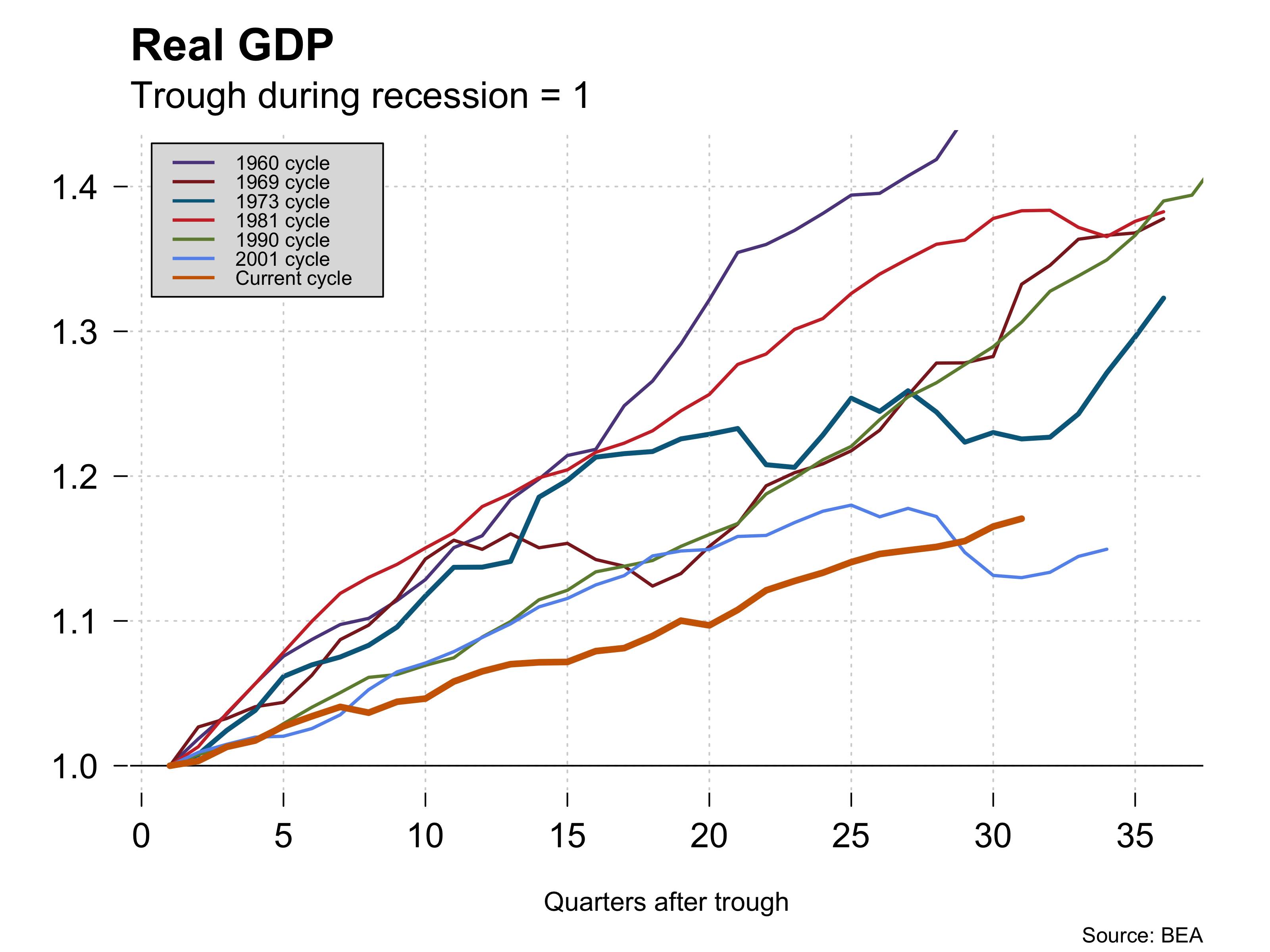
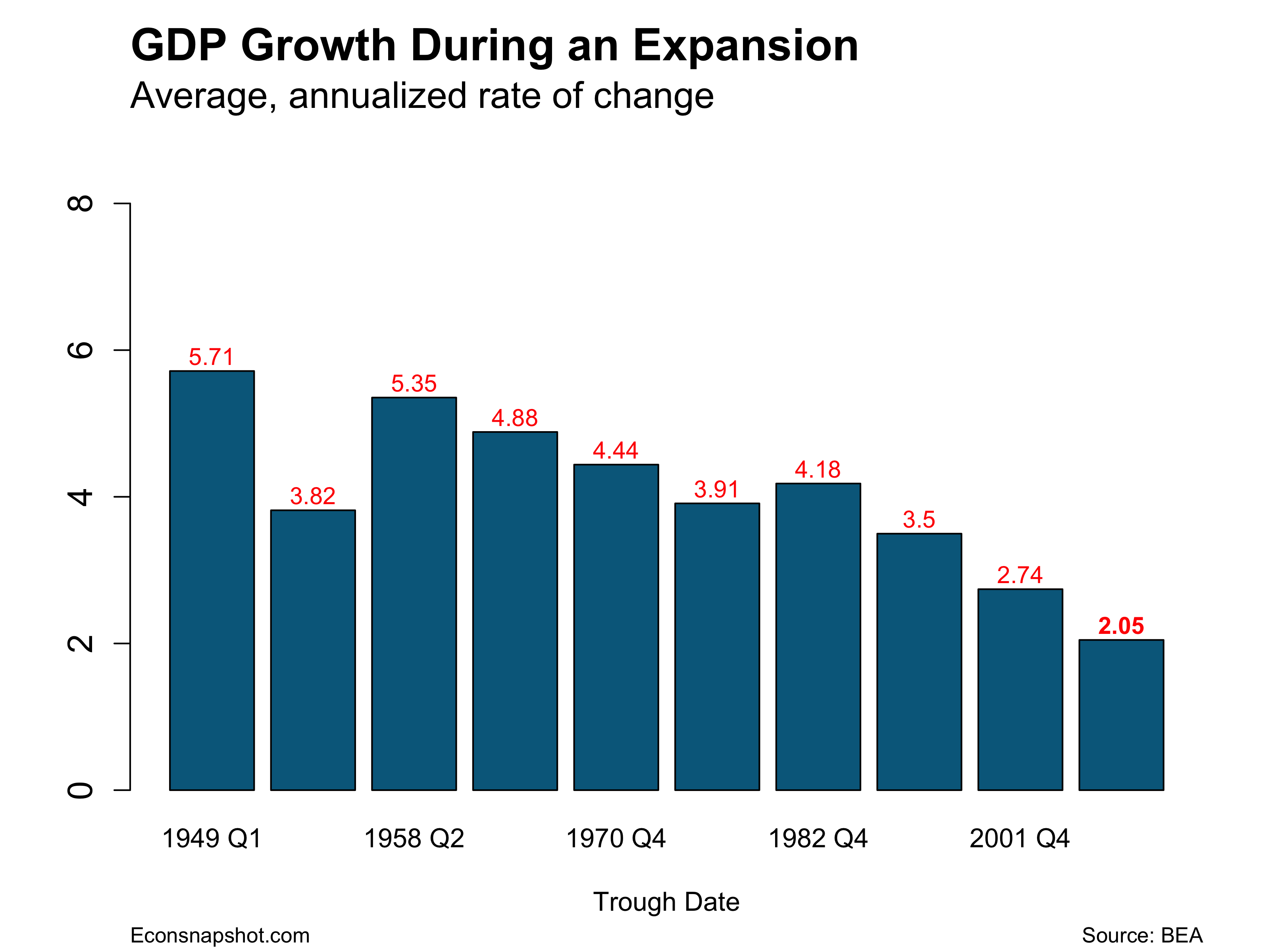
It seems important to point out that in spite of the good report, growth coming out of the recession still pales relative to growth coming out of previous recessions. That has been the story for seven years even though we have seen some robust quarters.

expansion-growth-2016-10-29

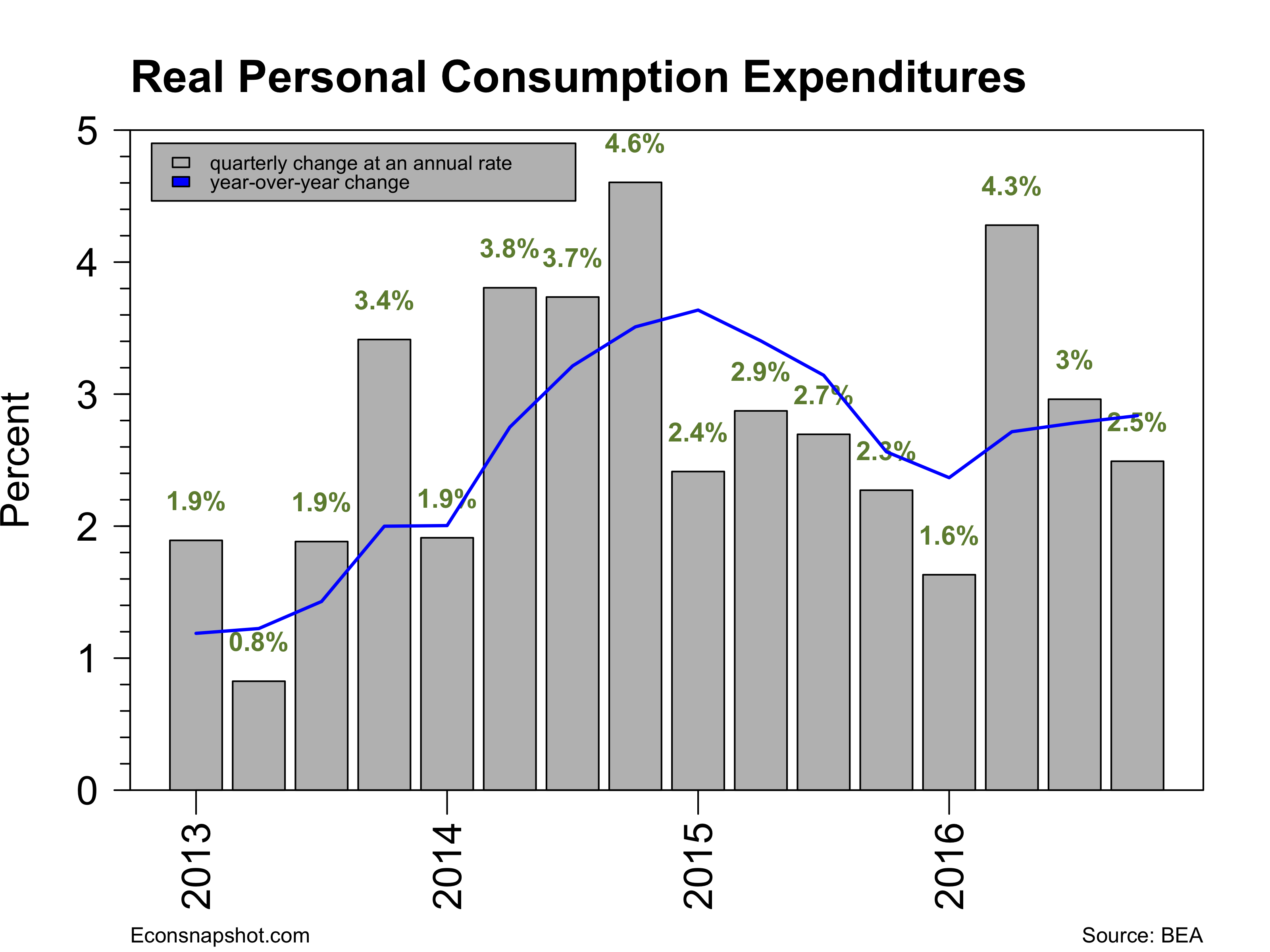
Personal consumption expenditures showed a somewhat muted 2.1% rise.

pcerealchgm-2016-10-28

Residential investment has shown weakness over the past two quarters, -7.7% in Q2 and -6.2% in Q3, after two years of positive growth. Non-residential fixed investment has also been quite weak over the past year or so. In general, investment continues to be a disappointing feature of the data.


residentialinv-2016-10-29

nrfireal-q-2016-10-29

inv-cyc-2016-10-29

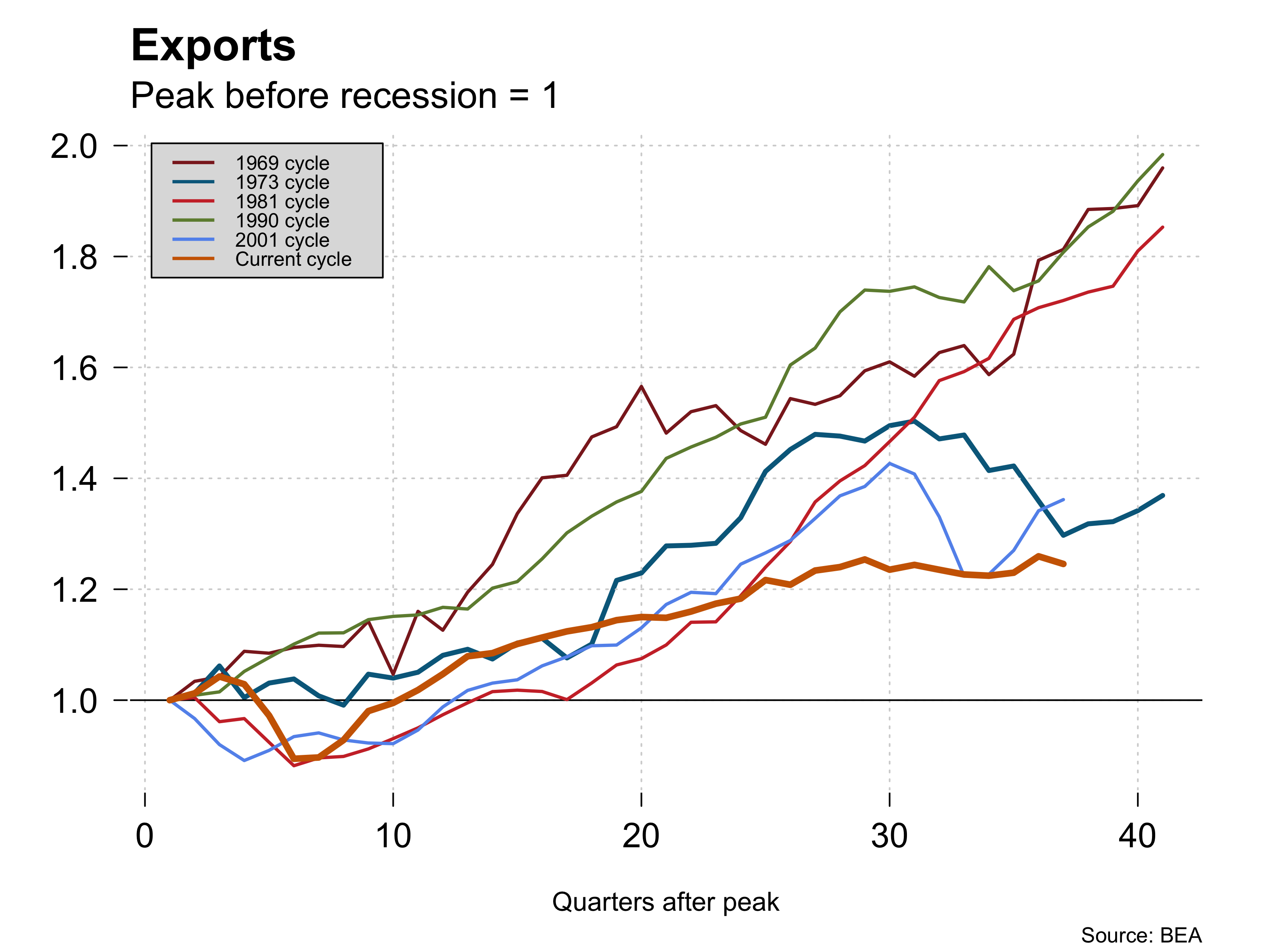
Some of the strength in GDP came from a rise in net exports.  Exports rose in spite of a stronger dollar and imports stayed flat.

trade-weighted-index-2016-10-29

exp-cyc-2016-10-29

imp-cyc-2016-10-29

It remains to be seen if the improved growth can be sustained.  There are many uncertainties – the election, the path of Brexit, the future of trade deals, and so on.  These are weighing on expectations and may be reflected in Q4 GDP growth.

September Employment Report Card: Modest

By Thomas Cooley, Ben Griffy and Peter Rupert

The BLS announced this morning that the establishment survey data revealed only a modest increase in employment of 156,000 for September. In addition, the July number was revised down from 275,000 to 252,000 but August was revised up from 151,000 to 167,000, so overall pretty much a wash as to the overall state of employment.

empchgm-2016-10-07

The labor market has averaged around 200,000 per month over the previous year. It appears clear from this report that it provides little help in assessing the next FOMC move.

Private sector employment was up 167,000 and government employment fell 11,000. This was consistent with the GDP report for Q2, which reported that state and local government spending had fallen. The mining and logging sector (oil sector is included) showed no decline in employment, the first non-negative number in two years.

emp-mining-logging-2016-10-07

Employment in the manufacturing sector shrank for the second consecutive month, down 16,000 in August and 13,000 this month. The services sector gained 157,000 jobs.

Average weekly hours rose slightly from 34.3 to 34.4.

The household survey showed a somewhat more robust looking labor market. The number of employed according that survey increased 354,000, with the labor force increasing 444,000. The overall impact drove the labor force participation rate up from 62.8 to 62.9.

lfp-2016-10-07

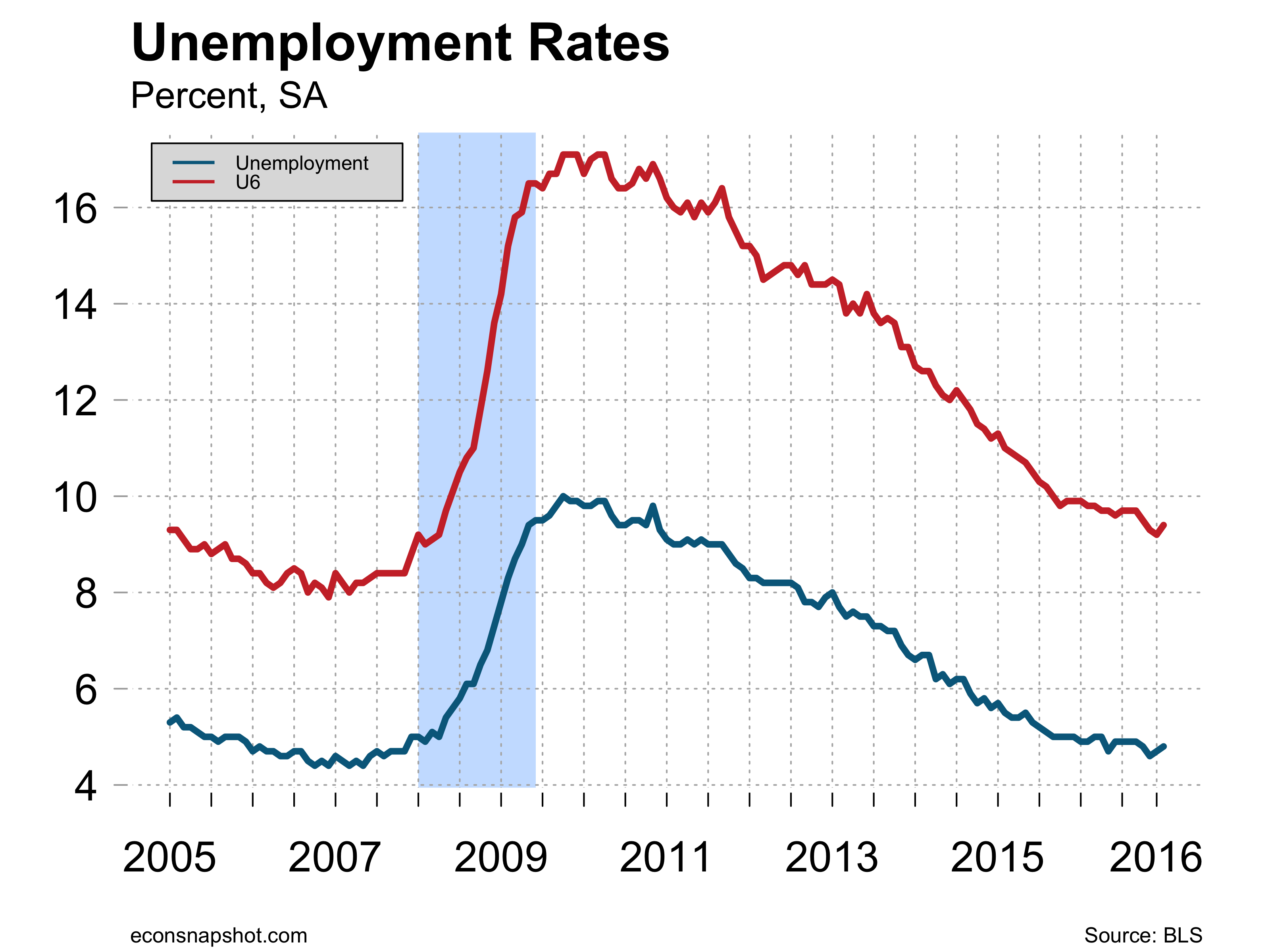
The increase in the labor force moved the unemployment rate up slightly from 4.92% to 4.96%, so does not look quite as drastic as going from 4.9% to 5.0% as reported.

uu6rate-2016-10-07

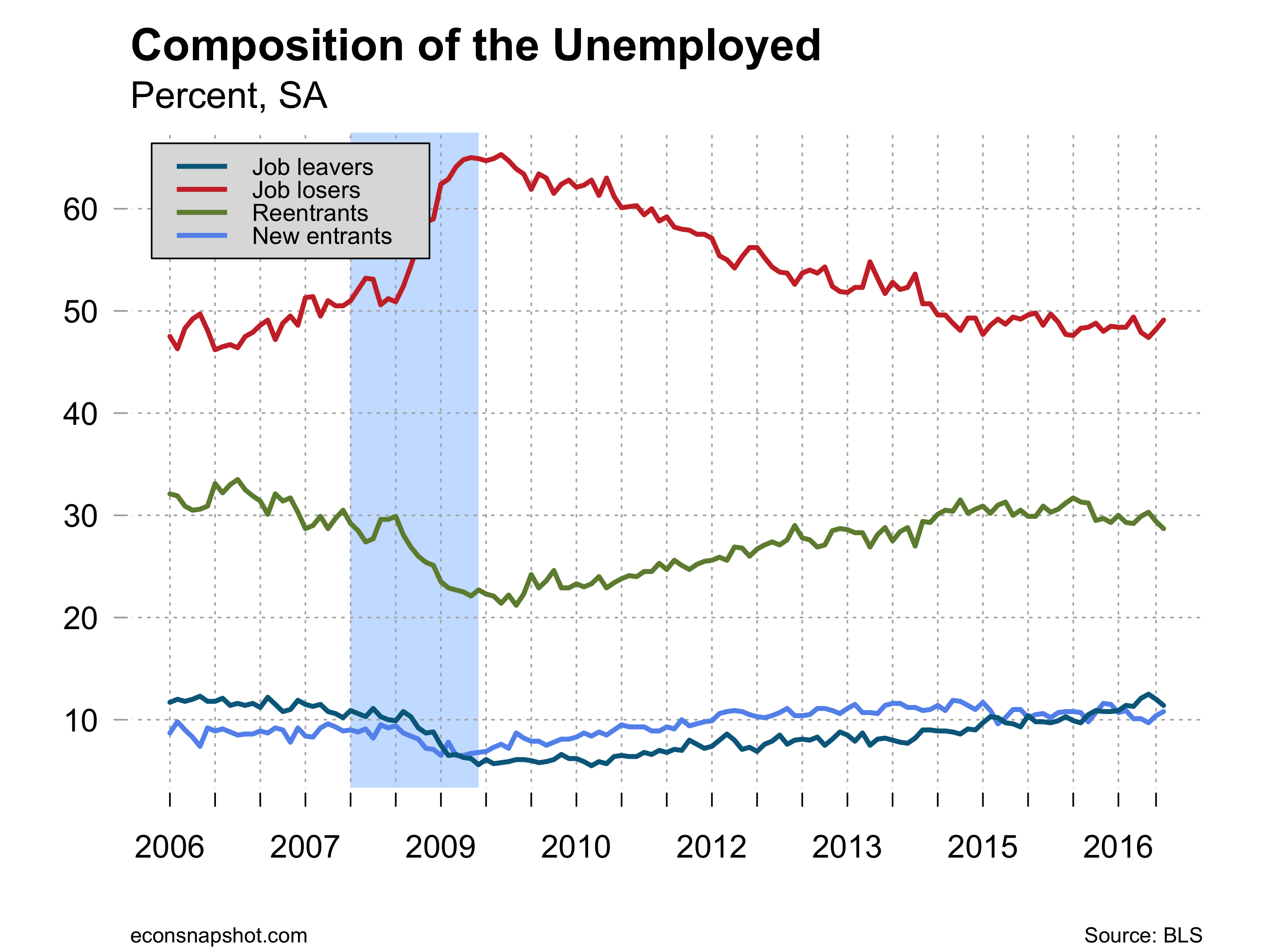
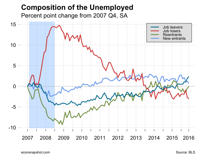
Looking at the composition of the unemployed since 2007 shows that job losers as a fraction of the unemployed are even lower than they were in 2007 and reentrants are a higher fraction of the unemployed.  Job losers at the nadir of the recession accounted for about 65% of the unemployed but only about 50% today. On the other hand new entrants accounted for about 6.5% of the unemployed at the nadir and now account for over 10%. The graph below shows how each of those changed since 2007.

unemp-composition-2016-10-07

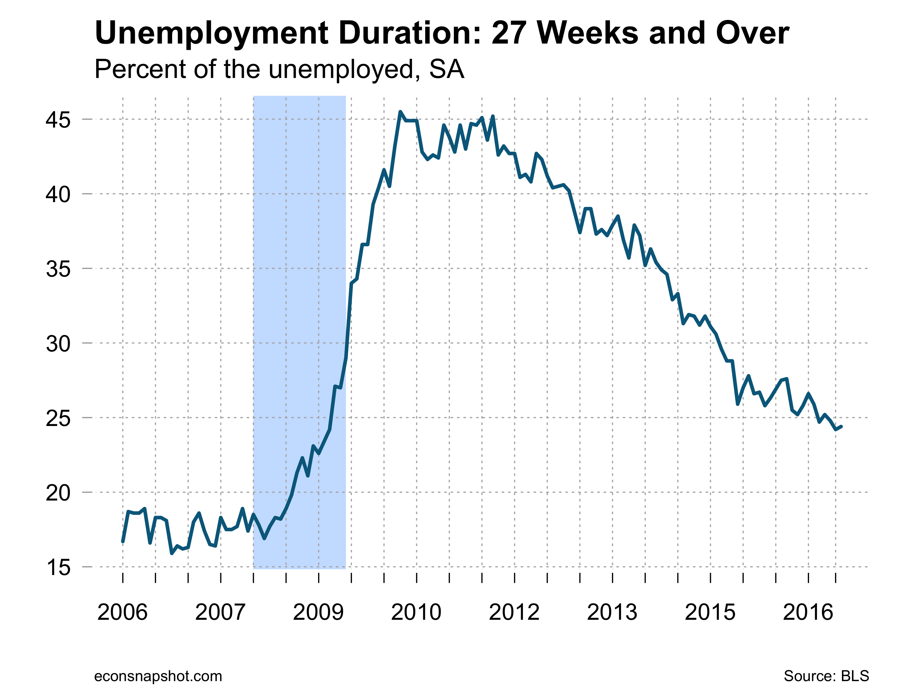
The number of persons unemployed 27 weeks and longer fell slightly but is moving quite sluggishly and as a fraction of the unemployed remains at about a quarter, still higher than any time since 1948.

udur27-2016-10-07

Once again the employment report does not help much in assessing what the FOMC will do at the next meeting. While the report showed continuing strength in the labor market and according to some beat expectations…still nothing to write home about.

GDP Report Shows Modest Gains

By Thomas Cooley, Ben Griffy, and Peter Rupert

There has been a rash of recent data showing the U.S. economy growing stronger. Rising incomes,  stronger domestic demand, and rising net exports are signaling a more robust economy. The upward revisions to second quarter GDP support that view and the hope and reasonable expectation is that the third quarter will be stronger still setting the table for a Fed rate hike later this year. The third estimate for second quarter GDP growth, released this morning by the BLS (link) estimates that the US economy grew at an annualized rate of 1.4% in the second quarter, up from a previous estimate of 1.1%, and up from the first quarter, in which the rate was 0.8%.

gdprealchgm-2016-09-29.png

These gains were largely accrued from increases in personal consumption expenditures, which increased at an annualized rate of 4.3%, exports, which grew at a rate of 1.8%, and fixed nonresidential investment, which grew at a rate of 1.0%. Offsetting these gains were declines in residential investment, of 7.7%, government spending (national fell 0.4%, while state and local fell 2.5%), and imports, which rose 0.2%. It should be noted that the levels of the categories that grew dwarf the levels of those that declined, leading to the overall increase in headline numbers.

gdp-cyc-trough2016-09-29

pcerealchgm-2016-09-29.png

As noted, personal consumption expenditures (PCE) played the largest role in GDP growth last quarter. This bucked a trend over the previous four quarters in which percent growth in the component had fallen, while still remaining positive. Growth in the component more than doubled over the Q1 figure, and was nearly at its highest rate of growth since the Great Recession. This is a strong indication that US consumers are confident in the direction of the US economy. For comparison, many European economies have not seen consumption growth of 4.3% in total since the beginning of the Great Recession:Real Consumption-13.png

Which shows the importance that the US economy has as a global driver of growth. In total, changes in PCE would have caused a 2.88% increase in GDP, all else equal.

resnonres-2016-09-29.png

inv-cyc-2016-09-29

Residential and non-residential investment swapped growth trends, with non-residential investment ticking positive for the first time in three quarters, and residential investment turning negative for the first time since 2013Q4. Nonresidential investment was driven up by increases in expenditures on industrial equipment, and intellectual property products, with the latter increasing by 9.0% at an annualized rate. Overall, Gross Private Domestic Investment caused a decline in GDP of 1.34%, if all other components were held constant.

The report should be taken with cautious optimism that the US has absorbed some of the global economic uncertainty in stride. Even more cause for optimism is that GDP growth would have been 1.7% annualized if the contribution of government spending had been removed, a highly variable series that has limited forecasting ability on the health of the economy, particularly in an election year. These figures are perhaps inauspicious in comparison to the halcyon heights of US economic history, but in the context of our times, they continue to reflect the strength of the US economy in period of great uncertainty.

August Employment not august

By Thomas Cooley, Ben Griffy and Peter Rupert

Employment from the establishment survey reported by the BLS increased 151,000, nearly all of which was in the private service sectors, increasing 150,000. The goods producing sector decreased 24,000, roughly offset by government employment, up 25,000.
Manufacturing employment has shown considerable weakness since 2015, while the service sector has continued to show strength. Education and health services along with leisure and hospitality posted the largest gains of the subsectors. Revisions were pretty much a wash: down 21,000 for June and up 20,000 for July.

empchgm-2016-09-02

emp-manuf-change-2016-09-02

emp-service-change-2016-09-02

Average weekly hours fell to 34.3 after six straight months at 34.4. Labor force participation and the employment population ration were essentially unchanged.

avghours-2016-09-02

The household survey wasn’t encouraging either. Employment, according to the household survey, increased only 97,000 and the unemployment rate ticked up slightly from 4.88% to 4.92%. The number of unemployed persons increased as did those not in the labor force. The number of people working part-time for economic reasons increased for the second straight month, but the number of people marginally attached to the labor force trickled down.

The problem the markets now face is that this report only increases uncertainty. The FOMC has been suggesting of late they seem to be favoring a rate increase sooner rather than later. Over the past three months employment increases have average 232,000 jobs a month but the most recent numbers are softer. If this had been a stronger report a rate increase would have certainly been likely this year. It may still be but it is likely that the Fed will wait for more indications. The CPI for July was unchanged and for the previous year up only 0.8.  If the economy keeps going sideways the Fed has a quandary: clearly they would like to get on more normal path, but the sluggish economy and global uncertainty have forced tepid policy responses until the storm quiets.

Q2 GDP Revised Down…Just a Bit

By Thomas Cooley, Ben Griffy and Peter Rupert

Today’s revised estimate of Q2 GDP from the BEA saw only a small downward revision that did little to change the economic outlook. The advance estimated growth of 1.2% was revised down to 1.1%. Personal consumption expenditures continues to be the main driver it appears, contributing 2.94%, while there was also a smaller decrease in private fixed investment. Although, investment overall has continued to look weak.

gdprealchgm-2016-08-26

nrfireal-q-2016-08-26

inv-cyc-2016-08-26

The general weakness, PCE aside, will almost certainly keep the Fed sitting on their hand this September.

Yellen’s Jackson Hole Remarks:

Federal Reserve Chairwoman Janet Yellen spoke at the annual meeting in Jackson Hole this morning (link to transcript). Entitled “The Federal Reserve’s Monetary Policy Toolkit: Past, Present, and Future,” she focused on whether the current monetary tools are adequate for future downturns. Most specifically, she points to the ability of the Federal Reserve to affect the quantity of reserves held by banks. After the government pumped extra liquidity into the market following the Great Recession, the previous policy tool (changing the volume of reserves offered by the Fed in the overnight market) would have been dwarfed by the reserves available from banks. To prevent this from happening, the Congress implemented a policy in October 2008 to allow interest to be paid on reserved held by banks. The results have been nothing short of astonishing:reserves-2016-08-27.png

Yellen made the case for a gradually rising Federal Funds rate conditional on economic conditions continuing to strengthen.  This strengthened the prospect that we will see further rises this calendar year.  All told, the prospect seems to be for gradual improvement of the economy as reflected in the steady improvement in employment and wages, but no major moves in the Fed’s policy stance or targets.

July Employment: Strength in Numbers

By Thomas Cooley, Ben Griffy and Peter Rupert

The Bureau of Labor Statistics announced that non-farm payroll employment for July increased 255,000, beating the “expected” job gains of 180,000. In addition, both May and June were revised up, 13,000 and 5,000, respectively. The bulk of the gains came from service sector jobs, up 201,000 with the majority of those in business and professional services.Employment in manufacturing (+9,000) and construction (+14,000) rose while  mining continued its decline (-7,000), consistent with continued weakness in the energy sector and oil prices.

empchgm-2016-08-05


emp-mining-logging-2016-08-05

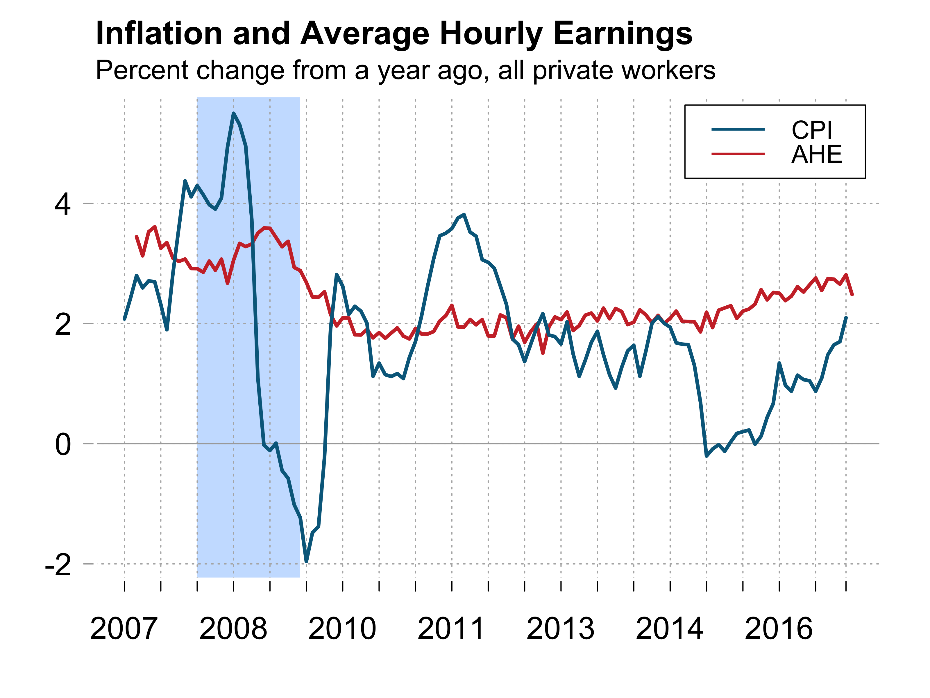
The continued strength in the labor market also showed up in an increase in average weekly hours and average hourly earnings.  Earnings are now increasing at a rate of over 2.5% year over year.

avghours-2016-08-05ahe-2016-08-05

Labor market dynamics from the household survey revealed an encouraging increase in labor force participation and employment and a decline in the number of persons unemployed, resulting in essentially no change in the unemployment rate at 4.89%. This means that fewer people are sitting on the sidelines. While the news is, on the whole, positive, the number of persons unemployed more than 27 weeks increased for the third straight month.

lfp-2016-08-05estabhouse-2016-08-05unemploy-2016-08-05uu6rate-2016-08-05

udur27-2016-08-05

The big puzzle is how to reconcile the continued strength in the labor market  with the very weak GDP growth reported last week and how the parse the impact of this on the decision making of the Fed.  Most likely the reason for these diverging signals will be become clearer over the next few months. The widespread view is that the continued strength of the labor market makes it likely that there will be a rate increase in 2016, although the weak GDP numbers will keep the market guessing.


Stagnant Growth Continues

By Thomas Cooley, Ben Griffy and Peter Rupert

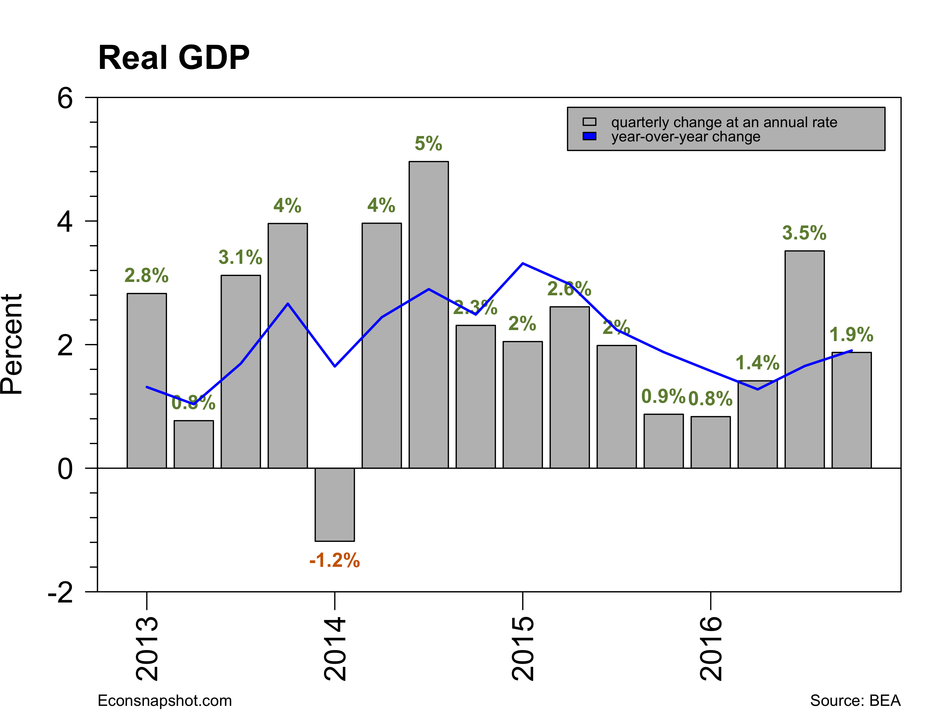
The U.S. economy grew at a paltry 1.2% rate in the second quarter continuing a pattern of anemic growth for the past three quarters. The expectations had been fairly high, somewhere around 2.6% growth. The Fed had “left the door open” for a September rate hike. The FOMC announcement on Wednesday suggested a brighter picture than the June announcement. Here the WSJ compares the two statements. Unfortunately the economy didn’t listen! Not only did the  Q2 GDP report  show a 1.2% growth rate for real GDP, the revision for Q1 was revised down from 1.1% to 0.8%. The annual revision to the National Income and Product Accounts (NIPA) was also announced with this release. While there were some upward and downward revisions over the last few years, the upshot was the average annual growth from 2012 through 2015 was 2.2% compared to the previous estimate of 2.1%. The past three quarters have been quite weak, 0.9%, 0.8%, and 1.2% making a September rate hike unlikely.

gdprealchgm-2016-07-29

gdp-cyc-trough2016-07-29

Today’s report also showed continued strength in consumer spending (PCE 4.2%),
and an increase in exports (1.4%) but weakness in private inventory investment, nonresidential fixed investment (-2.2%), residential fixed investment (-6.1%), and state and local government spending (-1.3%). Imports also decreased (-0.4%).

pcerealchgm-2016-07-29

nrfireal-q-2016-07-29residentialinv-2016-07-29

Also this morning the Bureau of Labor Statistics reported the latest Employment Cost Index. Overall, the 3-month seasonally adjusted index for total compensation for all cilvilian workers climbed 0.6% (2.3% yoy) following a 0.6% climb for the three months ending in March. The wage and salary component was up 0.6% (2.5% yoy) for the three months and the benefits component up 0.4% (2.0% yoy). Compared to the last couple of years the ECI has shown a bit of a hike, again pointing to the strengthening of the labor market.

eci-2016-07-29

eciwag-2016-07-29eciben-2016-07-29

The dismal performance of GDP combined with a strongish labor market keeps one guessing as to the next move by the Fed. The most-watched signals (GDP, employment, unemployment and  wages) seem not to be in sync, keeping the Fed at bay.  But weakness in both Europe and Asia combined with stagnant U.S. GDP growth may be the dominant factors urging caution. Nevertheless the Taylor rule continues to call for a significant rise.

taylor-rule-2016-07-29

June Employment Surge

By Thomas Cooley, Ben Griffy and Peter Rupert

After several months of weakening employment growth the establishment survey from the BLS showed that June payroll employment increased 287,000. The employment number for April was revised up 21,000 for a final reading of 144,000. The weak May employment number was revised down 27,000, however, to a mere 11,000.

empchgm-2016-07-09

Private sector employment was up 265,000 and government up 22,ooo. Almost all of the increase was in private service producing, however, up 256,000. Manufactuing employment rose only slightly, up 14,000 and construction employment was unchanged. Mining and logging employment continued to contract, losing another 5,000.

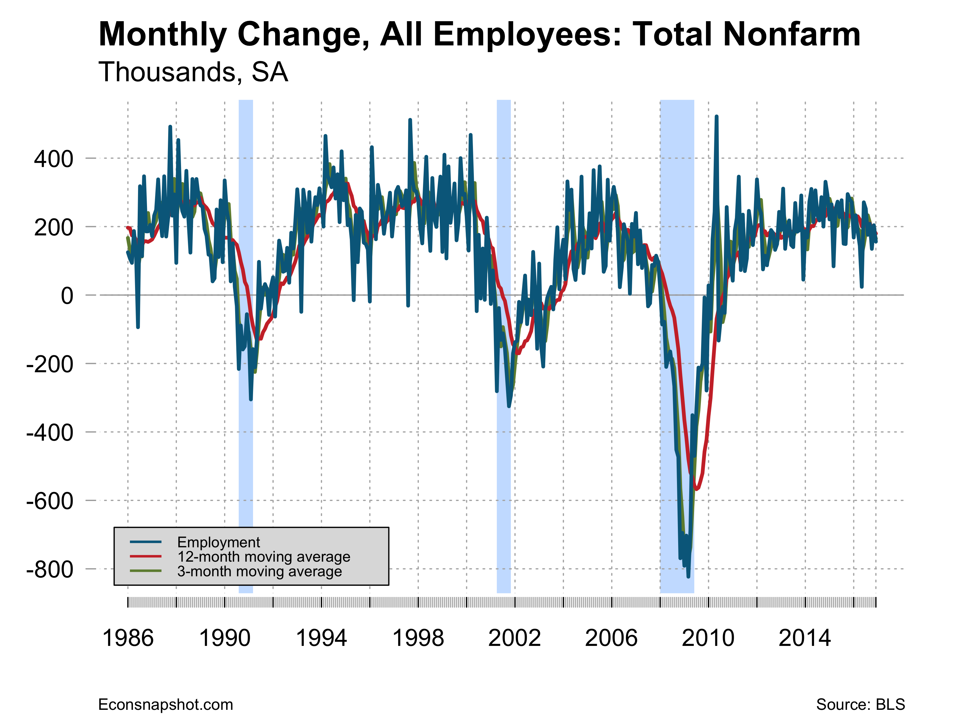
Mike Feroli observes that, “The swing between the May and June headline payroll numbers only looks extreme by modern standards. Over the past five years the standard deviation of monthly jobs adds was the lowest in the history of a series going back to the 1930s.” Here is a picture of the monthly changes going back as far as the data permit:

payems_monthly_change-2016-07-09

Of course that is a lot of data to see, here it goes back to only 1986:

payems_monthly_change-2016-07-09

And one more from 2010 on:

payems_monthly_change-2016-07-09

The data do show there appears to be decline in volatility and somewhat of a slowing down in employment growth over the past year and half or so and has likely given the FOMC reasons to not act.

The workweek held steady at 34.4 for the fifth straight month and average hourly earnings showed only a slight increase, from $25.59 to $25.61.

avghours-2016-07-09

The household survey saw an increase in employment of only 67,000 however. With an increase in the civilian labor force of 414,000, the participation rate climbed 0.1 to 62.7 , the employment to population ratio fell from 59.7 to 59.6 and the unemployment rate moved up from 4.692% to 4.899%.

lfp-2016-07-09

epr-2016-07-09

uu6rate-2016-07-09

Productivity for the first quarter fell 0.6% at an annual rate, with output increasing 0.9% and hours up 1.5%. This is the second consecutive quarter of a productivity decline, with 2015 QIV falling 1.7%. Compared to other cycles, while productivity has appeared fairly weak, it had been growing at a pace similar to other cycles for the first several years coming out of the recession but then tapered off to a much more moderate growth rate.

prodbar-2016-07-09

prod-cyc-2016-07-09

The strength of this employment report keeps hopes alive for a rate increase by the FOMC before year end, although later rather than sooner.