Q3 GDP Revised Up and Employment Strong

The last several days have given us a  a second estimate of GDP for Q3, new data on personal income, the employment report for November, and new unemployment claims. The overall picture from them is one of a steadily improving economy, although personal income fell slightly, down 0.1%.

GDP Report

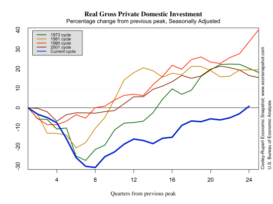
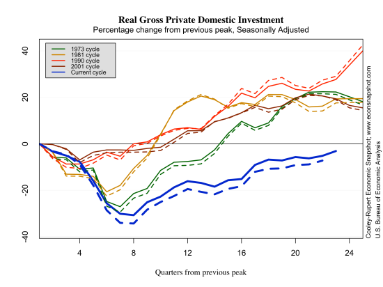
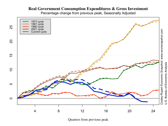
The big news with the release of the second estimate of real GDP for the third quarter from the BEA was the large increase, from 2.8% to 3.6% annualized growth. However, much (most) of this increase came from the big pop in inventory investment–likely meaning it will be unwound over the coming quarters. The implication being that this alone should have little effect on forecasts of real GDP although there is an upside–inventory growth may also reflect positive expectations about future demand. Last year in Q3 inventory investment was also a large contributor (0.6 percentage points) to the overall 2.8% GDP growth. Following that, GDP growth in Q4 of 2012 was only 0.1; moreover there was a very large decline in inventories in Q4 of 2012. Still, even without the current inventory contribution to GDP growth (1.68 p.p.), GDP grew about 1.9%; perhaps not something to write home about, but certainly showing continued solid growth. Real personal consumption expenditures continue to climb steadily and investment has finally reached its level of Q4 2007. Government consumption and gross investment appears to have broken from a three year decline and has held steady for the last couple of quarters, although below the level at the beginning of the recession.

rgdp-2013-12-06

cons-2013-12-06

inv-2013-12-06

gov-2013-12-06

Employment Report

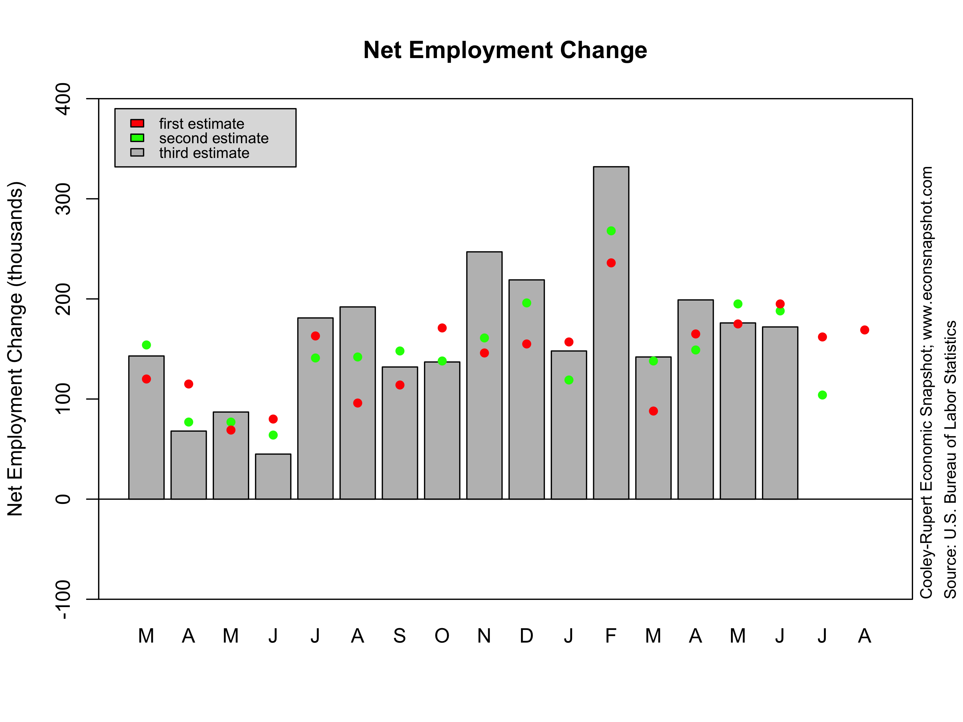
The Employment Situation report from the BLS added more support to the overall picture, that is, one of solid growth. There have been four fairly strong months of employment growth, with nonfarm payroll employment increasing 203,000 for November, 200,000 for October, 175,000 for September, and 238,000 for August. Moreover there are positive signs in the goods sector, with goods employment up 44,000, and over half of that in the manufacturing sector. Unemployment initial claims continue to decline–noting of course the recent effects of the government shutdown. The employment rate declined to 7% putting it in the range that Fed Chairman Bernanke cited earlier in the year as a sign that the labor market was recovering. The positive angle on this estimate is that labor force participation increased as did the employment/population ratio.  The increase was not enough to overcome the sharp drop in October.

claims-2013-12-06

lfp-level-2013-12-06

lfp-men-2013-11-08

lfp-women-2013-11-08

lfp-sex-level-2013-11-08

What next for the Fed?

The recent performance of several sectors in the US leaves a big question mark for the upcoming December meeting of the FOMC. Are these recent positive signs enough to begin to taper? Has forward guidance given us enough guidance to determine the timing? Magnitude? The problem is that there are always some confounding events…Christmas is just around the corner and the Chairman is on his way out. The graceful exit strategy would be to end QE and leave Chairman Yellen with a clean slate of expectations.

Q3 GDP and October Employment: A Continuing Recovery From a Hugely Costly Recession

This week brought a wealth of new readings on the economy with the nearly simultaneous release of the first estimates of GDP for the third quarter from the BEA and the October Employment Situation report from the BLS.  Both showed an economy that is steadily improving in spite of significant obstacles created by the global economic environment and by the political environment in Washington.  We begin this post with a summary of the the labor market data, followed by the estimates of third quarter GDP.  We finish with an updated estimate of the costs of this recession to date. The size of the loss is the most sobering information in this post.

The Labor Market

As we reported last month, the Great Recession continues to cast a long shadow over the U.S. labor market. Moreover, the government shutdown has made it difficult to interpret some of the numbers. Employment increased 204,000 (evidently much higher than expected) and private sector employment was up 212,000. While employment provided an upward surprise, both the employment/population ratio and labor force participation rate fell. As we noted in an earlier blog, the weakness in the labor market continues to play against the Federal Reserve’s earlier attempts to provide forward guidance about asset purchases and interest rates based on thresholds for the unemployment rate. As the figure below shows there were upward revisions to the two prior employment reports. Two hundred and thirty eight thousand jobs were added in August and one hundred and sixty three thousand in September.

empchgm-2013-11-08

Employment continues to crawl slowly toward the level it attained in December of 2007.

emp-2013-11-08

The unemployment rate in October ticked up slightly from 7.2% to 7.3%. Initial claims, obviously affected by the recent shutdown spiked up, but the trend down is also indicative of an consistently improving labor market.

urate-2013-11-08

claims-2013-11-08

Interestingly, labor productivity measured by total output divided by the total number of labor hours looks very similar to all previous recoveries except for the 2001 cycle. Even as employment fell 5% below its peak level, productivity continued to rise.

prod-2013-11-08

At some point in the past year the Fed indicated a threshold target for the unemployment rate of 6.5%. They had previously specified a target of 2% for inflation. If these targets were hit exactly, the Taylor Rule would imply a Federal Funds Rate of 4%. Currently, the Taylor Rule with these thresholds indicates that the federal funds rate should be significantly higher than its current level. The rule prescribes an interest rate policy of around 2%, well above the zero bound where the fed funds rate has been since 2010.

Because these implications have made bond markets jumpy – they view interest rate increases as imminent – the Fed has begun to try to walk this back a bit. A research paper released this week suggests that a thresholds should be set so that Rules don’t imply an early departure from the fully accommodating levels of the funds rate.


taylor-rule-2013-11-08

The employment/population ratio continues to be historically low compared to all other recoveries. It fell nearly twice as much and has shown very little recovery, as mentioned above, it fell again in October to 58.3%.

epr-2013-11-08

Indeed, the ratio is now about what is was back in the early 1980’s. Some of this has to do with demographics, to be sure.

eprlevel-2013-11-08

Below we plot the vacancy-unemployment relationship, the Beveridge Curve, since 2000. The variables moved down and to the right during the previous recession as job vacancies fell and unemployment rose. During the recovery it has shown a counter-clockwise loop as it moves back up to the left. This movement is not unexpected as noted by the Diamond-Mortensen-Pissarides workhorse model of search unemployment. The vacancy data in this graph come from JOLTS, however, these data only started in December of 2000.


beveridge-2013-11-08

Third Quarter GDP Growth

The first estimate of GDP for the third quarter was reported on Thursday. At first glance it looks like excellent news because Q3 GDP increased at a 2.8% annualized rate in spite of the ongoing effects of the government sequester.  Personal consumption and investment both increased as well.  But, the 2.8% increase may not be cause for rejoicing.  A big part of this was a change in business inventories which increased $86 billion in Q3 and added nearly .8% to the Real GDP growth rate in Q3. Typically growth driven by a spike in inventories creates some backdraft for future growth as businesses work them off. It is also especially worth noting that these estimates are based on partial data, likely rendered less reliable than usual because of the government shutdown.


rgdp-2013-11-08


cons-2013-11-08


inv-2013-11-08

The Costs So Far

This has been most protracted economic downturn since the Great Depression of the 1930’s.  There are costs associated with this downturn that won’t be realized for years – the costs of disruption to the financial system, long duration unemployment, bankruptcies, collapsed household finances.  We can, however, take a crack at estimating the aggregate loss in Real GDP as we did in an earlier post.  To do this one has to take a stand on what the growth trend would have been had we continued on from the previous peak of the business cycle. Since this is unknowable we consider a couple of possibilities. This past quarter the GDP growth rate was 2.8% and this was the average rate from 1984 to 2013. Using that as a benchmark the cumulative output loss of the recession so far is 4,126.37 Billion 2009 $ or 26% of current GDP.

gdp-loss-2-8

If we assume a larger long term growth trend – the average growth rate of 3.2% that prevailed from 1947-2013 – the cumulative output loss is even higher, at 9,345 billion of 2009 $ or roughly 60% of current GDP.  This is a loss of more than 10% of GDP or roughly $14,000 for each US household per year of the recession.

gdp-loss-3-2

Other conservative estimates of the cost of the recent recession are similar (see here for instance). While we can debate about the future long term growth potential of the US economy, the loss in output alone stemming from the financial crises 6 years ago is staggering. Even if the growth rate in the 3rd quarter of 2.8% is sustained, the economy will never reach its previous growth trend, a fact that has yet to occur in post-war business cycles.
gdp-loss-all

The September Jobs Report

The BLS (after reopening from the government shutdown) released the Employment Situation report for September, leaving the broad landscape of the economic recovery pretty much unchanged. The Great Recession is still casting a long shadow over the labor market as employment growth continues to be anemic and the employment/population and labor force participation remain at the lowest levels in more than thirty years. As we noted in an earlier blog, the weakness in the labor market continues to play against the Federal Reserve’s earlier attempts to provide forward guidance about asset purchases and interest rates based on thresholds for the unemployment rate.

Non-farm employment increased by 142,000, below most economist’s expectations. The private sector added only 126,000 jobs, of which 100,000 came from the service sector: the largest gains in Transportation and Warehousing (23.4k), Retail Trade (20.8K) and Temporary Help Services (20.2K). Given that the next report will come out on Friday November 8  (less than a month from this report) and that it will be influenced by the shutdown, it is unlikely to be very informative.

empchgm-2013-10-22

industry-empchg-2013-10-22

While a 142,o00 monthly employment gain is well below ‘normal recovery’ standards, the pace of improvement in the labor market has been consistent now for several years. Most labor market indicators have either returned to their pre-recession levels or are slowly nearing them. Consider the growth in non-farm employment:

emp-2013-10-22

While the level of employment has not yet reached its pre-Great-Recession peak in nearly six years, it has been climbing steadily. The monthly net employment gain has averaged 179,000 since January 2011.

The unemployment rate in September ticked down slightly from 7.3% to 7.2%. Initial claims, obviously affected by the recent shutdown spiked up, but the trend down is also indicative of an consistently improving labor market.

urate-2013-10-22

claims-2013-10-22

Interestingly, labor productivity measured by total output divided by the total number of labor hours looks very similar to all previous recoveries except for the 2001 cycle. Even as employment fell 5% below its peak level, productivity continued to rise.

prod-2013-10-22

As has been the case for some time now, the Taylor Rule indicates that the federal funds rate should be significantly higher than its current level. The rule prescribes an interest rate policy given the how far unemployment and inflation are from their long run stated targets of 6.5 and 2 percent, respectively. If the targets are hit exactly, the Taylor Rule gives a 4% fed funds rate. Currently, the rule suggests a rate of around 2%, well above the zero bound where the fed funds rate has been since 2010.


taylor-rule-2013-10-22

The question is what exactly the Fed is looking at that suggests that there continues to be a sufficient need to keep interest rates near zero and the rate of asset purchases high. One labor market indicator that might be particularly worrisome is the employment to population ratio. The employment to population ratio compared to all other recoveries looks much different, it fell nearly twice as much and has shown very little recovery.

epr-2013-10-22

Indeed, the ratio is now about what is was back in the early 1980’s. Unfortunately, we do not have any way of really knowing what this ratio “should” be! The reason is that female labor force participation, baby-boom retirees, schooling decisions and a host of other things determine the numerator, not just how many get employed given they choose to work. In other words, it is by no means clear that it is expected to rise back to its level in the year 2000 or even 2007. Note, though, it appears to have stabilized over the past few months.

eprlevel-2013-10-22

Another possible troubling trend is the relationship between unemployment and job vacancies, referred to as the Beveridge Curve.  Below we plot the vacancy-unemployment relationship since 2000. The variables moved down and to the right during the previous recession as job vacancies fell and unemployment rose. During the recovery it has shown a counter-clockwise loop as it moves back up to the left. This movement is not unexpected as noted by the Diamond-Mortensen-Pissarides workhorse model of search unemployment. The vacancy data in this graph come from JOLTS, however, these data only started in December of 2000.


beveridge-2013-10-22

The graph below uses a different data set (now defunct), the help wanted advertising index from the Conference Board, but we have only used the data from 1951-1998. This is the series that was formerly used by those looking at job vacancies before the advent of JOLTS. The colors indicate different decades. Ok, just as a quick quiz: Where are the 1950s on the graph and where are the 1990s?

bev-curve-1951-1998

The answer to the quiz can be found here. The point is that the outward shift in the  Beveridge Curve might come about for different reasons. First, as noted in the standard labor search framework, the counterclockwise movement comes about since firms can quickly post vacancies, yet matching firms to workers takes time. However, outward shifts can occur due to skill mismatch, here is an example, or changing demographics. It’s not clear which factor is causing the trend in the Beveridge curve since 2010, as it is also not clear what the role of monetary policy is in correcting the outward movement.

Final Estimate of Q2 GDP and the September FOMC

The Bureau of Economic Analysis announced here that Q2 real GDP increased at a seasonally adjusted annual rate of 2.5%, according to the final estimate. Growth in private domestic investment was revised down from 9.9% to 9.2% and government consumption and investment expenditures were revised up from -0.9%to -0.4%. Growth in private consumption was unrevised at 1.8%, but slowed compared to last quarter’s 2.3% pace.

gdprealchgm-2013-09-26

The revised data leaves the broad picture of the economy unchanged. Output, consumption, and income continue to grow at a modest pace. Employment and total hours are steadily growing, albeit slowly. Unemployment is creeping toward 6.5% (the Fed’s stated threshold to possibly, maybe, some chance of, increasing the funds rate) and initial claims dropped 5k, staying near the cycle low.

Not much is new. In fact, not much has really changed in the behavior of the economy since the start of the recovery in June 2009 (NBER’s official date). The graph below shows the series mentioned above, plotted as a percentage of their level in June 2009. From about 2011 onward, the growth rate of these macro ‘fundamentals’ has been pretty stable. GDP has averaged slightly above 2 percent growth (relatively slow compared to past recoveries); consumption has growth been slightly higher at 2.8%. In terms of household income, with the exception of the blip up in late 2012 as a result of the ending of the payroll tax holiday, growth has been steady also.

growth-trough-2013-09-26

claims-2013-09-26urate-2013-09-26

So, where does that leave the Fed? After the recent non-taper event, Fed officials hailed the move as a sign that the FOMC committee doesn’t follow market expectations, but is rather guided by the data. That data apparently told them that it wasn’t time to start pulling back on large scale asset purchases as a way to begin to unwind the Feds current bloated balance sheet but rather that more stimulus is still needed.

fed

So lets get this straight: the market largely anticipated that the Fed would begin to taper its purchases in September; expectations which the Fed largely dictated with the language of its June FOMC meeting:

Going forward, the economic outcomes that the Committee sees as most likely involve continuing gains in labor markets, supported by moderate growth that picks up over the next several quarters as the near-term restraint from fiscal policy and other headwinds diminishes. We also see inflation moving back toward our 2 percent objective over time. If the incoming data are broadly consistent with this forecast, the Committee currently anticipates that it would be appropriate to moderate the monthly pace of purchases later this year.

The Fed then decided to ‘go against’ expectations, because incoming data suggested stimulus was still needed. Here is what was said by Bernanke after the September meeting [emphasis added]:

The Committee anticipated in June that, subject to certain conditions, it might be appropriate to begin to moderate the pace of purchases later this year, continuing to reduce the pace of purchases in measured steps through the first half of next year, and ending purchases around midyear 2014. However, we also made clear at that time that adjustments to the pace of purchases would depend importantly on the evolution of the economic outlook—in particular, on the receipt of evidence supporting the Committee’s expectation that gains in the labor market will be sustained and that inflation is moving back towards its 2 percent objective over time.

At the meeting concluded earlier today, the sense of the Committee was that the broad contours of the medium-term economic outlook—including economic growth sufficient to support ongoing gains in the labor market, and inflation moving towards its objective—were close to the views it held in June. But in evaluating whether a modest reduction in the pace of asset purchases would be appropriate at this meeting, however, the Committee concluded that the economic data do not yet provide sufficient confirmation of its baseline outlook to warrant such a reduction.

As noted above, there has been almost no change in the rate of improvement in the macro data since 2011. So what exactly did change between the June and September meeting that caused the Fed to alter its stance? From the St. Louis Fed:

“The main macroeconomic surprise in the U.S. since September 2012 has been a lower rate of inflation,” [St. Louis Fed President, Jim] Bullard said.  He added that near-term inflation expectations measured from the TIPS market suggested little inflation pressure before the recent FOMC meeting.

“While I expect inflation to rise during the coming quarters, I want to see evidence of such an increase before endorsing less accommodative policy action by the FOMC,” Bullard said.

pcepi-y-y-2013-09-26

In June, they believed that ‘inflation [will move] back toward our 2 percent objective over time”. Now in September, they still believe inflation will continue to rise, but that since it remains below 2 percent, QE will continue.

With the addition of inflation to the threshold calculus it seems that “forward guidance” should no longer be in the vocabulary of Fed policy–as it now has little meaning to market participants beyond a dual mandate objective.

A good thought spoiled. Or was it a good thought at all? Sure, it was with the best intentions…but how could it be implemented? And where does the Taylor rule fit in to the forward guidance policy…a rule that calls for an increase in the funds rate?

taylor-rule-output-gap2013-09-26

Evidently, (of course) forward guidance it is not a rule at all, nor was it intended to be.

Where does this leave us? Well, the economy is continuing to recover. Unemployment is coming down, inflation is moving slowly toward the FOMC target of 2%. Not much different from a year ago…not much should be different in October or December. Will policy decisions remain the same? Well, we

”will closely monitor incoming information on economic and financial developments in coming months…’


Remember: you can always find the full ‘Snapshot’ of the US Economy here and on the main page.

August Employment Report…not so august

A Few More Workers…

The BLS Employment Situation report for August indicates a 169,000 increase in total non-farm employment. The gain in August was in line with expectations (which weren’t very strong to begin with), but the report also included large downward revisions to June and July (-74K in total). This lackluster report essentially means that the FOMC will likely keep its head down for a while longer.

empchgm-2013-09-06

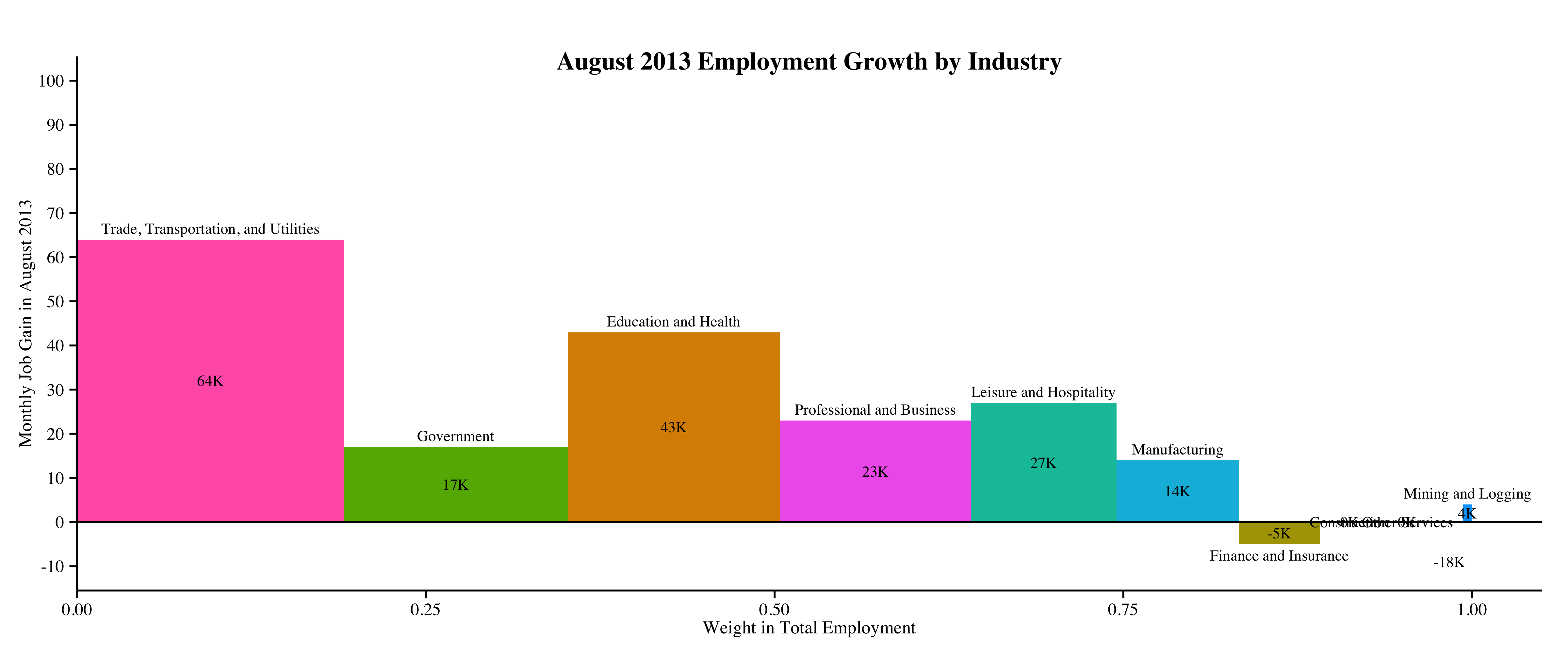
The employment gains in August mostly came from the Trade, Transportation, and Utilities (+65K) and Education and Health (+43K) sectors. The chart below shows the change in employment by industry with the width of each bar representing the share of that industry’s employment out of total employment.

industry-empchg-2013-09-06

…But Fewer Participants…

The household survey also reveals a drop in the labor force participation rate from 63.4 to 63.2. The unemployment rate was essentially unchanged at 7.3%.

lfp-level-2013-09-06

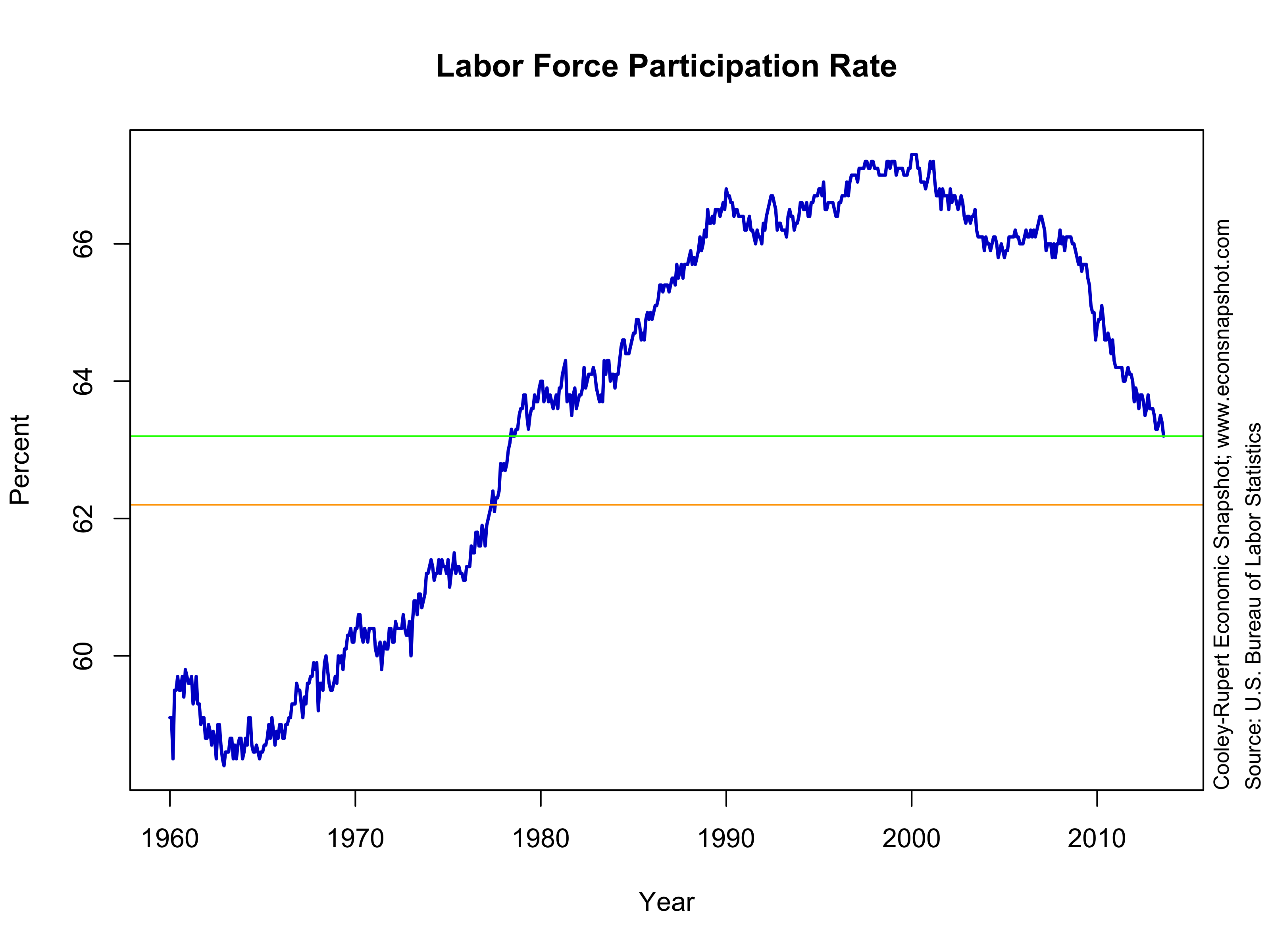
The participation rate continued its decline, falling to a level not seen since August 1978. This decline raises an interesting question about the Fed’s “forward guidance.” It has been reported over and over that the Fed will keep its accommodative stance until the unemployment rate reaches 6.5%, the “threshold.” However, as many have mentioned this threshold is not a “trigger.” So, suppose the labor force participation rate declines by 1 percentage point, from 63.2 (green line in the chart) to say 62.2 (the orange line). According to the Federal Reserve Bank of Atlanta’s Jobs Calculator given that participation rate, how many jobs need to be created per month to get to a 6.5% unemployment rate one year from now? The answer is….the economy would have to create approximately ZERO jobs per month!! And if it fell to 62.0% would even have to LOSE jobs! Surely, no one would argue that the labor market has improved enough to begin the taper! While forward guidance may indeed have been somewhat instructive, it appears that it is providing very little, if any, information for the future stance of policy, other than: if things are “bad” we will continue our accommodative stance, if they are “good”, we won’t. Choosing simple thresholds, targets, triggers, to make things more transparent may help to provide a framework, but the markets want to respond to the vast and myriad details….like a poor jobs report, etc.

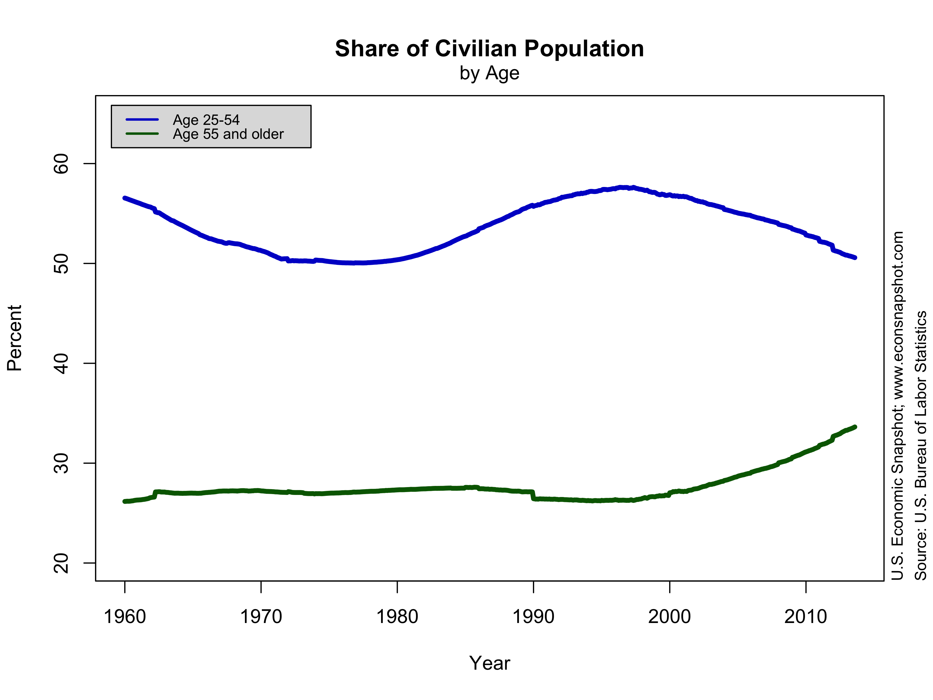
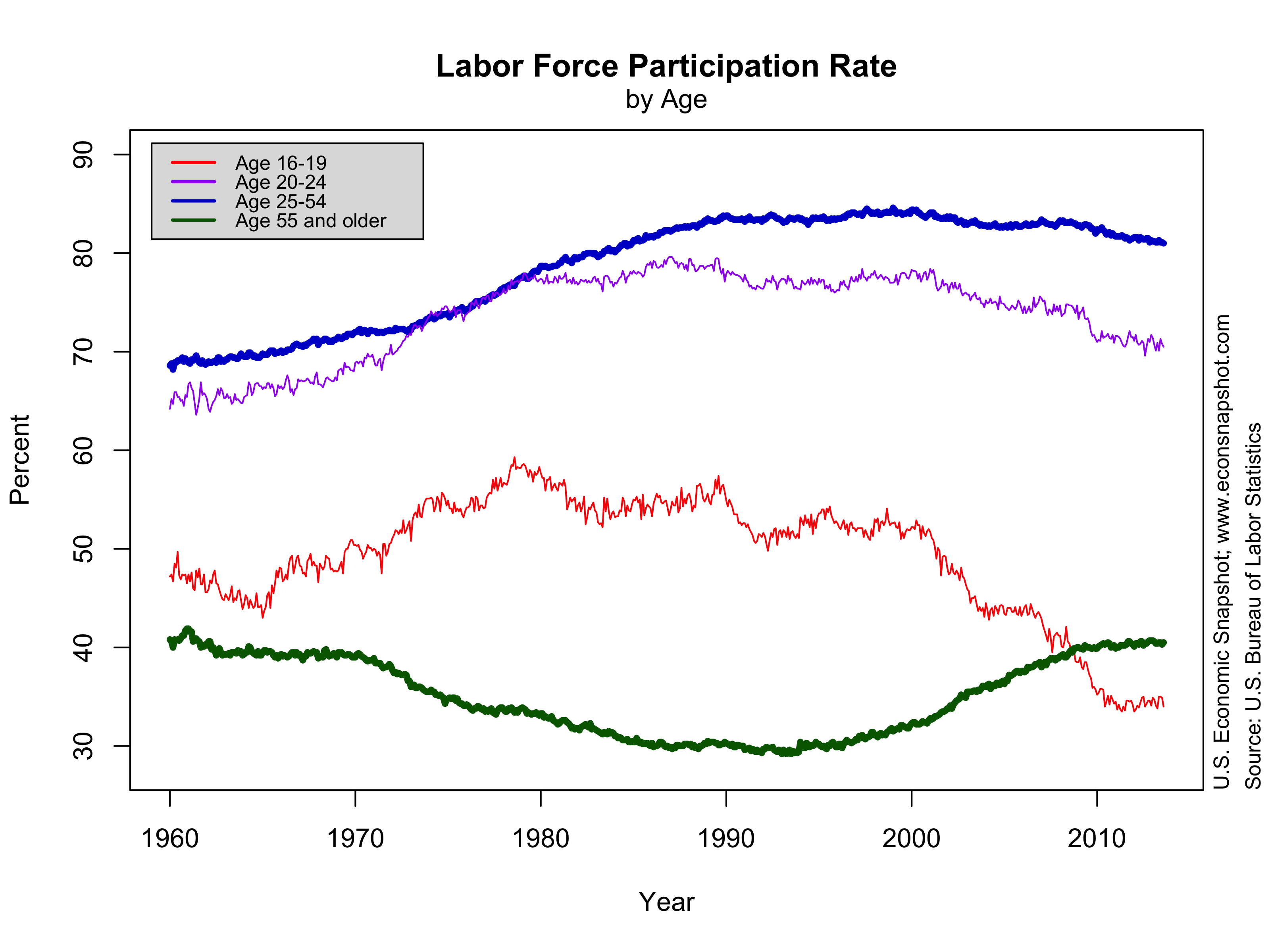
A portion of the decline in participation since 2008 (note, however, that participation started to decline in the late 1990’s/early 2000’s) is likely a result of discouraged workers leaving the labor force, but there are also demographic factors that decrease participation. For instance, changes in the age distribution have had an effect the overall participation rate. As a share of the civilian population, the share of people over the age of 55 has increased. Since these workers naturally have a lower participation rate, this reduces the participation rate in the aggregate, albeit the participation of those over 55 has actually increased.

pop-share-level-2013-09-06

lfp-age-level-2013-09-06

It’s important to know exactly why participation has fallen, particularly because of its implications on the unemployment rate, which the Fed seems to be using as its sole measure of labor market health in its forward guidance, as San Francisco Fed President John Williams pointed out this past week [the emphasis is ours]:

“Clearly, the unemployment rate plays an important role in our thinking and communication about future policy. Therefore, an important issue is whether it is giving an accurate read on where things stand relative to our maximum employment mandate. […]

Over the past few years, labor force participation has plunged below 64 percent, a level not seen in almost 30 years. This drop in labor force participation explains how the unemployment rate can be falling while the employment-to-population ratio has been roughly stagnant. The overall ranks of the unemployed have been declining because many people are leaving the labor force, rather than finding jobs. But, it’s important to remember that much of this decline in labor force participation reflects demographic trends, such as retiring baby boomers leaving the workforce. In addition, in recent years, there has been a big exodus of young people and so-called prime-age adults. Again, some of this is related to ongoing trends, such as an increasing share of young adults enrolling in school, and workers moving onto disability rolls.

Nonetheless, a portion of the exodus from the labor market is due to the recession and slow recovery. It appears that unprecedented numbers of young and prime-age workers have been bailing out of the labor force because the job market has looked dismal. Many of these prime-age workers who have left the labor force say they want jobs and are available to work. But they don’t think they can find work, so they’ve given up looking and therefore they’re not counted as unemployed. Many of these people will probably return to the job market as conditions improve.

All this gets quite complex. On the one hand, we have structural trends, like the aging of the workforce and young people spending more time in school. On the other hand, we have the effects of a weak economy, that discourages people from looking for work. From the standpoint of gauging the state of the labor market for monetary policy, it is crucial that we distinguish between structural developments in the labor market and the effects of a weak economy.

The idea behind that last point is that monetary stimulus is meant to address the latter issue (a weak economy) and cannot influence ‘structural’ things such as demographic changes. That’s certainly true in some sense. No amount of stimulus can slow down the aging of the workforce. But, that’s not to say that some of the policy actions the Fed has taken alters the way structural changes influence the labor market.

Upward revision to real GDP…signs of improvement?

Upward revision of Q2 real GDP was announced by the BEA here , indicating that Q2 real GDP increased at a seasonally adjusted annual rate of 2.5%; revised up 0.8 percentage points from the advance estimate of 1.7%. Note that analysts expectations for that advance estimate had been somewhere around 1.0%. Q1 real GDP growth was unchanged by the revision, remaining at 1.1%.

gdprealchgm-2013-08-29

rgdp-2013-08-29

As can be seen in the graph above, compared to other recoveries real GDP is growing significantly slower, as is consumption, shown below.

cons-2013-08-29

The large upward revision in output stemmed from higher growth in net exports, with both exports (up 8.6%) and imports (up 7.0%) rising. The Commerce Department releases a monthly trade report that already indicated a large tick up in the US trade balance during the second quarter. There was also  a larger accumulation of private inventories. This wasn’t much of a surprise. The real question is if these revisions shed any light on the upcoming employment report (due out Sept. 6) as well as expectations of the future path of the labor market…as this will provide rationale for a so-called “Sep-taper.”

However, it seems as if there is no indication that trade is contributing much to employment growth. Below we plot year-over-year changes in exports and employment for services and goods separately. Exports as a whole have been on a decline since mid 2010 and (at least for services), have diverged from employment growth.

fredgraph-services fredgraph-goods

A better sign of future declines in unemployment is in the reported drop in unemployment benefit claims, from the initial claims report. Declines in claims are consistently followed by falling unemployment.

fredgraph-cliams-urate

Below we show the snapshot of the remaining variables from the National Income and Product Accounts and remember you can always get a pdf copy of the entire economic snapshot hereContinue reading “Upward revision to real GDP…signs of improvement?”

Still An Anemic Recovery: Second Quarter GDP and the Benchmark Revisions to GDP

The Bureau of Economic Analysis announced here that Q2 real GDP increased at a seasonally adjusted annual rate of 1.7%, beating analysts expectations that were somewhere around 1.0%. In addition, Q1 was revised up to 1.1% from 0.4%. Government spending was revised up slightly in Q1, from -4.8% to -4.1%, and the Q2 change revealed stronger spending than many had predicted, still negative however, -0.4%. Personal consumption growth increased 1.8% and was revised up to 2.3% (was 1.8%) in Q1.

Comprehensive (benchmark) revisions

Every 5 years or so the BEA undergoes large benchmark revisions to incorporate new methodologies and statistical techniques. In this latest round of revisions the BEA incorporated several major changes (for a more detailed account go here). In particular, the revisions

  • Change the base year for real variables to 2009$ from 2005$.
  • Recognize expenditures by business, government, and nonprofit institutions serving households (NPISH) on research and development as fixed investment.
  • Recognize expenditures by business and NPISH on entertainment, literary, and other artistic originals as fixed investment.
  • Expand the ownership transfer costs of residential fixed assets that are recognized as fixed investment and improve the accuracy of the associated asset values and services lives.
  • Measure the transactions of defined benefit pension plans on an accrual accounting basis by recognizing the costs of unfunded liabilities and showing the pension plans as a sub-sector of the financial corporate sector.
  • Harmonize the treatment of wages and salaries by using accrual-based estimates consistently throughout the accounts.

These comprehensive revisions mainly affect the levels of variables. We plot below real GDP (logged) successively adding the changes in the comprehensive revision. The change to the 2009$ base year shifts up the level of real GDP as can be seen in the graph below (black line compared to the red line). Adding intangible investment shifts the line up further, but also has some growth rate effects (red line compared to green line). The blue line represents the current estimate.

gdp-revisions-2013-08-01

If we are mostly interested in how the revisions changed GDP growth, one way of controlling for the level is to normalize each series at the beginning of the peaks of business cycles. The graph below shows the pre-revision data (dashed lines) and the post-revision data (solid lines) using the same technique as we have used in our earlier blogs, plotting the evolution of the economy since the previous peak of the NBER recession dates. For almost all of the recessions the revisions lie above the older data.

rev-rgdp-2013-07-31

The graph shows that the revisions have made the latest recession appear not quite as deep and the latest recovery a little stronger than the pre-revision data had suggested.The same pattern emerges for consumption and investment.

rev-cons-2013-07-31

rev-inv-2013-07-31

In contrast, the revision to government consumption plus government investment shows a decidedly downward revision for this past recession and recovery.

rev-gov-2013-07-31

Although there was a bump up in GDP growth from the revisions, as is evident from the GDP graph above, the current recovery is still much weaker than past recoveries.

In order to assess how the incorporation of expenditures on intangible capital into fixed investment, we first look at the newly added components. Nonresidential fixed investment now includes the major categories: structures, equipment, and intellectual property products. Previously, equipment and software were lumped together. Now, software is included in intellectual property along with research and development and entertainment, literary, and artistic originals.

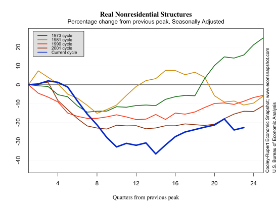
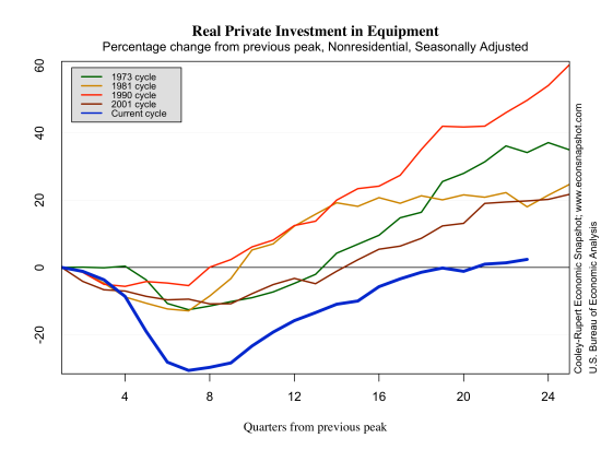
What is striking about the new methodology is that over the course of business cycles it is equipment and structures that fall substantially while intellectual property does not. There appears to be “hoarding” of intellectual capital. Traditional capital expenditures are cut first in response to shocks but not the inputs into intellectual property accumulation, such as research scientists.

rev-nr-structures-2013-08-01

equip-2013-07-31

intprop-2013-07-31

As is evident from the graph below, intangible capital has grown faster than tangible capital. That is, the ratio of intangible to tangible has increased substantially. Moreover, almost all of the cyclical volatility comes from the tangible capital. As intangible capital has become a larger share of investment the volatility of GDP has declined.

tangible-intangible-2013-08-01

ratio-tangible-intangible-2013-08-01

June Employment Report Beats Expectations

Steady growth in employment

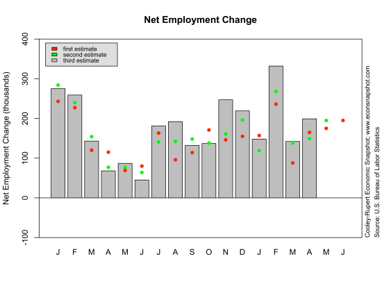
The BLS Employment Situation report for total nonfarm employment in June indicates a 195,000 increase in employment and upward revisions to April (from 149,000 to 199,000) and May (from 175,000 to 195,000). Expectations were in the 160,000 range.

empchgm-2013-07-05

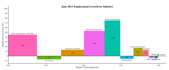
Private employment increased 202,000 while government employment fell 7,000. Most of the increase in employment came from the private service producing sector, rising 194,000. The largest increase there was in leisure and hospitality, increasing by 75,000. The following two charts show how employment has behaved over the month and year, respectively. The first graph depicts the employment change over the month by sector. As mentioned above, leisure and hospitality had the largest increase, 75k. The width of each bar represents the fraction of employment in that sector as of June, 2013. For example, the largest sector in terms of employment is Trade, Transportation and Utilities, representing 19% of total nonfarm employment; Leisure and Hospitality is 10.5% of employment. The year-over-year graph below shows, in percentage terms, the growth from June, 2012 to June, 2013. Over the past year Manufacturing posted the largest percentage gain, 9.3%; and Construction was the only sector with a yearly decline.

industry-empchg-2013-07-05

industry-empchg-y-y-2013-07-05

Overall, the level of employment in the private sector still lies below that seen in the previous peak, December, 2007. The employment-to-population ratio remains very low…the last time it was this low was back in the early 1980’s. Clearly, the labor market is still suffering.

emp-private-2013-07-05

eprlevel-2013-07-05

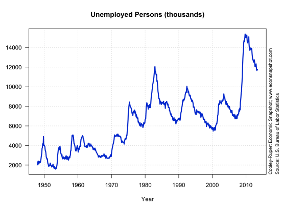
The number of unemployed persons (11.8 million) as well as the unemployment rate (7.6%) were little changed from the previous month.

unemplevel-2013-07-05
unemprate-2013-07-05

The labor force participation rate of 63.5% was up slightly from the month before, but it still remains far below the level in 2007.

lfp-level-2013-07-05

According to the Atlanta Fed’s job calculator, if the labor force participation remains at 63.5% and employment growth is similar to the last 3 months, say 197,000, then the unemployment should fall to 6.5% toward the end of 2014. Note that there have been indications, as mentioned in an earlier post, that the threshold for changes in monetary policy is 6.5%. This seems to jibe with other reports saying that the Fed Funds rate will remain at its current level until the end of 2014. Of course there are a lot of “ifs” there. For example, if the labor force participation rate rises to 65%, somewhere between where we are today and where it was in 2007, then the economy would need to see an increase of 380,000 jobs per month to get to 6.5% unemployment in 18 months.

Large Downward Revisions to GDP

The Bureau of Economic Analysis announced here that real GDP in the first quarter increased at a seasonally adjusted annual rate of 1.8%, revised down from the second estimate of 2.4% and the advance estimate of 2.5%. This revision, down 0.6 from the second estimate, is quite large historically. As can be seen here, the average revision from the second to the third estimate (without regard to sign) for real GDP from 1983-2009 is 0.2 with a standard deviation of 0.2.

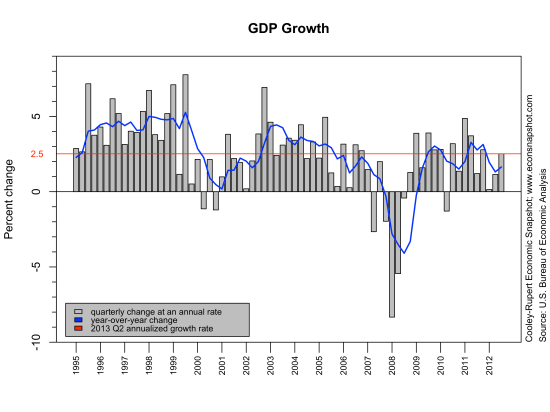
The weakness of current real GDP growth compared to other recoveries can be seen in the graphs below. First, in the GDP Growth chart below, the current value of gdp growth, 1.8% is highlighted in red. The visual makes it pretty clear that the current recovery lies below that of the earlier periods going back to 1995. That is, the year-over-year change (the blue line) is mostly higher from 1995-1999 than it was 2002-2006; and 2002-2006 looks to be higher than 2009-2013.

gdprealchgm-2013-07-02

The graph below shows that over the period 1947-1983 average real gdp growth was 3.64%; since 1983 it has been 2.72%. The latter period has been referred to as the Great Moderation as it is evident that the volatility in gdp growth has been, well, more moderate compared to the earlier period. Evidently the Great Moderation has also witnessed a moderation in average growth.
gdpreal-chg-q-break-2013-07-02

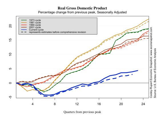
The graphs below show how this recession and recovery compares to others. Typically, 22 quarters past the previous peak we are about 15% above the previous peak–in the current recovery we are less than 5% above. In all of the graphs below, what is evident is that the rate of growth for every statistic is lower than that of all previous recessions and recoveries since the 1970’s, i.e., the slope of the dark blue line is flatter than any of the other lines. This underscores the fact that the weakness of the recovery is pervasive.

rgdp-2013-06-26

The large decline in output growth from the second to third revision was due in large part to personal consumption expenditures that were revised down from the second estimate  (3.4% down to 2.6%), of which services saw a large downward revision (3.1% down to 1.7%).

The only component of GDP that does not look unusually sluggish is fixed private residential investment.cons-2013-06-26 It reflects the widely reported broad recovery in the housing markets.  But, any optimism should be tempered by the extraordinary collapse and the duration of the collapse in residential investment.

services-2013-06-26

imports-2013-06-26

inv-2013-06-26

rfi-2013-06-26

govcons-2013-06-26

Employment, GDP, and the Taylor Rule

The employment report issued by the Bureau of Labor Statistics on Friday revealed an increase in total non-farm employment of 175,000, close to the median expectation of 170,000. However, the revisions over March and April showed a net loss of 12,000. In addition, about 25,000 of the employment increase came from temporary help services. While the labor force increased (420,000) the labor force participation rate was little changed at 63.4%, and remains substantially below the level in December of 2007. At 7.6% the unemployment rate crept up slightly and number of unemployed persons essentially unchanged.
empchgm-2013-06-07lfp-2013-06-07

rgdp-2013-05-28

unemprate-2013-05-28

Given this employment report and the fact that GDP continues a slow and steady rise , the policy debate is about when and how fast the Fed will begin to alter its stance on monetary policy. The Fed has repeatedly indicated that its target range for the federal funds rate of 0 to 1/4 percent will be

“…appropriate at least as long as the unemployment rate remains above 6-1/2 percent, inflation between one and two years ahead is projected to be no more than a half percentage point above the Committee’s 2 percent longer-run goal, and longer-term inflation expectations continue to be well anchored.”

This still leaves two uncertainties: (i) when will the unemployment rate fall below 6.5% and (ii) how fast will the Fed increase the federal funds rate after unemployment surpasses the threshold.

The Atlanta Fed’s handy jobs calculator provides some indication on (i).  The calculator tells you the average monthly change in payroll employment needed to bring the unemployment rate to a certain threshold in a certain amount of time. Suppose the monthly net employment gain continues to be around 187K (its average over the past year and a half). Then, it would take approximately 18 months to reach the Fed’s unemployment threshold of 6.5%.

As for (ii) what the Fed will do once it reaches this point remains unclear. However, about 20 years ago John Taylor proposed a “rule” that would provide more clarity, i.e., a rule the Fed should (or has been following) follow rather than discretion. The Taylor Rule has become the standard tool that financial market participants look to for guidance about the path of interest rates. The Taylor rule is a sort-of guide to how the fed should ( or does) respond given its targets and the current state of the economy. The idea being that if inflation or output is above some target then the Fed should respond with higher interest rates. How aggressively the Fed should respond (the coefficients of the Taylor rule on deviations from targets) is, of course, debatable. And, in the meantime, there is very little inflationary price pressures, whether one looks at the CPI or PCE or the median CPI.

The current environment is such that the Fed seems to be using a “non-linear” Taylor rule. That is, the Fed will leave the current funds rate alone until the economy reaches the 6.5% rate. It is also unlikely that when the economy does reach that number that the Fed will raise rates in very large steps. It is likely that the Fed will use a “smooth” Taylor rule that be a weighted average of the current rate and the rate implied by the Taylor rule, with more weight on the current rate.

That said, the following graph shows a fairly standard interpretation of the rule. Note that here we use the unemployment rate gap rather than the original output (GDP) gap, since that is what the Fed says it is looking at in the current economic environment.  The red line is the effective Fed Funds rate. The blue line is what the Taylor rule prescribes, given a long-term target of 6.5% unemployment and 2% inflation.

taylor-rule-2013-05-30

The fact that the Fed has emphasized a stance on monetary policy with ‘forward guidance’ is a step toward using a rule. Secondly, that the language of the forward guidance is in terms of the deviation of unemployment from a threshold is a step toward using a Taylor rule. Precisely which rule the Fed will plan to use after the unemployment rate is below 6.5% is debatable.

What is quite evident is that it is easy to identify different regimes. The next graph shows the deviations from the Taylor rule. When the green line is below zero it means that the Fed Funds rate was below that implied by the Taylor rule as given in the preceding graph. Of course it may well be that the unemployment rate target was not 6.5% in these earlier periods, the picture below is certainly informative. Moreover, Minneapolis Fed president Kochelakota suggests some benefits if the threshold unemployment rate  were 5.5% as he argued here.

taylor-rule-deviation-2013-05-30

That said, there are issues with such an accommodative policy: It is fairly easy to spot the Nixon-Burns years in the 1970’s. The Volcker tightening between 1979 and 1987. The Greenspan years after Volcker were very tightly aligned with the implied Taylor rule until the late 1990’s. In the early 2000’s the Fed maintained a stance of policy with lower interest rates than the Taylor rule suggested.

The near-zero Fed Funds rate has been in existence for some time now while the economy continues to improve–leading to a rate below that specified by the Taylor rule above. While not casting aspersions on leadership…it appears that when the Fed Funds rate has deviated substantially below that implied by the Taylor rule bad things seem to ensue.

All financial market participants know that interest rates have only one way to go – higher. If the Fed were to follow such a rule then changes in the funds rate may occur sooner rather than later.  If not, then some clarity about targets and threshholds would probably help given the we are supposed to be operating in a new era of transparency and communication.  Markets have been quite volatile in recent weeks and seemingly very sensitive to every signal from the Chairman. Indeed, the Chairman has remarked here that this is an issue that has not gone unnoticed, as the following excerpt shows:

“That said, the Committee is aware that a long period of low interest rates has costs and risks. For example, even as low interest rates have helped create jobs and supported the prices of homes and other assets, savers who rely on interest income from savings accounts or government bonds are receiving very low returns. Another cost, one that we take very seriously, is the possibility that very low interest rates, if maintained too long, could undermine financial stability. For example, investors or portfolio managers dissatisfied with low returns may “reach for yield” by taking on more credit risk, duration risk, or leverage. The Federal Reserve is working to address financial stability concerns through increased monitoring, a more systemic approach to supervising financial firms, and the ongoing implementation of reforms to make the financial system more resilient.”