Meager growth in employment
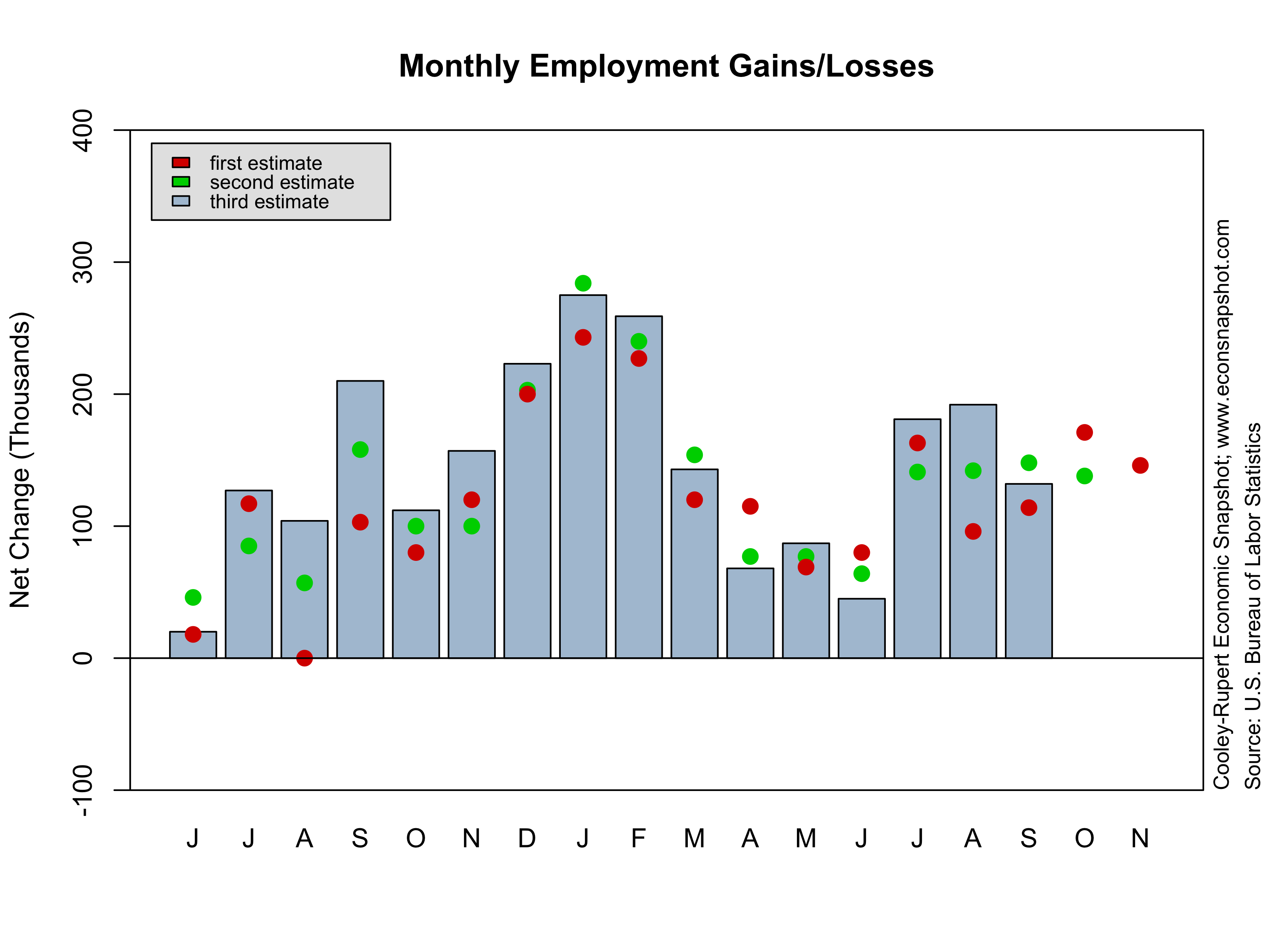
The tiny increase in total non-farm employment reported in the Employment Situation for March undershot analysts expectations…or rather their hopes? However, there was a little good news. First, January and February employment were revised up, from +119,000 to +148,000, in January and from +236,000 to +268,000 in February, as can be seen in the employment change graph below. Second, the average workweek for all employees actually rose to 34.6–only one other time, February of 2012 was it that high since June of 2008. The picture that emerges is of a labor market that usually turns out to be a little bit stronger than first estimates suggest. But, while the economy has continued to add jobs, it has not done so at a pace that is consistent with population growth. The employment to population ratio ticked down once again from its stubbornly low ratio and the labor force participation continued its steady decline. It is now as low as it has been since the early 1980s. The household survey paints an even more dismal view of the labor market. Employment declined by more than 200,000, the biggest decline in a couple of years.
Unlike previous months, employment in the government sector didn’t change very much but that is likely to be temporary. Early indications are that the sequester is gooing to further impact employment in the sector


