Weak Q1 GDP Growth

By Thomas Cooley, Ben Griffy and Peter Rupert

The advance estimate from the Bureau of Economic Analysis shows the weakest GDP growth in three years…although 2015 Q4 (0.9%) and 2016 Q1 (0.8%) were nothing to write home about.

gdprealchgm1-2017-04-28

Consumption (lack of) played a large role in the decline, only up 0.3%, along with a $39.2 billion decline in inventories. This is clearly at odds with the surge in consumer and business sentiment following the election of Donald Trump. That optimism about the economy has yet to translate into real improvement. The deeper issue is whether the first quarter weakness will spill over into the second.  Most observers think not although we are probably not on track for growth greater than 2%.

pcerealchgm1-2017-04-28

On the positive side, investment expenditures came in strong, both non-residential and residential. Overall, fixed investment was up 10.4% with non-residential structures up 22.1%, equipment up 9.1% and intellectual property products up 2.0%. Residential investment was also quite strong, growing 13.7% in the first quarter.

nrfireal-q-2017-04-28

Government consumption expenditures and gross investment was down 1.7%, the main contributor to the decline was national defense spending, down 4.0%. State and local government was also down 1.6%.

govci-2017-04-29


While the weak GDP report along with the earlier weak jobs report may lessen the resolve for the Fed to move aggressively on rate hikes, the recent surge in employment costs may be signaling a tight labor market.

ecirealchgm1-2017-05-01

Underwhelming Job Growth

By Thomas Cooley, Ben Griffy and Peter Rupert

The BLS announcement of a 98,000 increase in payroll employment for March was far below expectations. Moreover, both the January and February employment growth numbers were revised down, -22,000 and -16,000, respectively. Many forecasters estimated job growth between 180,000 to 200,000, especially given the 236,000 increase from the ADP report. The household employment numbers shot up 472,000.

empchgm-2017-04-07

estabhouse-2017-04-07

There was a decline in the number of unemployed persons, down 326,00. while labor force participation held steady at 63% and the employment to population ratio increased slightly from 60.0 to 60.1. Combined, these changes led to the headline unemployment rate ticking down to 4.5%


epr-2017-04-07


Average hourly pay rose from $26.09 to $26.14 while weekly average hours of work remained at 34.3 for the second consecutive month.

avghours-2017-04-07

Other indicators of economic health, like the composition of jobs, suggested improving conditions: part-time for economic reasons fell by 151,000, while the number of marginally attached workers fell by nearly 150,000. In combination, it seems that conditions have improved for those without strong ties to the labor market. The composition of the unemployed continued to show signs of improvement.

unemp-composition-2017-04-07.png

Where The Jobs Are

The employment gains were largely in the service producing sector, up 61,000 despite a 29,700 decline in retail trade. Professional and business services was the largest gainer in the services sector, up 56,000. Construction jobs increased by 9,000.


Upward Revision to Q4 GDP

By Thomas Cooley, Ben Griffy and Peter Rupert

The third and final estimate of Q4 GDP growth reveals an upward revision from 1.9% in the advance and 2nd revisions to 2.1%. The increase came largely from a full one percentage point increase in PCE, from 2.5% in the advance estimate to 3.5% in the 3rd.

gdprealchgm1-2017-03-30

pcerealchgm1-2017-03-30

Fixed investment was revised down slightly, from 9.4% to 9.2% with a fairly large downward revision to intellectual property rights, falling from 4.5% in the 2nd estimate to 1.3% in the final. Non-residential fixed investment grew at 0.9% while residential grew at near double digits, 9.6%.

nrfireal-q-2017-03-30

residentialinv-2017-03-30

Exports fell by 4.5% while imports shot up 9.0%, leading to a large decline in net exports.

netexports-2017-03-30.png

With the final estimate now in for real GDP, 2016 growth was the slowest since coming out of the Great Recession, 1.6% (tied with 2011).

gdpychg-2017-03-30


Fed Raises Interest Rates On Strong Jobs Report

By Thomas Cooley, Ben Griffy and Peter Rupert

The Federal Reserve, as expected, increased the target Federal Funds rate by 25 basis points today in a sign the monetary policy is returning to normal after years of historically low interest rates. With inflation near the target level and continued strong employment growth the stage was set for the FOMC to continue pushing up the Federal Funds Rate and Fed officials for the past few weeks have been signaling strongly that a rate hike was imminent. Todays announcement set expectations for two more rate hikes this year conditional on the data.

The last compelling piece of evidence fell into place with the release of the establishment survey  last Friday by the BLS.  It showed continued strength in the labor market. Payroll employment increased 235,000, with gains spread across almost all sectors. Retail trade, however, was down 26,000 and employment in motor vehicles and parts declined by 8,000. The private sector added 227,000 and government added 8,000. The mining sector (oil and gas mainly) added 9,000. Payrolls were revised up 11,000 in January and down 2,000 in December.

empchgm-2017-03-10


Average weekly hours remained at 34.4, although the index of aggregate weekly hours increased 0.2%. Average hourly earnings moved up slightly, from $26.03 to $26.09.

avghours-2017-03-10

The household survey admitted a surge in employment of 447,000.  The employment to population ratio also increased, from 59.9 to 60.0. The labor force participation rate increased, from 62.9 to 63.0 as a result of a 340,000  increase in the labor force. The number of persons unemployed dropped by 107,000, leading to a drop in the unemployment rate from 4.78% to 4.70%. In addition, the number of persons unemployed more than 15 weeks dropped by 184,000.

epr-2017-03-10lfp-2017-03-10

uu6rate-2017-03-10
udur27-2017-03-10

This is a remarkably healthy picture of the labor market, a contrast to the way it was depicted by the President Trump prior to his election.  But our analysis of the election results in November highlighted the importance of manufacturing job losses for Trump’s victory.  His primary message to voters was a promise to save and create traditional blue collar jobs. In this and subsequent posts we are going to track where the jobs are being added with the goal of providing a more nuanced picture of how the labor market evolves under this administration.

Where the Jobs Are

As a starting point it is useful to note that for several decades employment growth has been dominated by increases in service sector jobs. Manufacturing jobs have been in secular decline as a share of the labor force. That is the underlying reality of this economy.

empmanservag-2017-03-10

Against this long term background, we can contrast recent employment growth in what are traditional blue collar jobs – manufacturing, construction, mining. Manufacturing has not recovered from the decline following the great recession, while construction has been steadily rebounding from it’s trough.  Mining, which includes the energy sector, rebounded rapidly from the recession, driven by high oil prices, and has since collapsed as prices fell.  The least volatile component of employment is services, rebounding steadily since 2009. Although much attention has been focused on manufacturing and other traditional blue collar jobs the blue collar jobs of this economy in the future are in the service sector – in health care, retail and the like. So it is misleading to focus only on the traditional blue collar jobs.


emp-sector-growth-2017-03-14

Ultimately, the test of this administration will be how many jobs it generates relative to the working population. There is no perfect indicator of this, but one useful benchmark is the employment to population ratio.  In the graph below we show how the employment to population has evolved over various presidential regimes. The clear champion job creator was Ronald Reagan followed by Bill Clinton. In subsequent posts we will track how the current administration compares as well as tracking where the jobs are created.


epr1-pres-2017-03-14


A Healthy Labor Market For The New Year

By Thomas Cooley, Ben Griffy and Peter Rupert

January employment numbers released by the BLS reveal a 227,000 increase in payroll employment, but a 40,000 decrease in November after the final revision and a 1,000 increase to December. Total private employment, however, was up 237,000 as the government shed 10,000 jobs. The service sector showed the largest increase with 192,000 more jobs. Mining and logging (oil largely) increased for the third consecutive month. Average job growth for the last three months is 183,000 similar to what it was in 2015. This is not spectacular, but it is steady.   empchgm-2017-02-03

Average weekly hours remained at 34.4 and average hourly earnings increased very slightly, from $25.97 to $26.00.

avghours-2017-02-03

ahecpi-2017-02-03

The household survey showed an increase in the labor force, the participation rate climbing to 62.9% and the employment to population ratio increased to 59.9. This is encouraging if it signals that workers who have been sitting on the sidelines are coming back into the labor force. However, the number employed fell somewhat and those unemployed rose, so that the unemployment rate increased slightly, from 4.72% to 4.78%. The number unemployed 27 weeks or longer ticked up slightly.

lfp-2017-02-03

epr-2017-02-03

uu6rate-2017-02-03

udur27-2017-02-03

unemp-composition-percent-2017-02-03

The productivity report on February 2 revealed a 1.3% increase in output per hour for the fourth quarter of 2016. Output increased 2.2% and hours increased 0.9%. Unit labor cost rose 1.7%, reflecting a 3.0% increase in hourly compensation alongside the 1.3% increase in productivity.

prodbar-2017-02-03

ulcbar-2017-02-03

The overall labor market picture is one of steady progress but not much pressure on wages. This sets the table well for the Fed’s plan to gradually raise rates over the course of the year. There is no reason to hurry and no real reason to back away from their plan.


2016 Ends on a Quiet Note

By Thomas Cooley, Ben Griffy and Peter Rupert

Fourth quarter real GDP grew at a 1.9% seasonally adjusted annual rate, according to the advance estimate, as announced by the Bureau of Economic Analysis. Overall, for 2016 GDP increased at a 1.6% clip, one full percentage point lower than the 2.6% increase in 2015 and also lower than the 2.4% growth rate posted in 2014. Although, the year-over-year change has somewhat reversed its downward trend that began in 2015. Compared to other recoveries, our current one depicts slower growth coming out of the trough than previous recoveries going back to the 1960’s. Note, however, that several of the recoveries had slipped back into recession by this time, some eight years after the trough. According to the NBER business cycle dating committee there have been 11 cycles since 1945, the average duration during that time span from trough to peak is 58.4 months.

gdprealchgm1-2017-01-27

gdp-cyc-trough2017-01-27

expansion-growth-2017-01-27

The principal contributors to the Q4 growth were personal consumption expenditures (contributing 1.70) and investment (contributing 1.67). The decline in exports and increase in imports were the largest drag on growth with net exports contributing -1.70. Over the year, real PCE grew 2.7%, only slightly lower than the 3.2% growth in 2015 and 2.9% in 2014.

pcerealchgm1-2017-01-27


exp-cyc-2017-01-27

Overall for 2016 investment fell 1.5%, nonresidential structures down 3.1%, equipment down 2.8 but intellectual property products up 5.0%.


December Employment Slightly Off Expectations

By Thomas Cooley, Ben Griffy and Peter Rupert

Happy New Year! Today’s employment report from the BLS revealed that establishments increased employment by 156,000 in December.  In addition, over-the-month revisions decreased October employment by 7,000 while adding 26,000 to November’s job gain. There were 144,000 more private sector jobs, 12,000 of those in goods producing and 132,000 in service sector jobs. 2016 saw an increase of 2.2 million new jobs, lower than the 2.7 million jobs added in 2015.

empchgm-2017-01-06

Health care and social assistance led the way with a 63,300 employment gain. Durable goods manufacturing employment increased 15,000. On the downside, temporary help services shed 15,500 jobs; construction down 3,000 and mining and logging down 2,000.

While employment gains were less than many anticipated (somewhere in the 180,000 range) hours of work were also a bit disappointing, remaining at 34.3 after a downward revision to November from 34.4. to 34.3. Most of 2014 and 2015 saw the workweek in the 34.5 to 34.6 range while 2016 started off with a 34.6 reading but has declined over the year. avghours-2017-01-06

Real earnings of all private workers has been trending up, finally showing signs of wage growth. In real terms, however, the CPI has eaten away some of the gains.

ahecpi-2017-01-06

From the household survey the labor force increased 184,000, causing the participation rate to climb slightly to 62.7, while the number of employed increased 63,000, so that the unemployment rate increased from 4.65% to 4.72%.

epr-2017-01-06lfp-2017-01-06

The overall picture for 2016 shows a labor market that continues to expand, but lethargically, although at a pace higher than the recovery from the 2001 recession.

emp-rec-rec-trough2017-01-06

Looking at the 12 month moving average there is some evidence of a slowing down in employment growth. However, given the recent election and the mostly positive effects on confidence measures as well as the stock market, perhaps signals a brighter future for the labor market.

payems_monthly_change-2017-01-06


Mr. Trump will Inherit a Robust Economy

By Thomas Cooley, Ben Griffy, and Peter Rupert

The BEA presented an early gift to the incoming administration with the final estimate of Q3 GDP growth, revised from 3.2% to 3.5%, the highest growth rate since Q3 of 2014. The strong GDP growth combined with an unemployment rate of 4.4% justifies the Fed’s December interest rate boost.

gdprealchgm-2016-12-22

The increase in real GDP in the third quarter was led by contributions from PCE (contributing 2.0 percentage point, see Table 2 in the link above), exports (1.6p.p.), private inventory investment (0.49p.p.), nonresidential structures (0.3p.p.), and federal government spending (0.16p.p.). Residential fixed investment was a drag on growth, falling for the second consecutive quarter, down 7.7% in Q2 and down 4.1% in Q3.

pcerealchgm-2016-12-22

residentialinv-2016-12-22

The U.S economy will continue to grow through the fourth quarter although it is unclear what impact the Trump election will have on Fourth Quarter results. Wholesale changes in trade policies, or merely expectations of changes in trade policy could begin impacting GDP as early as the next report.

gdp-cyc-trough2016-12-22
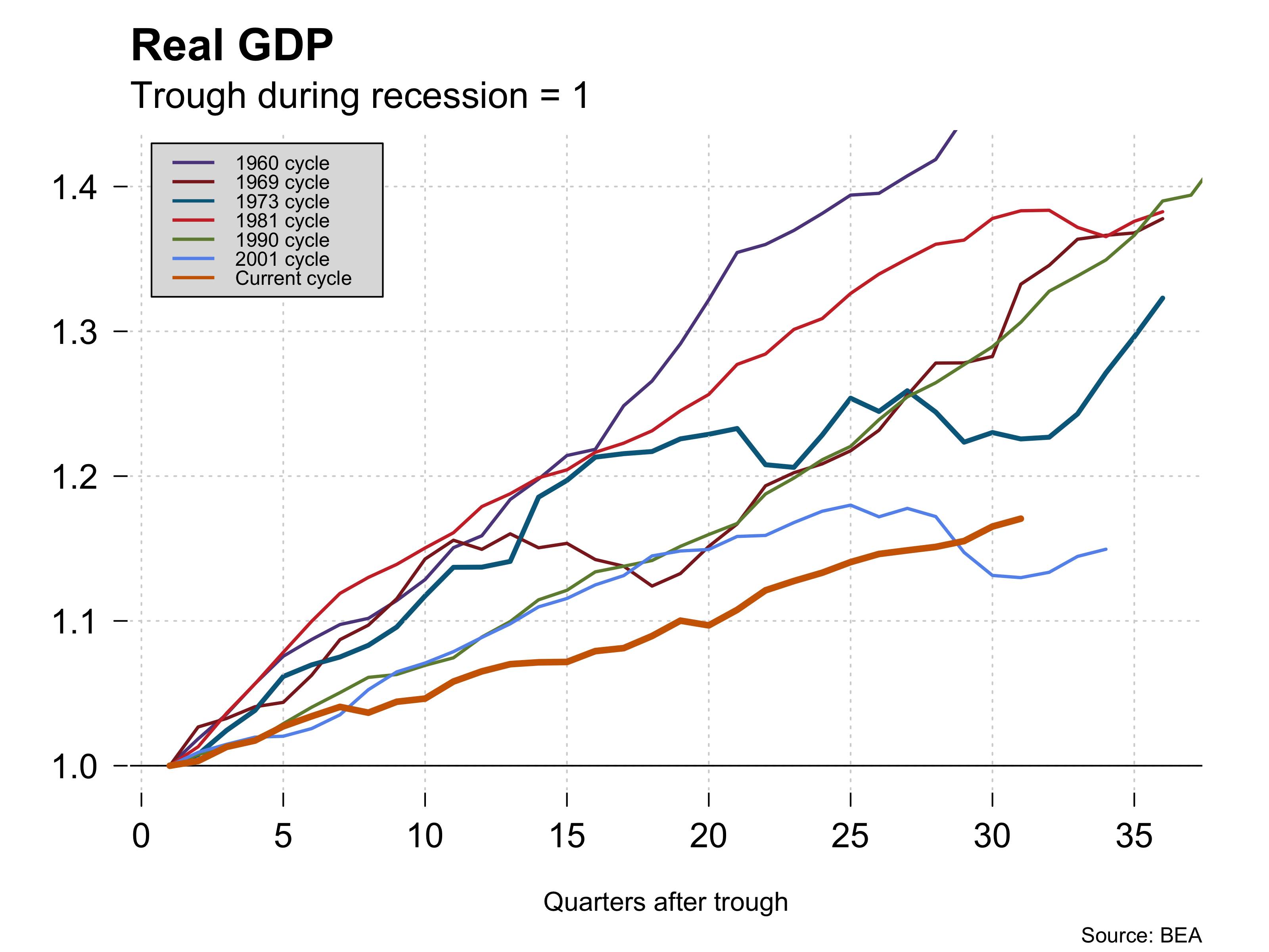
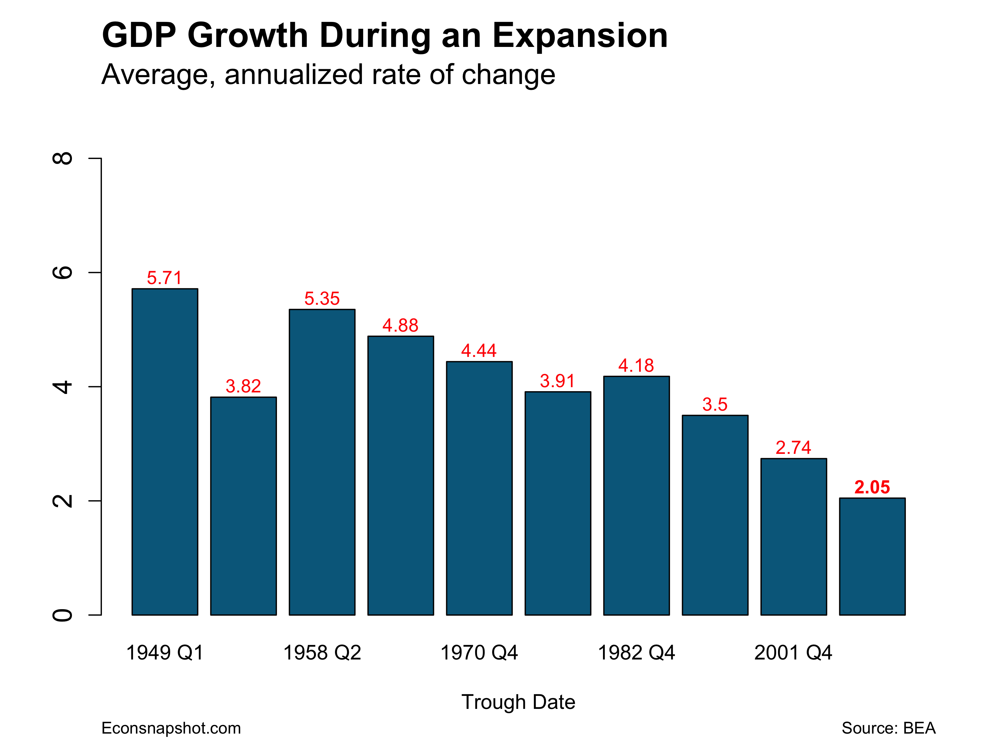
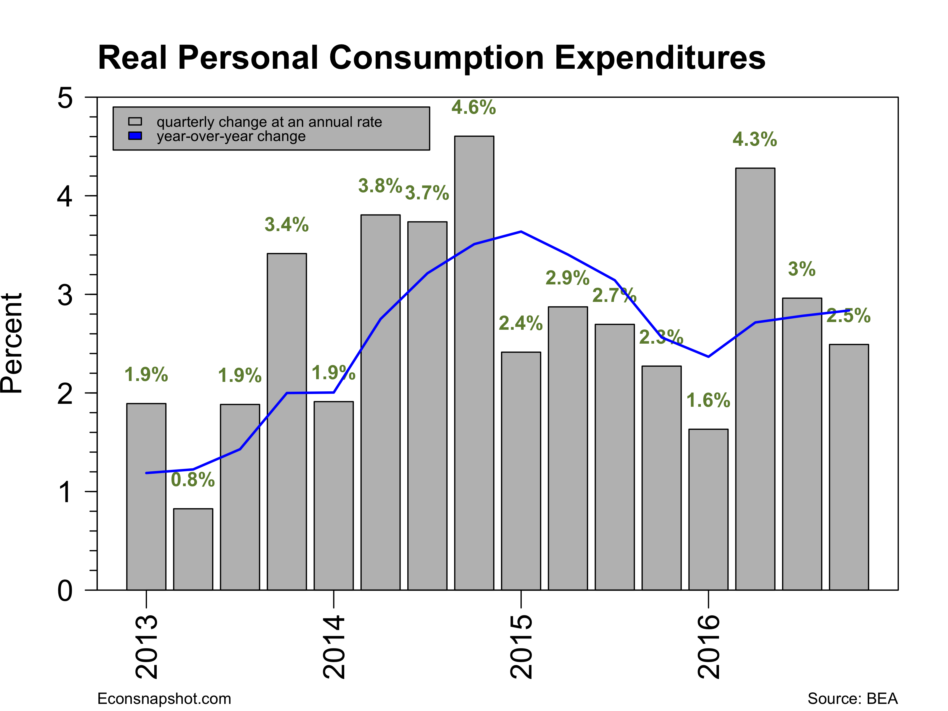
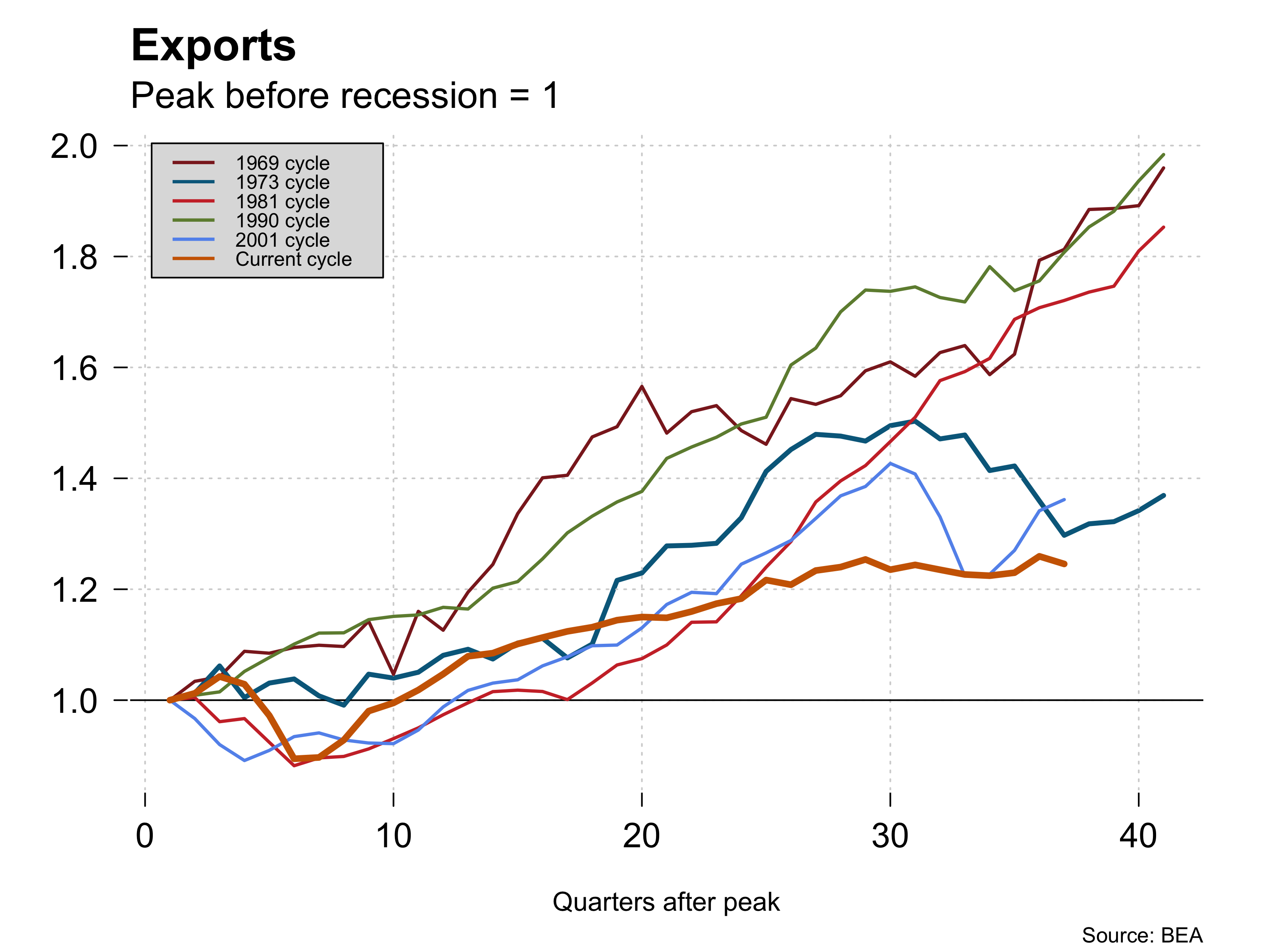
There is some reason for pessimism on this score because Mr. Trump’s election has already pushed the dollar to new highs – currently nearly at par with the Euro.  This will hurt U.S. exports in the long run. And it may run counter to what Mr. Trump promised if the U.S. loses jobs in the Export industries.  Markets are pricing in a substantial gain in GDP and corporate profits on the basis of what is know so far and the yield curve has steepened significantly. But housing remains weak in the Fourth quarter so far and higher interest rates are not going to help that. The unfortunate fact is that the smoke really hasn’t cleared on Trump’s goals. It remains to be seen whether this optimism is warranted just as it remains to be seen what Mr. Trump’s policies actually turn out to be.

Electronic Voting Machines and the Election

By Thomas Cooley, Ben Griffy, and Peter Rupert

Three states are facing or currently undergoing a recount of votes cast, after a number of computer scientists reported some evidence of problems with the electronic voting. This finding was heavily disputed in the media, and seemingly little evidence was produced to support the conclusion that there was malfeasance in counties with electronic voting. Indeed, following the initial media response, the lead computer scientist backed away from initial reports, saying that there are flaws in electronic voting that could be easily exploited, and that an audit is important, but there isn’t direct evidence. We use our data to explore the claim that counties with electronic voting exhibited different voting patterns than their paper peers. What we find is definitely troubling: in some of the swing states, and specifically in states that were projected to vote Democratic at the top of the ticket, those with electronic voting had a decrease in the percent of the total vote going for the Clinton-Kaine campaign, and an increase for the Trump-Pence campaign. We try to determine if this is spurious by checking for patterns in other places with electronic voting, as well as during the 2012 election. We only find this correlation for swing states during the 2016 election.

Data:

We use the American Community Survey (5-year) for demographics (race, age, gender, education), data from the BLS on unemployment (October 2016 preliminary estimate), data from the BEA on personal income (2015 estimates; more recent estimates include many fewer counties. We use data from Verified Voting for voting machine type (here), which lists type, make, and model of voting machine by county for all states. Finally, we use voting data from Politico for the 2012 and 2016 elections, as well as data from CNN for the 2008 election. We have updated our data slightly since our last post, and the updated file is available here.

Results:

First, we graphically explore areas where various attributes (i.e. race, gender, education, income, unemployment, population size) do a good job explaining election outcomes, and areas where they do a worse job explaining the outcome. We started this in a previous post, and continue along those same lines. We find how much of the shift in voting patterns can be explained by these attributes by running a regression (including state fixed effects). We then use these predictions to assess how far each county is from their predicted outcome. Graphically, these differences are as follows:

resid.png

A “blue” county is one in which the Clinton campaign outperformed what would be predicted by the county’s demographic and economic characteristics, while a “red” county is one in which the campaign underperformed. The set of attributes do a good job explaining the election outcomes, with more than 90 percent of the counties falling less than 3 percentage points above or below our prediction. There do appear geographic patterns, however, in the over or under performance. Now, here’s the map of counties with electronic voting machines:

voting_machines.png

Green counties signify counties that exclusively employ paper balloting methods, while yellow counties are ones that employed either a mix of paper and electronic voting, or electronic voting exclusively. It’s worth noting that only 76 counties in the entire country use only electronic voting machines, with nearly all of these located in Pennsylvania. Now, as a visual explanation of what we will do, compare the two above maps. If you focus on the swing states (Wisconsin, Pennsylvania, North Carolina, and Florida), what you see is a pattern emerging in which our model underpredicts Democratic support in counties where paper ballot methods are prevalent, and overpredicts Democratic support in counties where electronic voting methods are prevalent. In other words, counties with electronic voting machines are (visually) less likely to vote for Clinton than we would expect given their demographic makeup. Importantly, this pattern does not appear to be  visually present in states that were never considered swing states, i.e. Texas, California, Washington, Illinois, where there is visually no correlation between voting methods and support. Focusing on Wisconsin, Pennsylvania, North Carolina, and Florida, we see

FL_NC_PA_WI_Diffs.png

Here, we remove all counties with only paper voting, and focus on four key states that employ a mix of electronic and paper voting. Yellow counties are those with electronic voting who disproportionately voted for the Republican ticket when compared to their county demographics. Key areas, specifically population centers in each state appear to have voted less frequently for the Democratic ticket than would be predicted by their characteristics. But of course, visual inspection can be deceiving, so we now turn to more robust analysis.

To assess whether there were inconsistencies in swing states for counties with electronic voting, we use the same specification as above, but include an indicator variable for whether a county is in one of Florida, North Carolina, Pennsylvania, or Wisconsin, as well as an indicator employs electronic voting machines (EVM in the table below).

test_2016.PNG

The coefficient of interest is the last one: This says that being in a swing state and having electronic voting in a county was associated with a 0.8 percentage point decrease in support for the Clinton campaign relative to support for the Obama campaign in 2012, after controlling for the attributes. This result is statistically significant, meaning that electronic voting machines in a county, or things that might be correlated with electronic voting machines in a county, are able to explain some of the results in these states. Ok, sorry, but here is a little “techy” stuff, we include state fixed effects (i.e., we account for how the overall state changed its vote during the election), employ clustered standard errors, and weight the counties by their population. This result is not limited to these four swing states (it is a larger effect if you include states that were considered swing states, but went Democratic, like Colorado). Our code and data are available here: code, data for those who wish to explore this result. We look at these four states because they were predicted to go Democratic before the election, and because exit polling the night of the election also put them squarely in the Democratic column:

pres_state_exit_pct.png

If we expand our group of states to include other “swing states,” these results continue to hold as well. One notable exception is Ohio, whose counties exhibited a positive association between electronic voting and difference in voting patterns. For Ohio, it’s important to note that a large number of votes (over 20%) were cast by mail prior to the election, and that polls as early as October 28th were suggesting that the state would move to the Republican column. This may not be entirely satisfactory, but we wouldn’t necessarily expect to detect an effect if large numbers of ballots were cast in advance. Our exit poll data was obtained from TDMS Research, and are “unadjusted (night of)” exit polls; Edison Research alters their exit polls after the election to better reflect the electorate that they believe voted. It’s worth noting that these unadjusted exit polls have been shown to be unreliable in the past.

Of course, what we find could simply be spurious correlation, or simply a correlation between the placement of electronic voting machines and some underlying factor that was correlated with additional support for the Republican Ticket. We can’t directly discount these explanations, but we can explore the variation in voting patterns among states that were never considered swing states. If these “non swing states” exhibit the same type of pattern, i.e. electronic voting machines implied fewer votes for the Democratic ticket, then we would think that electronic voting machines are more common in places that changed their votes in the election for some other reason. We first explore this for four strongly Republican states, Arkansas, Missouri, West Virginia, and Kansas. The counties in these states exhibited approximately the same average change in support for the Democratic ticket when compared with the swing states, -6.6% on average for counties in swing states, and -7.4% for counties in the strongly Republican States. They also have about the same prevalence of electronic voting machines, with 53% of swing counties having electronic voting, and 50% of strongly conservative counties having electronic voting. The results are as follows:

placebo_2.PNG

Unlike before, there is no correlation between electronic voting and a change in support for either party. Note that we can include larger strongly conservative states like Texas, and the results still hold. Now, is there any pattern in strongly Democratic-leaning states, like California, Illinois, Washington, and Virginia?

placebo_1.PNG

Again, we find no correlation. Note that we use Virginia because it contains variation in electronic voting, though it is arguably still a swing state.

This is pretty strong evidence (we believe) that counties in swing states with electronic voting are different in some important way that isn’t captured by some underlying correlation across the country. If we thought that there was some non-random placement of electronic voting machines across the country, we would expect the pattern from the swing states to hold up nationwide. It does not, which suggests that these differences are limited to places that were expected to be close during the election.

Finally, we repeat the same exercise for swing states during the 2012 election. Data on electronic voting for the 2012 election is also available from Verified Voting, and is included in our data for analysis. For this, we choose Florida, North Carolina, Virginia, and Ohio, states that were expected to be close during the 2012 election and also contain counties with and without electronic voting. What we find is the following:

test_2012.PNG

For the 2012 election, no correlation arises between electronic voting and states that were expected to swing the election. This again suggests that our results for the 2016 election are not simply spurious correlations.

It’s also worth noting that even if we assigned all counties in the country paper voting, the size of the effect is not large enough to change the election:

pres_state_pct_no_electronic.png

But, it’s hard to tell what the real size of the effect would be without more detailed data.

It’s tough to draw precise conclusions as to what these correlations mean. It’s still possible that there are other factors driving our results, other than electronic voting. But, what we do know is that results in key swing states differ in counties with electronic voting. Further, the patterns in these counties are not exhibited by other similar but not electorally important counties across the country. Additionally, electronic voting had no impact in swing states during the 2012 election. Taken together, it seems tough to dismiss the correlations that we have found in the data. While we don’t know how to interpret the findings practically, it certainly lends credence to the efforts to initiate recounts in several of the swing states.

Links:

uncleaned data: link

cleaned data: link

Stata code: link

github code (note, some of this code is mildly out of date; will update soon): link

Interactive maps:

Unexplained Variation map: link

Voting Machines map: link

Exit Polls map: link

Outcome with no Electronic Voting map: link


November Employment: so-so

By Thomas Cooley, Ben Griffy, and Peter Rupert

Today the BLS announced that November payroll employment increased 178,000. This was in line with expectations and consistent with recent months. Several of the headline numbers indicate a very strong jobs report: unemployment declined to its lowest level since August 2007; but these numbers mask the continued truncation in the labor force, as much of this decline was driven by a decline in the labor force participation rate. The establishment survey contained positive results for the employed.

empchgm-2016-12-02

Of the increase in employment, 156,000 were private sector jobs, up from 135,000 in October. The single largest category was the services sectors, providing 139,000 new jobs, which was more than the 128,000 created in October. About half of this came from professional services, while most of the rest was composed of education and health services. Government employment (local, state, and federal) increased by 22,000, up from 7,000 in October. Average weekly hours held constant at 34.4, having changed little over the past year:

avghours-2016-12-02.png

Hourly earnings showed a small decline, moving from $25.92 to $25.89 per hour, and breaking a year a positive growth, though the decline was small and year over year, the growth rate was still positive:ahe-2016-12-02.png

As with last month’s employment report, the household survey again contained some less positive results for the US labor market. Unemployment continued to trend down, declining to 4.6 percent from 4.9 percent in October, it’s lowest since before the recession:


More inclusive measures (U6) also exhibited this downward trend. The rate for adult men declined from 4.6 to 4.3, and the rate for women declined from 4.3 to 4.2. Superficially, all of these statistics are very positive. However, much of the decline was driven not by new jobs, but by unemployed leaving the labor market, which contributed about a third of the decline in the unemployment rate:

uu6rate-2016-12-03

lfp-2016-12-02.png

Accounting for this decline were a large decline in reentrants and new entrants to the labor market, which combined to account for 144,000 of the overall 387,000 decline in unemployment levels.unemp-composition-2016-12-02.png

Both of these statistics suggest that unemployment is a very persistent state for some workers, leading to discouragement among workers. Indeed, the household survey also reports a large uptick in marginally attached workers, from 1,700,000 to 1,932,000, with about half of this increase coming from discouraged workers.

The only real take-away is that indicators for the labor market are mixed at this point. For those who are attached to the labor market, there are positive signs about employment opportunities. The continuing concern is the decline in labor force participation. However, this report was sufficiently strong and should not deter the Fed from making its expected move on interest rates at he next meeting.