Update: Second Estimate of Q3 GDP Shows More Growth

The second estimate of Q3 Real GDP, released today indicates that output grew slightly faster at 2.7% than previously estimated at 2%. On the face of it this seems like good news because it implies a more robust recovery than the earlier estimate. Unfortunately there are reasons to temper that optimism.  Much of the increase was due to an upward revision in the Q3  change in inventories which increased from$34 billion to $61 billion.  Unfortunately, these inventories could dampen growth in the fourth Quarter as firms work them off.  Net Exports were also revised upwards and added significantly to the increase in estimated GDP growth.

The fundamentals that we look to  for evidence of a robust recovery were not encouraging. Real consumption growth was revised downwards from 2% to 1.4% and real private non-residential investment declined 2.2% in the third quarter in contrast to the 3.6% increase in the second. There has been a lot of concern about the drop off in capital spending and many observers attribute it uncertainty about Europe and fiscal policy.  Whatever the reason, the consequences for future output growth cause for concern.

In a departure from our usual format we present many of the series in both per-capita terms and levels in the following graphs.


Continue reading “Update: Second Estimate of Q3 GDP Shows More Growth”

Employment Snapshot – The New Positive

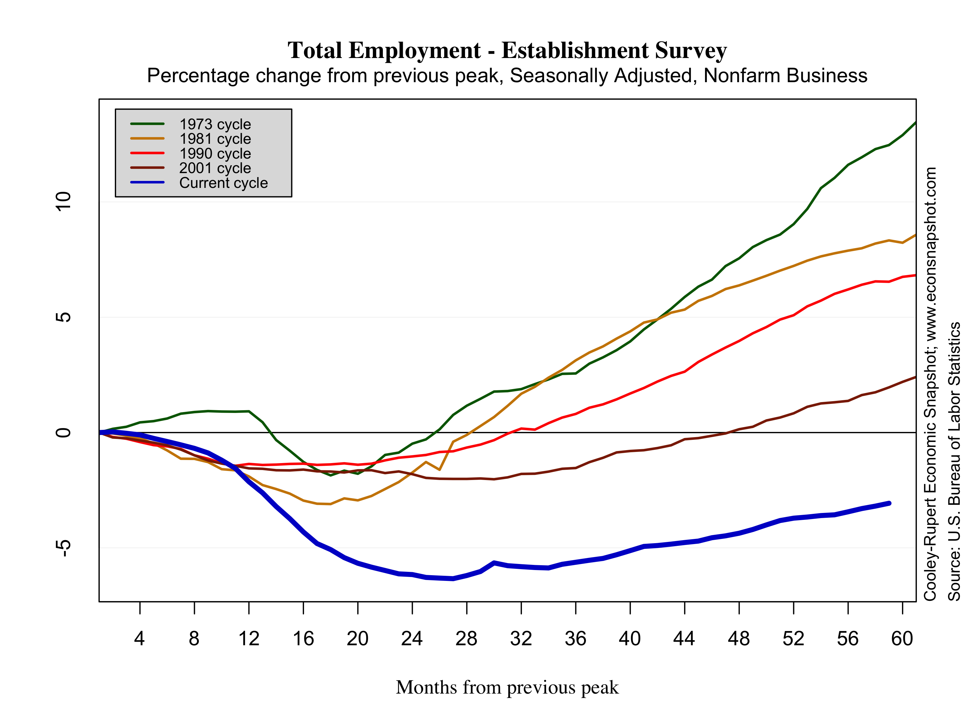
The Employment Situation released today from the BLS is being hailed by many as encouraging and  a positive sign the economy is picking up steam yet, as seen in the graph below, both the pace and the level of the recovery of the labor market are still well below the average from the previous four cycles. The report today shows non-farm payrolls increased 171,000 in October. The report also included upward back-revisions for August (192k from 142k…note that the revision was nearly 100k higher than the advance estimate!) and September (148k from 114k).  Employment gains were primarily attributed to service industries (+163K), led by retail trade (+36.4K) and health care (+32.5K). Goods producing industries increased over the month (+21K) after two consecutive months of decline. The market has responded relatively positive the past three employment reports despite the slow growth. For instance, last month the Dow increased .3% based on a reported employment gain of 114K. Comparatively, last October the market decreased 5% based on a similar increase of 112K jobs. What was once seen as weak, is now encouraging. From the same WSJ article above, John Silvia of Wells Fargo Securities says “Over the past three months, private-sector job gains have averaged 149,000, suggesting sustained growth even though the trend remains subpar”. As the graph below shows, the trend was the same last October as it is now. The difference is maybe the market as a whole is starting to believe 149K  is now the new long term trend. If this is the case, a 171K jobs number is certainly positive.

Continue reading “Employment Snapshot – The New Positive”

Advance Q3 Estimate: Defense Spending Surge Drives Slightly Higher GDP Growth

Is this good news? The advance estimate of Q3 Real GDP, released on October 26 indicates a 2.0% rise in real GDP: Still pretty tepid but higher than the 1.3% growth in the second quarter. But, you may want to keep the celebration in check – the major part of the increase was driven by a large 9.6% increase in Federal Government spending and a big part of that was defense spending: National defense spending rose 13.0%. Overall, the increased Federal spending accounted for .7% of the 2% growth in real GDP essentially all of the increase since the second quarter.  Note that government spending rose 3.7% overall, the first increase in 8 quarters. The last time government spending fell for 8 consecutive quarters was the unwinding of the Korean War, from 1953:Q3 to 1955:Q2.

There is a legitimate question about whether increased growth fueled by government spending that is financed by borrowing has welfare implications that we should be happy about. This is a hotly debated issue and is particularly pertinent since other aspects of the economic picture were quite weak. Gross private domestic investment was weak, growing at just 0.5%, with investment in non-residential structures declining at 4.4% and equipment and software investment flat at 0.0%. This counters somewhat the revival of residential investment that has been the subject of much publicity. The upcoming jobs report for October will help to sharpen views about the recovery.

Continue reading “Advance Q3 Estimate: Defense Spending Surge Drives Slightly Higher GDP Growth”

Is Labor’s Share of Income Declining?

Recently there has been much attention surrounding the behavior of labor’s share of income. Although it seems like it should be completely straightforward, the measurement of labor’s share is a bit tricky. As was pointed out by Tim Worstall, a contributor to Forbes, this problem is “geeky.”

The issue has been raised again in a recent article out of the Federal Reserve Bank of Cleveland’s Economic Commentary series, Labor’s Declining Share of Income and Rising Inequality, by Jacobson and Occhino. Evidently, some of their underlying calculations were taken from a paper Paul Gomme and I wrote years back, Measuring Labor’s Share of Income, also from the Cleveland Fed. In that paper we carefully described the calculations for measuring labor’s share and compared that to the measure employed by the Bureau of Labor Statistics.

Jacobson and Occhino mention that their calculations were based on the work Gomme and I did but they neglect important components in the calculation. Below we show four different measures including the Occhino-Jacobson and Gomme-Rupert measures.

So, what is the cause of the discrepancy? Here is the geeky part. There are some things that are obviously returns to labor income, for example, wage and salary income, call this unambiguous labor income. Similarly, there is unambiguous capital income, like the returns to owning an office building. Therefore, we can determine how much of this unambiguous income goes to labor and how much to capital. One geeky problem arises due to “ambiguous” income. For example, think of a sole proprietor. Some of the income of this proprietor is a return to labor (the hours spent working) and some will be a return to the capital owned by the proprietor (computer, store scanner, etc). In the data these are not broken out separately. Accepted practice  is to allocate shares of ambiguous income to labor and capital in the same proportion as derived from the unambiguous incomes. In the end, labor’s share is obtained by dividing unambiguous labor income by total unambiguous income (that is, unambiguous labor income and unambiguous capital income).

Here’s where things get really geeky. The problem with the Jacobson and Occhino calculation is that they neglected to make adjustments for the government and the housing sectors. In the data there is no capital income series for the government. All income for that sector appears as wage income to government workers. While the housing sector does break out the two, it also includes a source of capital income (imputed rent to owner-occupied housing) for which there is no corresponding labor income.. Paul Gomme and I recently  redid the calculations and the results are shown in the Figure below. The “Raw NIPA data” line in the graph turns is the line that Jacobson and Occhino report, the last data point being 63.8%. Once the adjustment to the housing and government sectors are taken into account, it is evident that labor’s share moves around its long run average – there does not appear to be a downward trend. Note that all of the measures show that labor’s share is currently below its long run average, as it will be from time to time. In the graph below we plot the data starting in 1929 (Jacobson and Occhino started in 1947) because that is the earliest data available from the National Income and Product Accounts (NIPA).

the fall in labor’s share since 1970 identified by Jacobson-Occhino is precisely because they didn’t do the adjustments for the government and housing sectors that we implicitly told them they should do. From 1970 to 2011, the gap between the Gomme-Rupert measure of  labor’s share of income and Jacobson-Occhino’s rises from around 3 percentage points to 4.5 percentage points, or a rise of 1.5 percentage points. If you add the government wages and salaries into the Gomme-Rupert calculation, the gap rises from 10.5 percentage points to 11.5 percentage points for a rise of 1 percentage point. This increase reflects the well-known (?) fall in the share of government wages and salaries in income. If instead, you add housing income flows to the Gomme-Rupert calculation, the rise is from 5.5 percentage points to 6.6 percentage points, or a rise of 1.1 percentage points. This latter increase is due to a less well known increase in housing sector capital income’s share of GDP. Whether this latter increase can be attributed to rising housing prices– 2009 represents a high for housing capital income as a share of GDP; it falls in 2010 and falls further in 2011–is not that clear. These observations make me suspicious that movements in this series are driven in large part by housing prices.

The principle difference is that for Jacobson and Occhino, labor’s share is below its long run average almost every year since 1980 (there are a handful of years where the share is essentially at its mean) whereas the Gomme-Rupert series still looks like it’s fluctuating around its long term average. It may be premature to declare a long term decline in labors share.

Continue reading “Is Labor’s Share of Income Declining?”

Snapshot – Cautious Optimism for the Labor Market

The Employment Situation released today from the BLS, shows non-farm payrolls increased 114,000 in September. The report included upward back-revisions for August (142k from 96k) and July (181k from 141k). The increase was still below the average monthly employment gain in 2012 of 146,000, and below the revised employment gains from July and August of 181,000 and 142,000, respectively. As seen in the graph below, both the pace and the level of the recovery of the labor market are still well below the average from the previous four cycles. Employment gains were primarily attributed to service industries, led by health care (+44K) and transportation and warehousing (+17K). Goods producing industries declined over the month. Particularly discouraging was the decline in manufacturing payrolls (-16K) coming on the heels of the positive report from the ISM that overall manufacturing activity increased in September.

The national unemployment rate decreased over the month from 8.1% to 7.8% and for the first time since the recovery began, the decline wasn’t affected by a reduction in participation. The labor force participation rate increased slightly to 63.6%. While still far below the participation rate of 66% at the peak, the dual increase in participation and reduction in unemployment is a sign for cautious optimism.

The BLS also recently released the preliminary estimate for the benchmark revision for March 2012. The estimate revises employment upward for March 2012 by 386,000; moreover, private employment revised up 453,000.

There has also been much ado about the massive increase in the seasonally adjusted one month change in household employment numbers from the CPS–the increase reported is a whopping 873,000. Was there such clamor back in January 2012 when that same statistic was reported as 847,000 (establishment survey reported +275,000)? Or the 991,000 (establishment survey reported +95,000) increase in January 2003? Or the 2,036,000 (+248,000 for the establishment survey) in January 2000? The household numbers also show that of the 873,000 increase in employed persons, 582,000 were part time.

Continue reading “Snapshot – Cautious Optimism for the Labor Market”

Slow growth just got slower: third estimate of Q2 Real GDP

The third estimate of Q2 Real GDP, released on September 27 shows that previously reported slow growth was even slower. The previous estimate of 1.7% was revised down to an anemic 1.3%. Note, however that the annual benchmark revisions in July increased both 2011 Q4 (was  3.0% now 4.1%) and 2012 Q1 (was 1.9% now 2.0%). Personal consumption was revised down somewhat, 1.5% from 1.7%, after increasing 2.4% in Q1. Secvojnd quarter growth is approaching stall speed and early indications about the third quarter are not encouraging.

Continue reading “Slow growth just got slower: third estimate of Q2 Real GDP”

Snapshot – The Dismal Labor Market: Slim Prospects for the Unemployed

According to the establishment survey from the Bureau of Labor Statistics, nonfarm payroll employment increased by 96,000 in August, undershooting expectations by a large margin. Private payrolls increased by 103,000 while government continued to shed jobs, declining by 7,000. Service sector employment rose by 119,000 while the goods-producing sector declined by 16,000, led by a big decline in durable goods manufacturing, falling 17,000. The report undershot expectations by a large margin, many had predicted the labor market would add about 125,000 jobs or so. Moreover, downward back revisions of 41,000 over the previous two months show a much weaker labor market. While there had been some upbeat, hopeful, data released toward the end of this week, the labor market did not listen. The labor market has developed a bit of a bump in the recovery road, according to the BLS, “Since the beginning of this year, employment growth has averaged 139,000 per month, compared with an average monthly gain of 153,000 in 2011.” It has also become evident in the labor market that we continue to drown our sorrows…employment in food and drinking establishments has risen 298,000 over the past 12 months.

The household survey from the BLS revealed a slight decline in the unemployment rate, edging  down to 8.1%. However, the number of unemployed persons remained about the same at 12.5 million and of those, about 40% are categorized as long-term unemployed, having been unemployed 27 weeks or longer. More discouraging perhaps is the fact that both the labor force (154.6 million) and the labor force participation rate (63.5%) fell. The last time the participation rate was this low was in June of 1979. It should be noted however that labor force participation began to decline around the year 2000 after rising steadily since the early 1960’s; but since the Great Recession has declined at a faster pace.

Continue reading “Snapshot – The Dismal Labor Market: Slim Prospects for the Unemployed”

It’s Slow, but it’s Growth

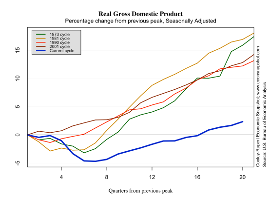
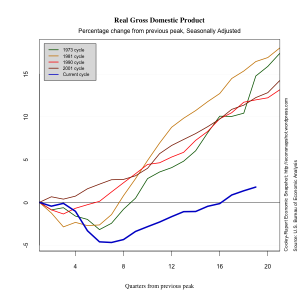
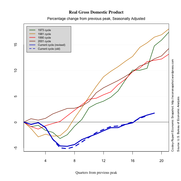
The Second Estimate of Q2 GDP, released on August 29 shows slow, continued growth in many areas, although there isn’t too much to remark on in the current release. The revision for GDP was up, 1.7% from 1.5%. Consumption was revised up the same, from 1.5% to 1.7%, led by an increase in the revision of services, from 1.9% to 2.4%. The graph below plots real GDP comparing this recession and recovery to past ones. A major theme of this blog is that to get an accurate snapshot of where the US economic recovery is, it is necessary to have a benchmark with which to compare. The graphs we present use the comparison of past cycles to guide our understanding of the current economic environment.

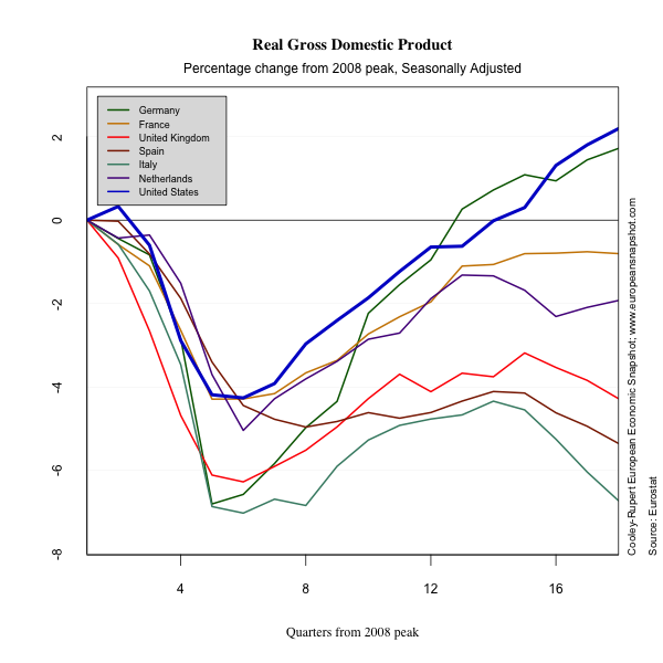
Many have commented on the slow growth coming out of the recession and that commentary is likely using the above comparison. Indeed this last recession and the current recovery stand out compared to any seen since the Great Depression. So, comparing against past recessions and recoveries is one way to put things into perspective. Certainly the crisis that struck the world at the end of 2007 and beginning of 2008 was unprecedented, save for the Great Depression. Not only in causes and scope, but also in its global reach. An interesting comparison might be to look at how several European countries have fared relative to the U.S. Each country felt the crisis in different ways and responded in different ways, leading to different outcomes. The graph below shows the percentage change of real GDP from the peak of the business cycle in Europe (2008 Q1) and the U.S. (2007 Q4).

In this perspective the US hasn’t fared so badly. The depth of the recession in the US was not as bad as that felt in Germany, Italy, or the UK. In terms of recovery, the US is on pace with Germany, around 2 percentage points above peak level. In fact, Germany is the only EU country pictured that has positive output growth, while the rest remain stagnant or are actually falling. The point here is that maybe, just maybe, the U.S. and Germany are doing as well as can be expected given the global environment. And yes, we always want more and we want it faster…but it might not be realistic.

Below we present a snapshot of the current recovery in terms of consumption, investment, government spending, exports and imports.
Continue reading “It’s Slow, but it’s Growth”

Snapshot – The July Employment Report and Unemployment Scenarios for November

Nonfarm payroll employment increased by 163,000 (the median forecast was around 100,000) in July after increasing a revised 64,000 in June and 87,000 in May. The unemployment rate edged up from 8.2% to 8.3%. This increase was in spite of a decrease in labor force participation which decreased from 63.8% to 63.7% and reflected another downward tick in the employment population ratio. Participation is now at historically low levels.

In our last snapshot of the labor market, we used the Atlanta Fed’s Jobs Calculator to evaluate some likely scenarios of the state of the labor market come the November elections. The job’s calculator in essence does some back of the envelope calculations on what the monthly jobs number needs to average to reach a certain unemployment rate at a specified point in the future.

After this morning’s July release, there will be only 3 additional months of data until people enter the voting booths in November. Employment gains are typically slightly higher in September and October than in the summer months, so if we are optimistic that employment will continue to increase by the same amount as it did in July, that would indicate that, by November, the unemployment rate will drop to around 7.92%. Sounds optimistic? It probably is.

This assumes that the labor force participation rate will remain historically low (at 63.7%). Since the peak of the business cycle in 2007 Q4, labor force participation has decreased by 2.3 percentage points (66% to 63.7%). That decrease is partly to attributed to long term demographic changes like the aging of the baby boomers. But a part of that decrease is certainly attributable to cyclical factors.  A large number of discouraged workers (those who would like to work, but have given up searching) still remain in the pool of people out of the labor force. The decisions of these workers  to begin searching for a job and enter the labor force is an important determinant of the unemployment rate.  Here are some other scenarios for November with different levels of the participation rate (assuming monthly job gains will be around 170,000).

  • If the labor force participation stays at 63.7%, the unemployment rate in November will be around 7.9%.
  • If the labor force participation increases to 63.9%, the unemployment rate in November will be around 8.2%.
  • If the labor force participation increases to 64%, the unemployment rate in November will be around 8.35%.
  • If the labor force participation increases to 64.1%, the unemployment rate in November will be around 8.48%.

As you can see small swings in the participation rate have large consequences for the unemployment rate  in November.

The Recovery in the Rearview Mirror and Discouraging News About Q2

The first report on second quarter real GDP growth was largely as expected after many weak signals. Real GDP grew at a seasonally adjusted annual rate of 1.5% in the second quarter of 2012. Annual benchmark revisions show growth rates of 2.0% (was 1.9%) in Q1 and 4.1% (was 3.0%) in Q4 of 2011. The overall path of the expansion is somewhat weaker as a result, with revisions dating back to 2009 showing 2010 revised down (now 2.4% was 3.0%) with nearly offsetting upward revisions for 2009 (now -3.1%) was -3.5%) and 2011 (now 1.8% was 1.7%).

Revision highlights and low lights

While the revisions did little to the overall path of the recovery, there were some interesting and large revisions to the components. As an example, nonresidential investment and investment in structures saw large upward revisions in growth rates over the past several quarters.

                            Q2 11  Q3 11  Q4 11  Q1 12 
  Nonresidential..........  14.5   19.0    9.5    7.5
   Previously published..   10.3   15.7    5.2    3.1
    Structures............  35.2   20.7   11.5   12.9
      Previously published  22.6   14.4    -.9    1.9

In spite of the stronger picture for these series, there were downward revisions to investment in equipment and software. For this reason it is useful to have a complete picture of the revisions to see how extensive they can be. We present this below.

The most important part of this data release are the preliminary estimates for second quarter GDP and its components. These suggest a weakening and possibly faltering recovery.  Consumption of non-durables increased only very slightly and consumption of durables declined after a strong first quarter rebound that helped the auto sector.  Both exports and imports increased compared to the first quarter.
The evidence suggests that the situation in Europe where most of the economies are contracting again and the slowdown in the emerging margins of Asia are having an effect on the U.S. recovery.  The lengthy contraction in employment is a potent of how severe our “growing pains” are.

In a departure from our standard presentation, we show the revisions explicitly in the following graphs so you can see how the picture of the recovery changes with better information. The magnitude of the revisions raise the question of whether markets overreact to preliminary information about the recovery….or is it simply the business press who over react?

Continue reading “The Recovery in the Rearview Mirror and Discouraging News About Q2”