By Peter Rupert
When Kevin Warsh told the Senate Banking Committee that the standard inflation numbers are “quite imperfect” and that he prefers “trimmed averages,” he pushed a wonky corner of inflation statistics into a political spotlight—and, with it, an old and worthwhile question: underneath the monthly noise, what is the underlying rate of inflation, and how should we estimate it?
The debate that followed mostly talks past itself, because it runs together things that ought to be kept apart. The central confusion is this: the trimmed mean is not a different, softer inflation number you choose. It is a more efficient estimate of the same inflation the headline is already trying to measure. Once that is clear, the case for it comes in three parts—a theoretical case for why trimming is the right way to estimate the center of price-change data, an empirical case for what the CPI data actually show when you do it, and a practical case for why the CPI is the index to trim and why trimming is the sensible tool to reach for.
The Theoretical Case
The CPI is an estimate
Start with what the headline number actually is. The all-items CPI is a weighted average of price changes across hundreds of components—a sample estimate of an unobservable quantity: the true central tendency of price change across the basket households buy. The ordinary average is one estimator of that quantity. The trimmed mean is another. They aim at the same target; the only question is which recovers it more reliably.
Efficiency: fat tails break the sample mean
For the kind of data inflation produces, the ordinary average is the worse estimator. In any given month the cross-section of price changes is not spread out smoothly—most components cluster tightly while a handful sit far out in the tails, a “fat-tailed” (leptokurtic) distribution. For such data the sample mean is inefficient: those few extreme values grab the average and jerk it around, so the headline lurches from month to month even when the underlying rate has not moved. Trim the tails and you recover the same central tendency with far less noise.
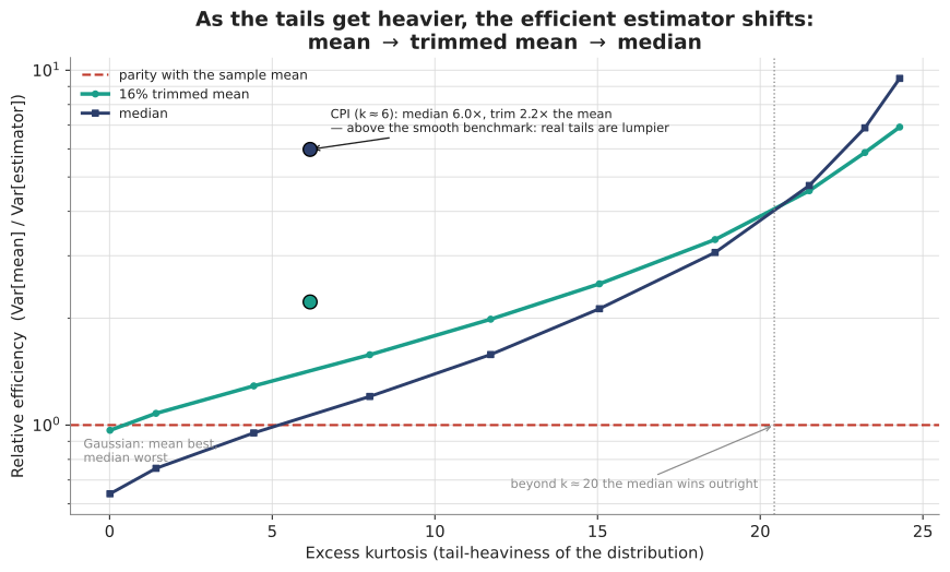
We can say precisely how this plays out. Simulating from distributions of increasing tail-heaviness, the efficient estimator shifts in a clear sequence: for near-Gaussian data the sample mean is best; once the excess kurtosis climbs above about one-half the trimmed mean overtakes it; and as the tails grow heavier still the median overtakes them both. Real CPI data sits well inside that range—a typical monthly cross-section has an excess kurtosis around 6—and there both robust estimators beat the sample mean handily: on the Cleveland Fed’s components the trimmed mean is roughly 2.2 times as efficient an estimator of the center as the simple average, and the median about 6 times. The plain average is the efficient choice only in a narrow near-Gaussian sliver that inflation never occupies. The empirical points sit above the simulated curves—the median markedly so—because a real CPI month is the extreme case the smooth model only approximates: a tight cluster of prices plus a lone outlier like gasoline, which is exactly the structure the median is built to ignore.
Mike Bryan’s first rule: every price is idiosyncratic
The deepest objection to trimming is that by discarding an outlier we might throw away real information—that today’s extreme mover is the leading edge of tomorrow’s trend. This rests on an assumption worth naming and challenging.
The economist Michael Bryan, then at the Federal Reserve Bank of Cleveland, did more than anyone to bring robust estimators into inflation measurement: the weighted-median and trimmed-mean CPI both grew out of his work with Stephen Cecchetti in the 1990s, which showed that trimming a fixed fraction from each tail of the monthly price-change distribution yields a markedly more efficient estimate of trend inflation than the simple average (Bryan and Cecchetti 1997). Call it Bryan’s first rule of prices: there is no such thing as a price change without an idiosyncratic component. Every price is the outcome of a particular market with its own trend and its own shocks. Some idiosyncratic movements are larger than others, but there is no way to know, a priori, how large—a big observed change might be a large idiosyncratic shock sitting on top of a downward trend, the two partly cancelling. You cannot read a single month’s outlier and know whether it is signal or noise. That is exactly why an agnostic statistical estimator is called for, rather than a judgment about which movements are “really” informative.
A rule, not a judgment
This is the cleanest reason to prefer the trimmed mean over the traditional “core” fix, and it is a point of principle. There is a real difference between blindly trimming the tails of a distribution and targeting specific goods for exclusion. Core inflation—the CPI stripped of food and energy—makes a judgment: it decides in advance that food and energy are the noisy items and removes them every month, whether or not they were the problem that month, and it leaves in whatever else happens to be lurching. The trimmed mean makes no such judgment. It applies a rule: rank the components this month, remove whatever sits in the tails, average the rest. It never has to know in advance where the noise will come from—which is fortunate, because by Bryan’s first rule, no one does.
The Empirical Case
Theory says trimming should work. Whether it is needed, and whether the objections to it actually bite, is an empirical question about a particular index. To answer it we rebuilt the Cleveland Fed’s exact 45-component measure from the underlying BLS data, using the weights from their own component table (including their four census-region owners’ equivalent rent splits). It reproduces their published trimmed-mean and median series closely—a correlation of about 0.97, root-mean-squared error under half a percentage point, over 172 months. Everything below is computed on that measure—theirs, not an approximation.
Two concrete months: March and June 2026
The mechanism shows up in single months, and the last few have supplied an almost laboratory-clean pair.
In March 2026 the headline CPI rose at a 12.6 percent annual rate—taken at face value, an inflation emergency. But look at where the components actually sat. The great majority were rising in the low single digits. The number was driven by energy: gasoline jumped more than 21 percent in the month, and fuel oil nearly 19 percent. Those are not signals about underlying inflation; they are two fat tails in a fat-tailed month. The simple average hands them their full weight and is dragged to 12.6. The trimmed mean sets them aside and estimates the same underlying rate at 2.4 percent; the median, at 2.8. Same target, cleaner reading.
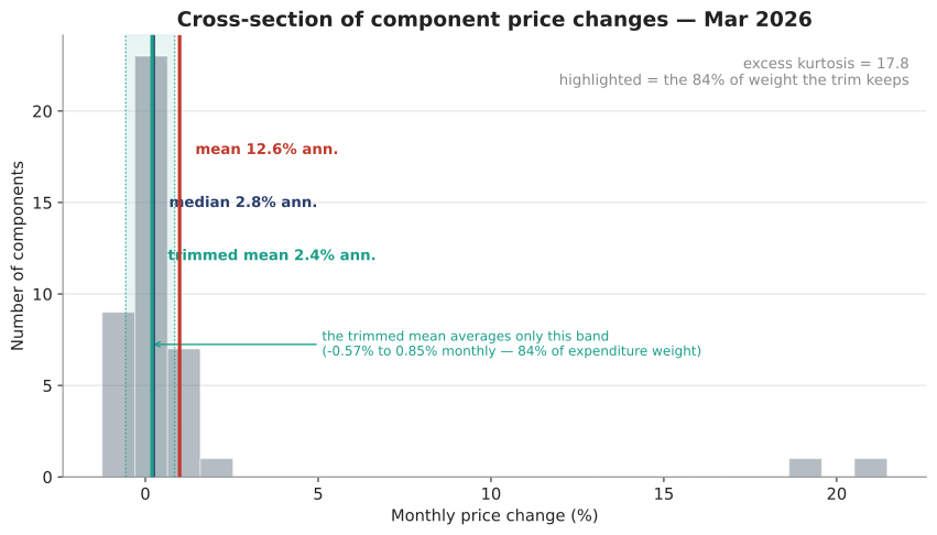
Then June, and this is the part that should settle the charge that trimming is a dovish trick. The headline fell, at a 4.0 percent annual rate, as the energy spike unwound. The trimmed mean read 0.6 percent—that is, higher than the headline. In March the trim read ten points cooler than the simple average; three months later it read more than four points hotter. It is not biased down. It is biased toward the middle, which is the whole point. Which direction that lands in any given month is not the analyst’s to choose.
Trimming halves the noise
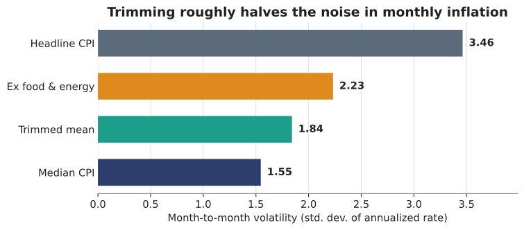
March and June are not flukes. Over the full sample the measures rank by month-to-month volatility exactly as the theory predicts—the trimmed mean cuts the headline’s noise roughly in half (a standard deviation of 1.8 against the headline’s 3.4), and the median is steadier still at 1.6. Core, at 2.2, is noisier than either.
The skewness question, and Waller’s example
The one serious way trimming could go wrong is skewness. If the price-change distribution is persistently skewed, a symmetric trim no longer recovers the mean—it drifts toward the median and biases the estimate. Governor Christopher Waller illustrates this with a three-good economy in which sharp price increases rotate across goods period after period: trim the extremes each period and you report 2 percent while true inflation is 3, because the extra inflation lives entirely in a tail that keeps refilling.
The example is valid—and it quietly names its own fix. Waller has built a persistently skewed distribution, and the answer to persistent skew is not to abandon trimming; it is to trim asymmetrically, cutting more from one tail than the other so the estimator is unbiased again. That is exactly what was done for Brazil, what Rogers did for New Zealand, and what the Dallas Fed does today for the PCE, whose distribution is genuinely skewed. Persistence is not a defeater; it is information you use to set the trim.
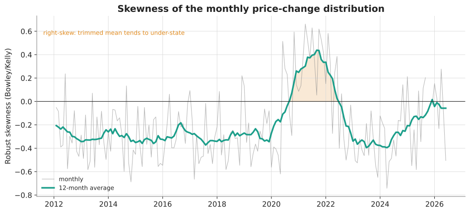
And whether that calibration is even needed is empirical—for the CPI, it mostly is not. The CPI cross-section is left-skewed on average (robust skewness about −0.2) and left-skewed over the past year, the opposite of the regime Waller’s example requires; if anything a symmetric trim runs slightly hot on the CPI, not cold. Over the last three years the headline has averaged 3.02 percent and the trimmed mean 3.01 — a gap of +0.01 percentage points, essentially zero. The headline and the trimmed mean track within a hundredth of a point. There is no 2-versus-3 wedge to find.
The tails carry no signal
Bryan’s first rule is testable. If the discarded tails carried early information about the trend, the gap between the headline and the trimmed mean would forecast where the trend is heading. It does not: regressing future trend inflation on the current headline-minus-trimmed gap, holding the current trend fixed and using standard errors robust to the overlapping windows, the gap’s coefficient is essentially zero (t ≈ 0.6). The trimmed-away tails do not lead the trend.
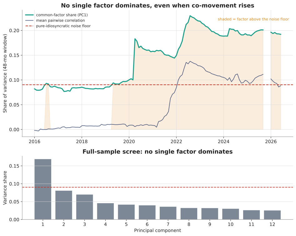
There is a deeper way to see why. Waller’s rotating-spike story needs a hidden common force pulling prices the same way period after period. We looked for one — extracting the single strongest common factor across the components (the 41 with a complete common history) and tracking its share of variance. Through 2019 it sits essentially at the pure-noise floor: co-movement no greater than chance would produce. From 2020 it climbs with the inflation surge and stays elevated — prices did move together more during the shock and its aftermath. But it never comes close to dominating: even at its 2023 peak the strongest factor explains under a quarter of the variance, and it takes eight separate factors to reach even half. There is co-movement, but no hidden common force strong enough to give the trimmed mean a persistent bias to exploit. (Three series that BLS begins publishing later are dropped from this factor analysis, along with the months that precede them.)
The Practical Case
Theory and evidence settle how to estimate inflation. Two practical questions remain: which index to estimate, and why trimming is the sensible instrument rather than an exotic one.
Why the CPI, not the PCE
Which price index to trim—the CPI or the PCE—is a question of weights and coverage, not of estimation, and it is where the practical considerations live. They point to the CPI.
The CPI is the number the public actually lives with, and it lives with it contractually. Social Security cost-of-living adjustments are set by the CPI, moving benefits for some seventy million people. Many union and private wage agreements carry CPI escalators. Rent-control and rent-stabilization formulas in a large number of cities tie the allowable annual increase to the CPI—in some places the cap is written directly as a CPI-linked number. Inflation-protected Treasuries pay off the CPI. When the CPI prints, real dollars change hands; the PCE, a national-accounts construct, has no comparable direct claim on anyone’s income.
The PCE is also, in practice, downstream of the CPI. The Bureau of Economic Analysis builds much of the PCE from CPI source prices and imputes a good deal of the rest, so the PCE is in substantial part a re-weighting of CPI data—and it arrives about two weeks later. Its weights are revised continually, which injects a revision volatility of its own. So the later, less-familiar index is largely assembled from the earlier, more-familiar one. Whichever index you target, the trimmed version is the more efficient monthly estimate of it—but there is no practical reason to reach past the CPI for a downstream index that fewer people use and that lands later.
Why trim: the company it keeps
The last objection to answer is the intuitive one—that trimming “throws away data.” It does not, and the surest way to see this is to notice how many other fields, facing the same problem, arrived independently at the same tool.
Olympic figure skating, gymnastics, diving, and ski jumping all drop the highest and lowest judges’ scores and average the rest—a literal trimmed mean, adopted precisely so one erratic or biased judge cannot swing the result. Metrologists and experimental physicists trim repeated measurements to blunt instrument glitches; the field of robust statistics grew up around exactly this problem. Signal and image processing use the “alpha-trimmed mean filter,” which sits deliberately between the mean and the median depending on how impulsive the noise is. Even LIBOR was, by construction, a trimmed mean of banks’ submitted rates, chosen to defang both outliers and manipulation.
None of these fields believes it is throwing away information. Each is using the estimator that the shape of its data selects—the mean when the data is well-behaved, something more robust when it is not. Inflation’s cross-section is emphatically not well-behaved; it is among the fatter-tailed distributions one encounters. To insist on the raw average there, alone among all these applications, is the genuinely idiosyncratic choice.
One honest wrinkle, since it recurs: at the CPI’s tail-heaviness the median is even more efficient than the 16 percent trim. Pure variance-reduction would push you all the way to the median. But the 16 percent trim tracks the headline’s underlying trend more faithfully, because it keeps more of the distribution—so the trimmed mean is the better all-round estimate of the same basket, while the median is the steadier but more austere summary. That is why the Cleveland Fed publishes both, and why watching them together tells you more than either alone.
Putting it together
The trimmed mean is not a controversial object once it is seen for what it is. Theoretically, it is the efficient estimator of the center of a fat-tailed distribution, an agnostic rule rather than a judgment about what to exclude. Empirically, in the CPI, the skewness that could bias it is absent, the outliers it discards carry no forecastable signal, and no single common factor is strong enough for the feared bias to run on. Practically, the CPI is the index that matters to real contracts and arrives first, and trimming is the same battle-tested tool that Olympic judges, physicists, and financial benchmarks all rely on.
The debate worth having is not whether the Fed should “switch” to a softer gauge. It is the narrow, almost technical question of whether, having chosen what to measure, one estimates it with the noisy tool or the precise one. Put that way, it scarcely looks like a controversy at all.
A note on the numbers: the trimmed-mean and median series here are built from the Cleveland Fed’s 45 CPI components, drawn from BLS and weighted with the Cleveland Fed’s own component table; they reproduce the Cleveland Fed’s published series at a correlation of about 0.97. The volatility, skewness, forecasting, efficiency, and common-factor results are computed on that same 45-component panel.

5 thoughts on “Reading Inflation Through the Trimmed Mean”