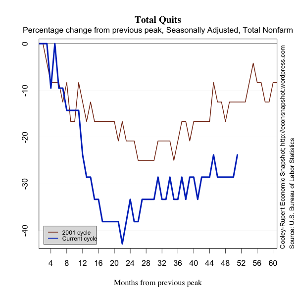
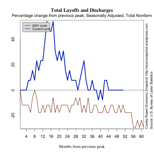
Welcome to the Cooley-Rupert Economic Snapshot, our view of the current economic environment. This is the latest version of our snapshot of the U.S. Economy based on the new employment numbers released on Friday by the Bureau of Labor Statistics. The complete Snapshot based on the preliminary estimates of first quarter GDP from the Bureau of Economic Analysis can be found in our previous post.
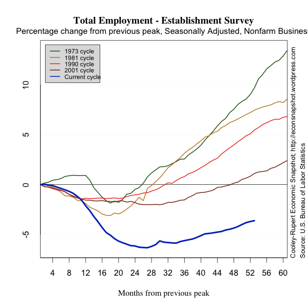
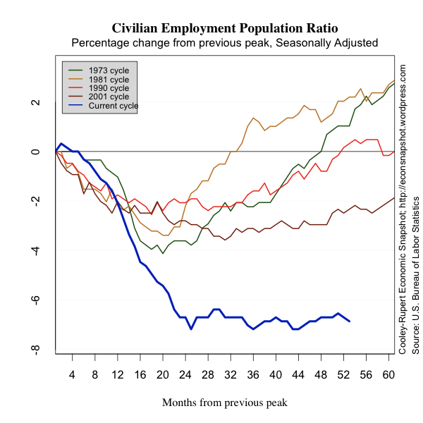
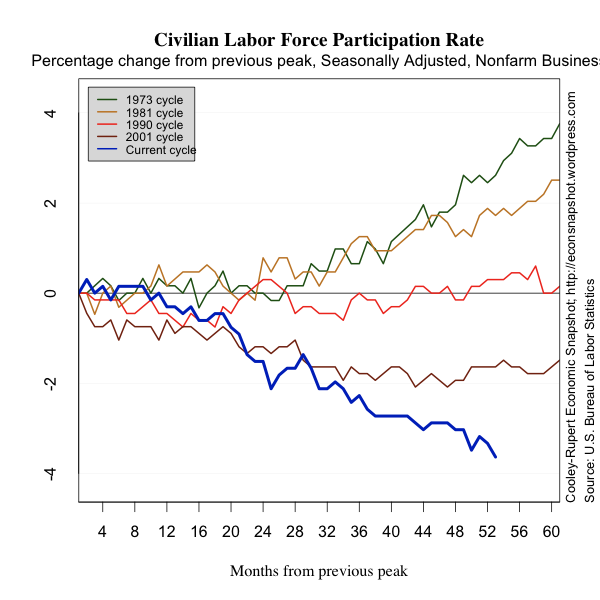
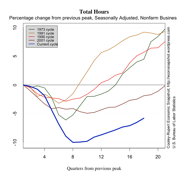
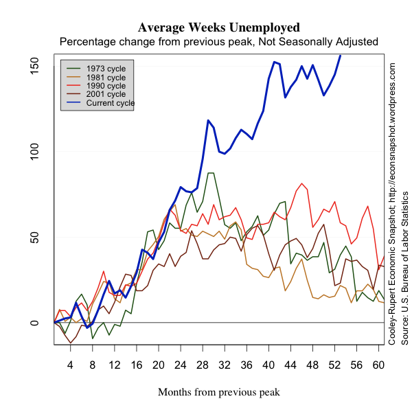
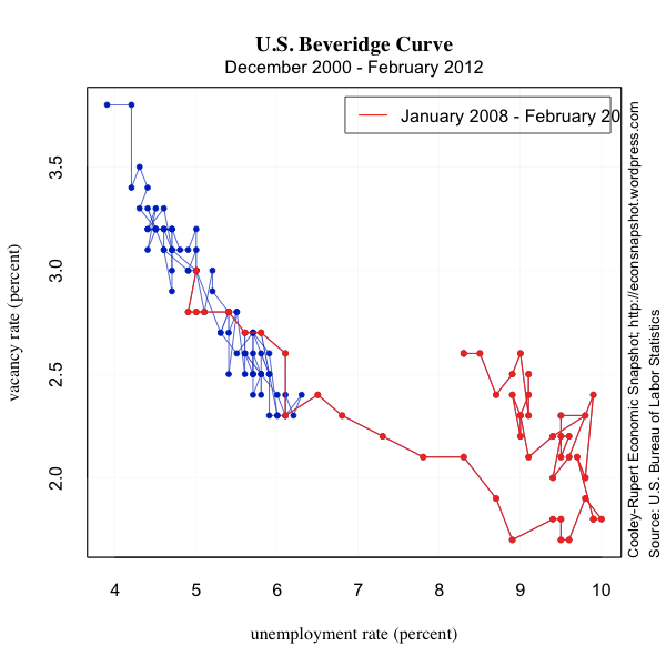
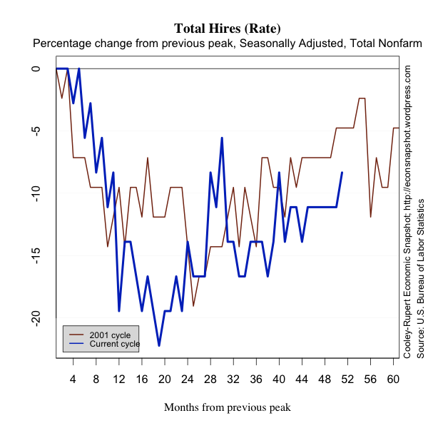
As in all of our snapshots we present the data in a way that we find particularly useful for assessing where we are in the business cycle and tracking the U.S. economic recovery. The paths of all the series presented are plotted relative to their value at the peak of the respective business cycles. We use the business cycle dates identified by the National Bureau of Economic Research.
You can also find the most recent version of the entire snapshot in pdf form here. As always we welcome any suggestions for additional data that you would like to see and suggestions for how to improve the presentation of the data.
A Disappointing and Sluggish Labor Market
The latest Employment Situation report from the Bureau of Labor Statistics shows non-farm payroll employment rose by a only 115,000 jobs in April. This was very disappointing compared to 154,000 jobs added in March (a slight upward revision) and an average of over 250,000 jobs per month for the prior three months. This will provide little updraft to the stagnant labor market. The number unemployed ticked down slightly to 12.5 million but the unemployment rate remained essentially unchanged at 8.1% because the labor force participation rate trended down further to 63.6%. In twelve months roughly 2.7 million people have left the labor force. Many economists have been hoping the labor market would add about 210,000 jobs consistent with the trend earlier this year. For comparison, as we did last month, we plot employment as reported by ADP, an association of payroll processors. Many observers view this as a useful early indicator of the BLS numbers.
The number of long term unemployed fell by 200,000, but, as reported in an earlier post, these are roughly 40% of the total unemployed. The numbers of people who are involuntarily underemployed, marginally attached to the labor force and the number of people who classify as discouraged workers also fell slightly. While these are all slight improvements, the meager job growth admits only very minor improvements in the health of the labor market.
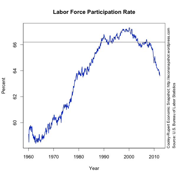
The Federal Reserve Bank of Atlanta has a Jobs Calculator that calculates the number of jobs that need to be created per month given some specified future level of unemployment by some particular date. What is interesting to note is that the number of jobs that need to be created depends on the number of people in the labor force. In the labor force participation chart below, it is easy to see the spectacular rise in the labor force since the early 1960’s, attributable to the rise in female labor participation. Female labor force participation increased from 34% in 1950 to a peak of 60% in 1999. Since then it has drifted slightly lower to 58.1 % in 2011. Male labor force participation has drifted slowly down over the same period. In 1950 it was 86.4%. In the most recent month it was 70%, the lowest rate since records have been kept. These changes in labor force participation reflect a mix of demographics, long term cultural shifts and perceived opportunities in the labor market. They have important implications for our understanding of the jobs problem.
In January 1993 the aggregate labor force participation rate was 66.2%. In January 2008 the labor force participation rate was also 66.2, just one month after the beginning of the recession was dated in December, 2007. The highest labor force participation rate to date was recorded in the first four months of 2000. The current labor force participation rate is 63.6%. Now, according to the Jobs Calculator at the FRB Atlanta, 146,417 jobs must be created per month to reach 7.5% unemployment by the end of 2013, which is in the middle of the central tendency of the forecasts by the Federal Open Market Committee. This is not an unreasonable number, although above the latest employment numbers. Now, instead, suppose we believe the labor force participation will climb back to 66.2% (shown on the graph), the number just as we entered the recession…and below the all time high. The choice reflects the conservative belief that maybe the growth in labor force participation between 1993 and 2008 was unsustainably high. Under this scenario, to get to a 7.5% unemployment rate by the end of 2013 would take 438,547 per month! Obviously, the job creation over the past several years is much below this number. This indeed puts a new perspective on the health and very sluggish improvement in the labor market, not to mention the likelihood the FOMC’s projections (and many other’s) will be met.
Employment continued to increase in professional and business services, health care services and leisure and hospitality. Manufacturing jobs also increased. Retail trade employment increased following earlier declines.
