This is the latest version of our snapshot of the U.S. Economy based on the new employment numbers released today by the Bureau of Labor Statistics. The complete Snapshot based on revisions to third quarter data on National Income and Product from the Bureau of Economic Analysis can be found in our previous post. As in previous snapshots we present the data in a way that we find particularly useful for assessing where we are in the business cycle and tracking the U.S. economic recovery. The paths of all the series presented are plotted relative to the their value at the peak of the respective business cycles. We use the business cycle dates identified by the National Bureau of Economic Research.
You can also find the most recent version of the entire snapshot in pdf form here. As always we welcome any suggestions for additional data that you would like to see and suggestions for how to improve the presentation of the data.
The Labor Market
The latest Employment Situation report from the Bureau of Labor Statistics shows a net addition of 120,000 non-farm jobs in November. Prior payrolls were revised higher for October (100,000 from 80,000) and lower for September (110,000 from 158,000). While not a robust recovery, the numbers represent steady improvment. The Government and Construction Sectors continue to shed jobs. All other sectors improved. For comparison, we also include employment as reported by ADP, an association of payroll processors. Many observers view this as a useful early indicator of the BLS numbers.
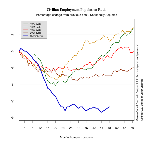
An apparently encouraging sign is that the civilian unemployment rate declined sharply to 8.6%. Unfortunately this reflects in part a sharp decrease in labor force participation by 0.2% to 64%. This is most likely a reflection of discouraged workers discontinuing their job search. As a result the employment population ratio, seen as a metric of the size of the labor market, only increased .1 percentage points to 58.5%.
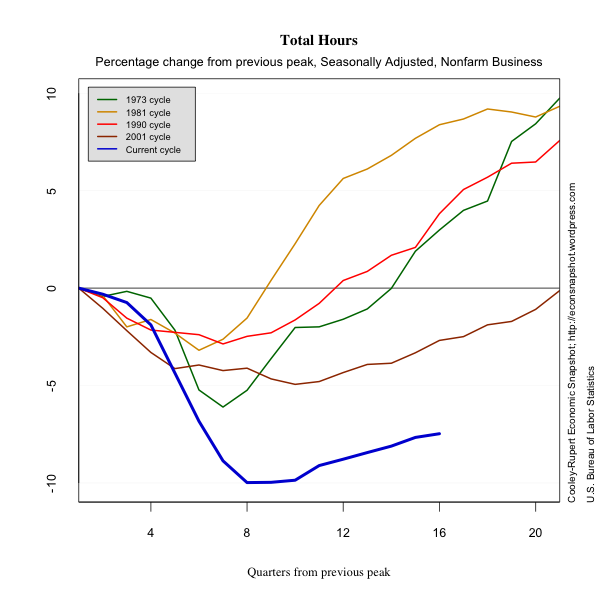
We include data on Aggregate Hours of work and the duration of unemployment. Aggregate Hours captures changes in both the extensive margin of labor force adjustment (employment), and the intensive margin (hours of work). Many believe this offers a more accurate picture of the economy …and the picture is grim. Currently the average number of weeks spent unemployed is 41.1. That is 150% higher than it was at the peak of the business cycle. At this point during the previous four recoveries, unemployment duration was on average only 16% above its peak level. Indeed, during the so-called “jobless recovery” at the beginning of this decade, duration was only about 50% above the level at the previous peak.
Productivity continued to increase and unit labor costs continued to decrease. The duration of unemployment crept slightly higher this past month.
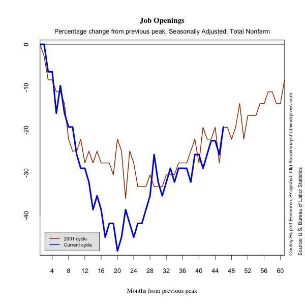
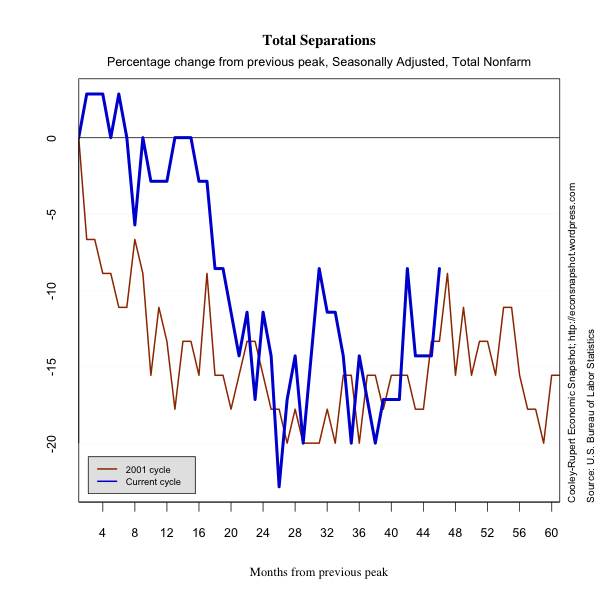
As noted in our last report the latest data from JOLTS, the Job Openings and Labor Turnover Survey shows an increase in vacancies, and an increase in quits. Both of these suggest that the labor market is beginning to show more flexibility than in the last several months. In fact while the level of openings and quits are still well below their value from December 2007, the start of the cycle, they closely track the trend from the 2001 cycle. The changes are modest but encouraging. Below are graphs showing JOLTS data and data updated from Friday’s Employment Situation.


