By Thomas Cooley and Peter Rupert
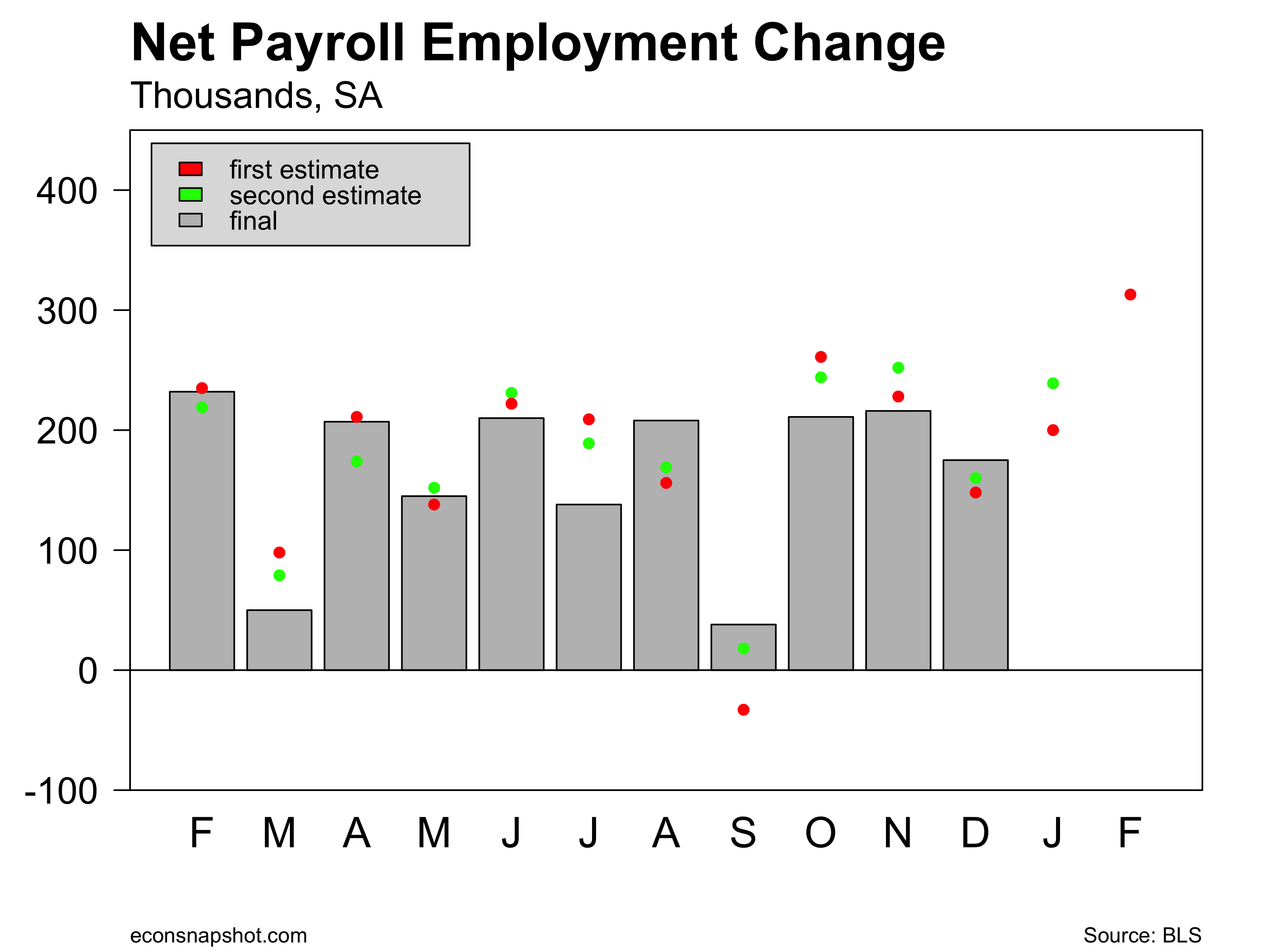
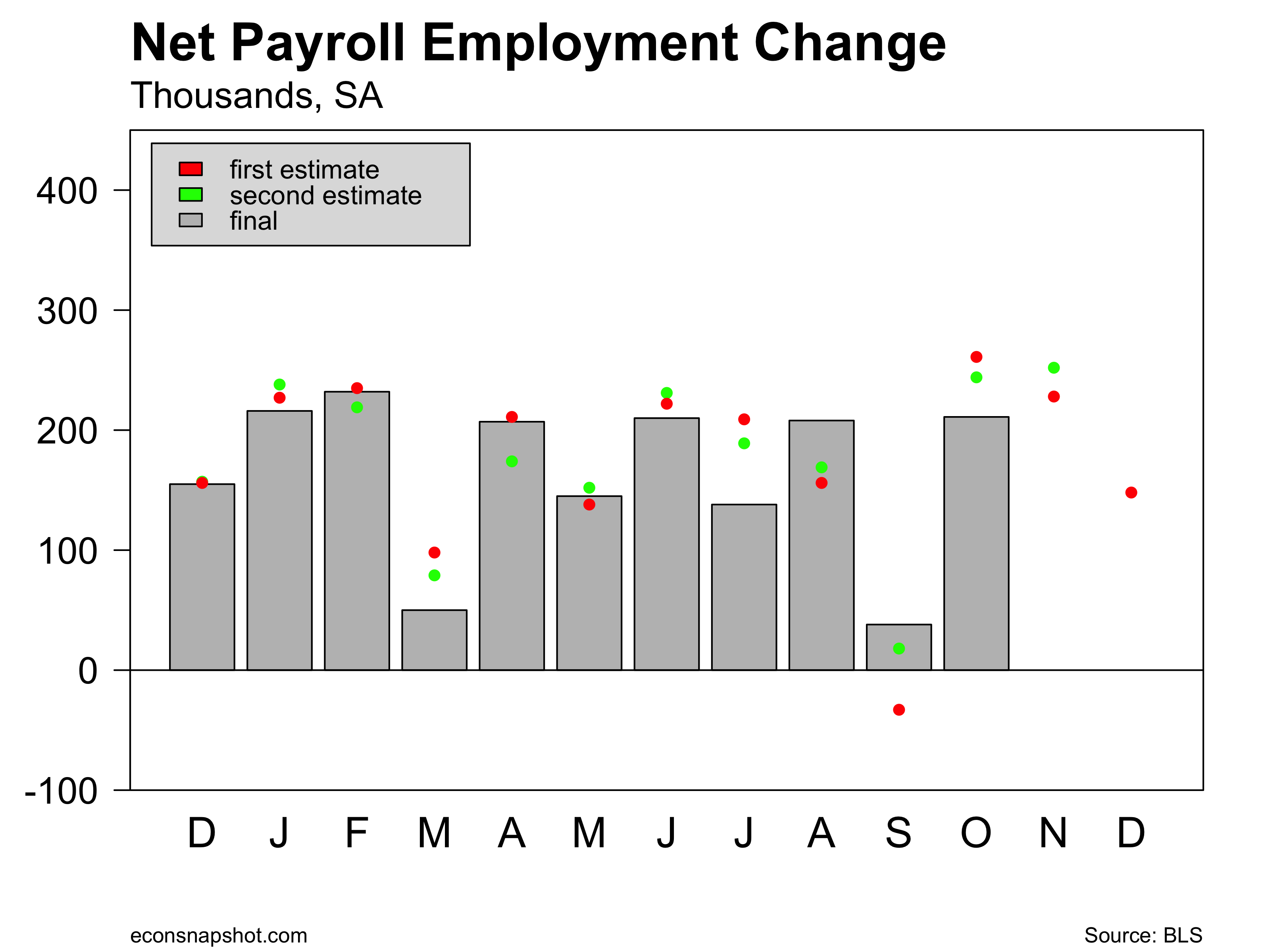
The BLS announced that nonfarm payroll employment rose by 103,000 in March and revised February employment up 13,000 to 326,000 and January down 63,000 to 176,000. The 50,000 in downward revisions and the weak 103,000 March number paints a fairly different picture of the labor market…one not quite as strong as it was just yesterday.
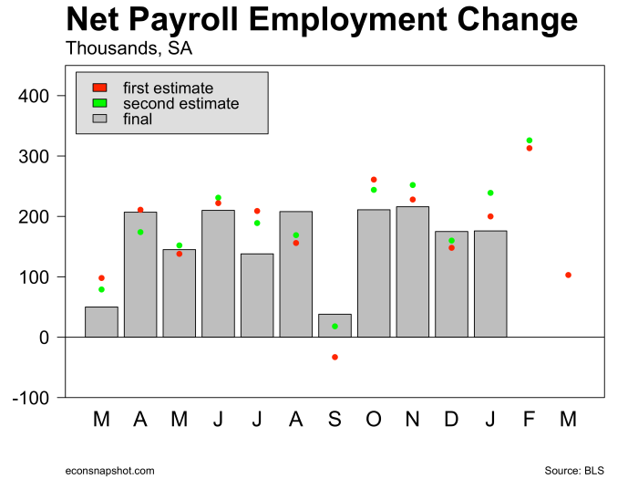
The sharp drop off may well have been weather related as the construction sector lost some 15,000 jobs in March.

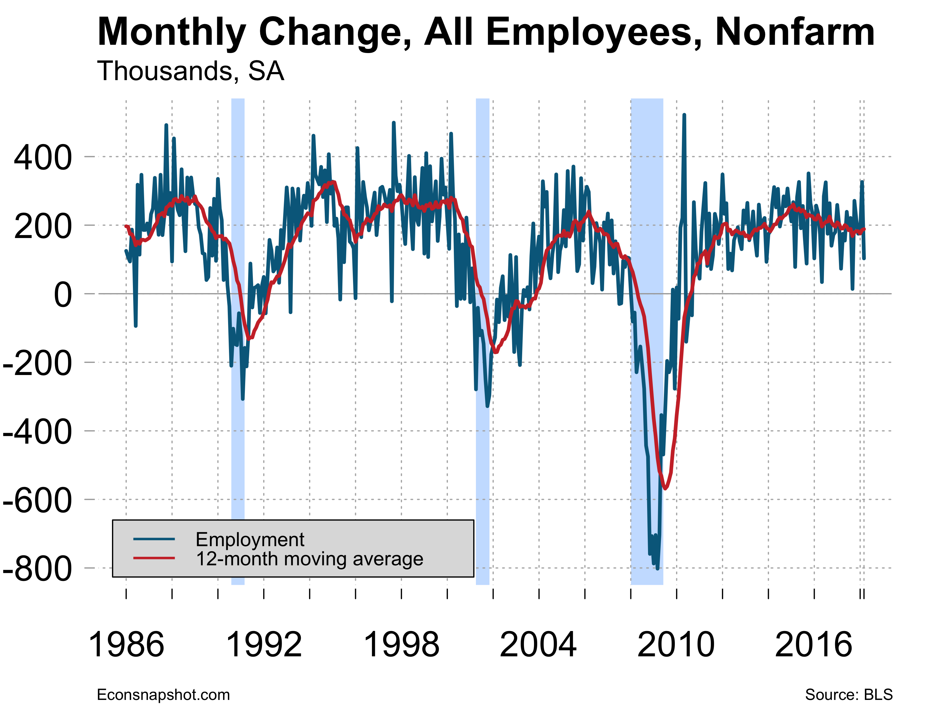
Looking at the data over a longer period of time with a 12 month moving average suggests that employment growth has been slowing for some time. But this is the ninth year of an expansion and the fact that the economy is continuing to add jobs at a good pace is encouraging, the March hiccup notwithstanding.
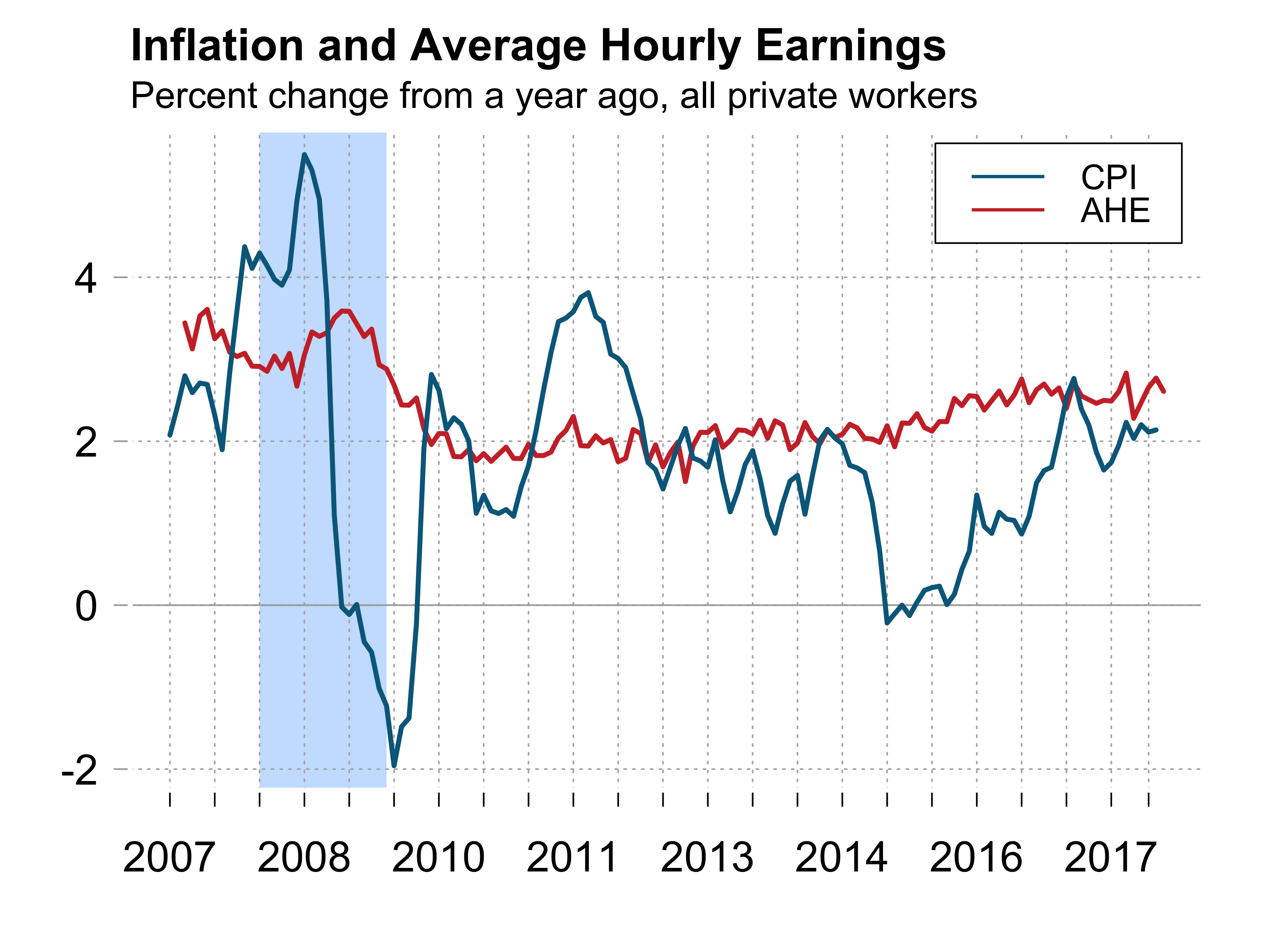
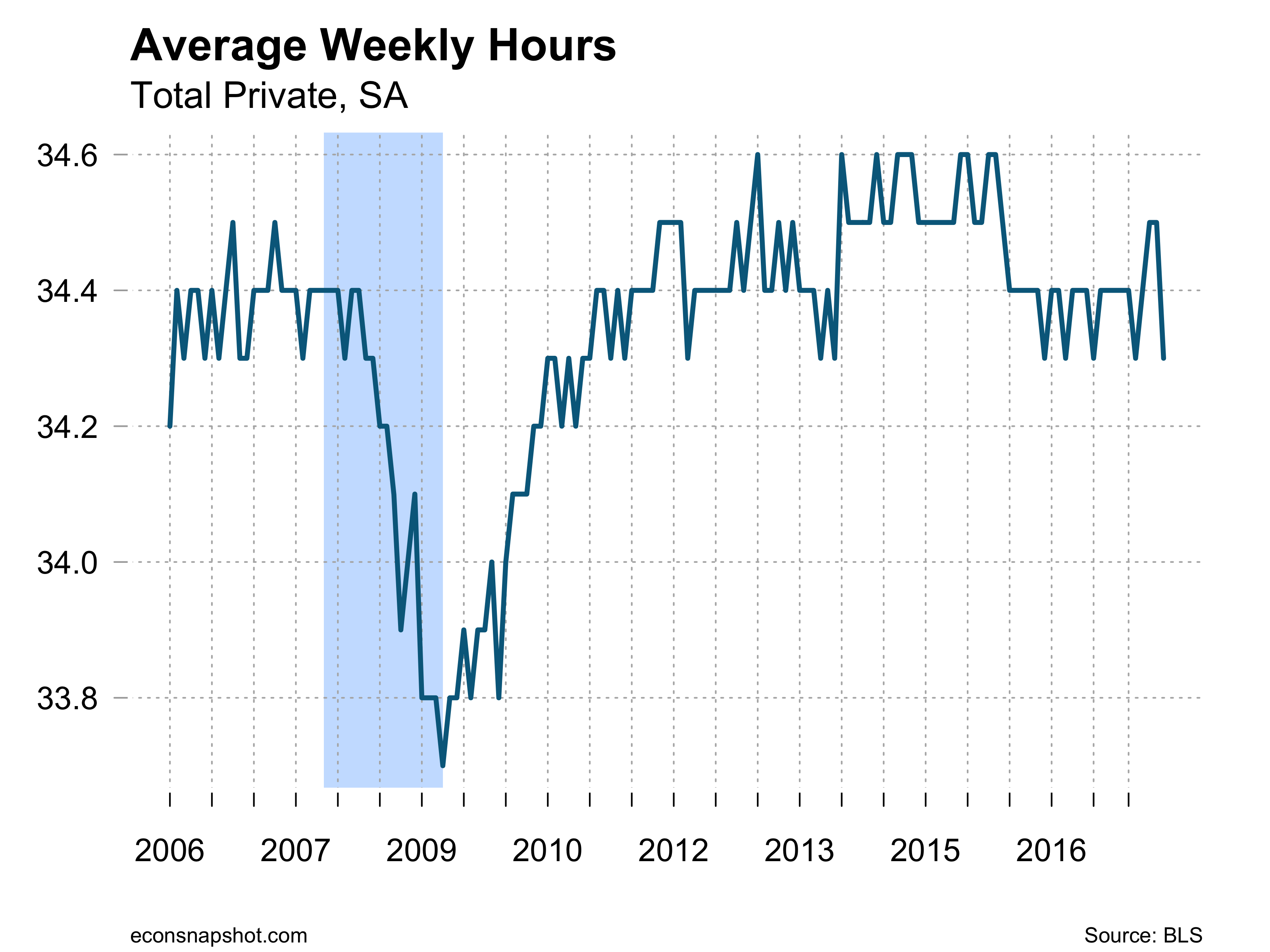
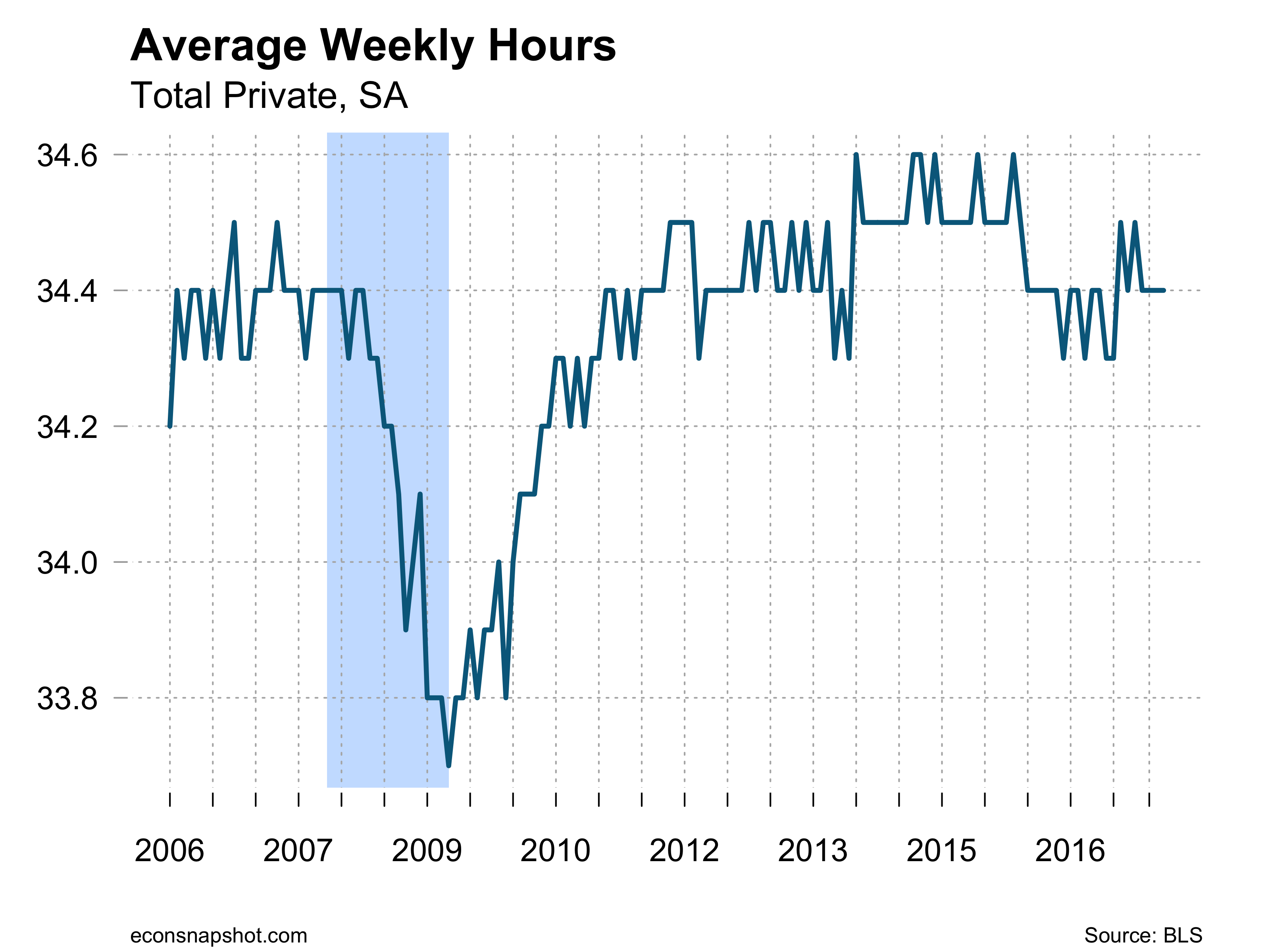
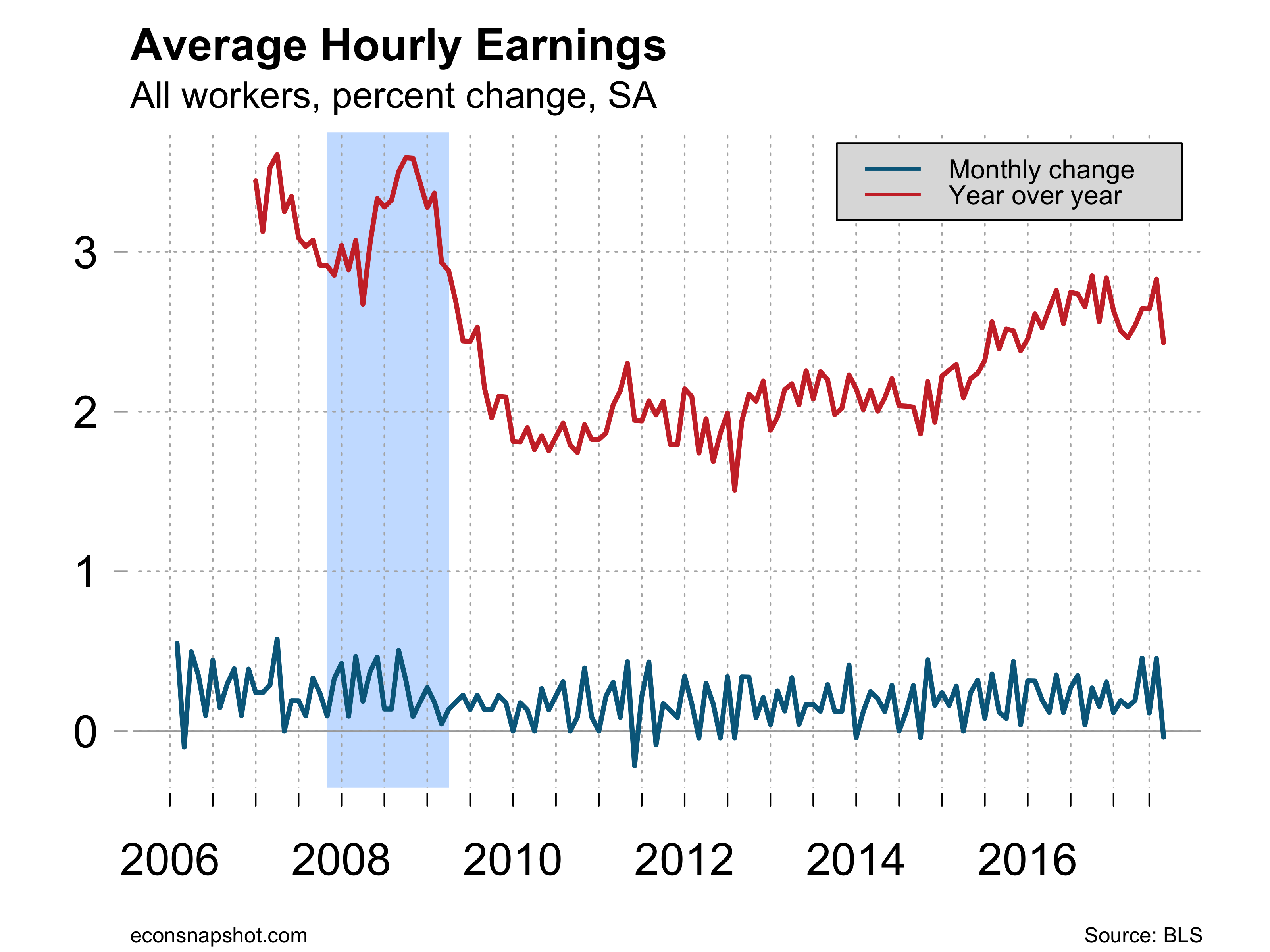
Average hourly earnings increased 8 cents and is up 2.7% since last year and with low inflation has lead to real wage gains. Average weekly hours remained at 34.5.

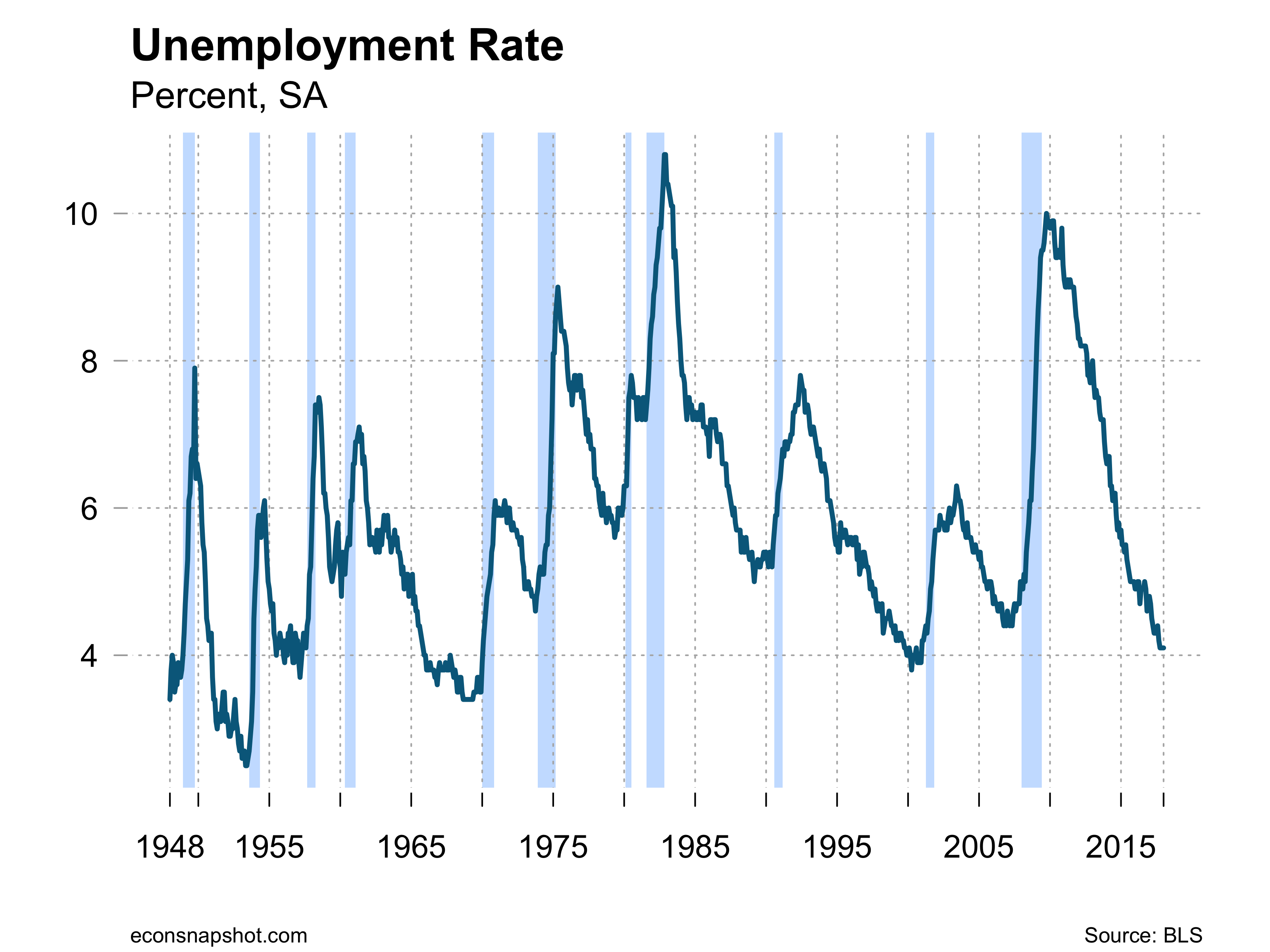
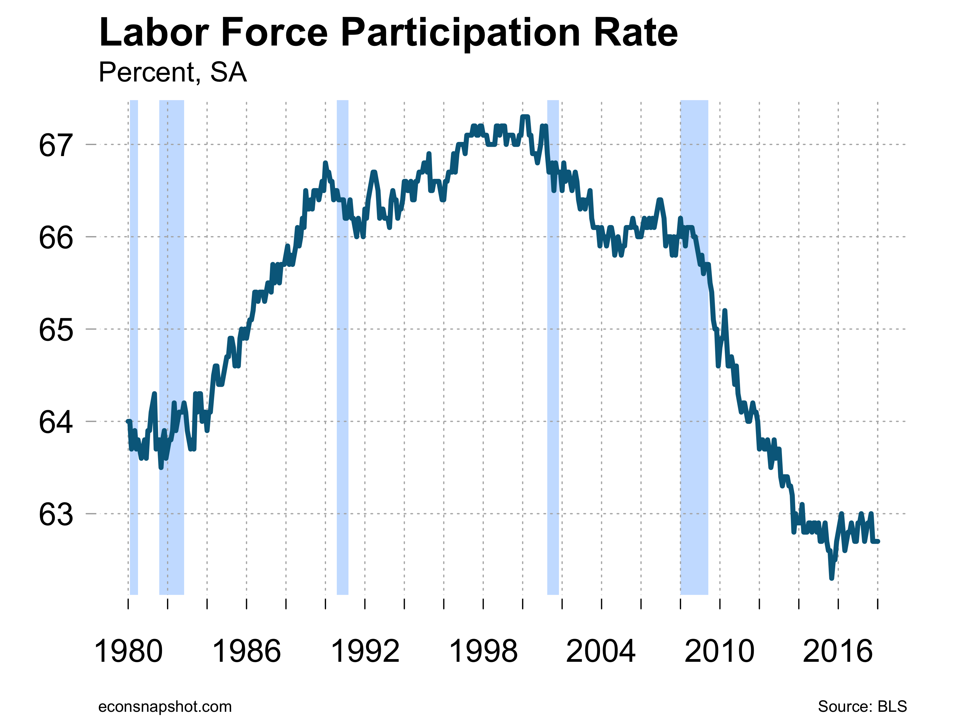
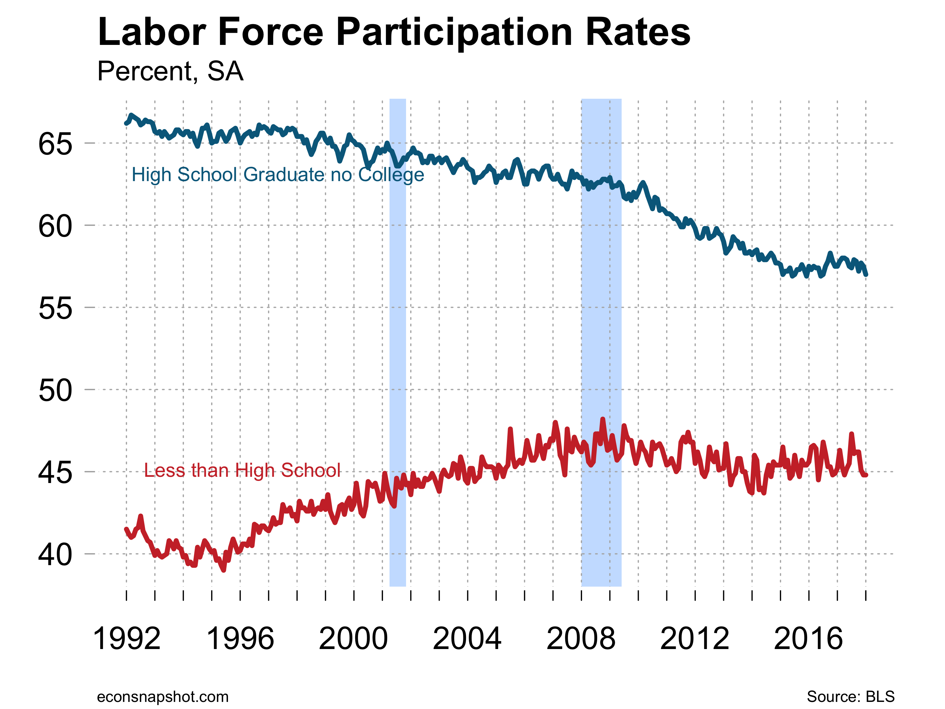
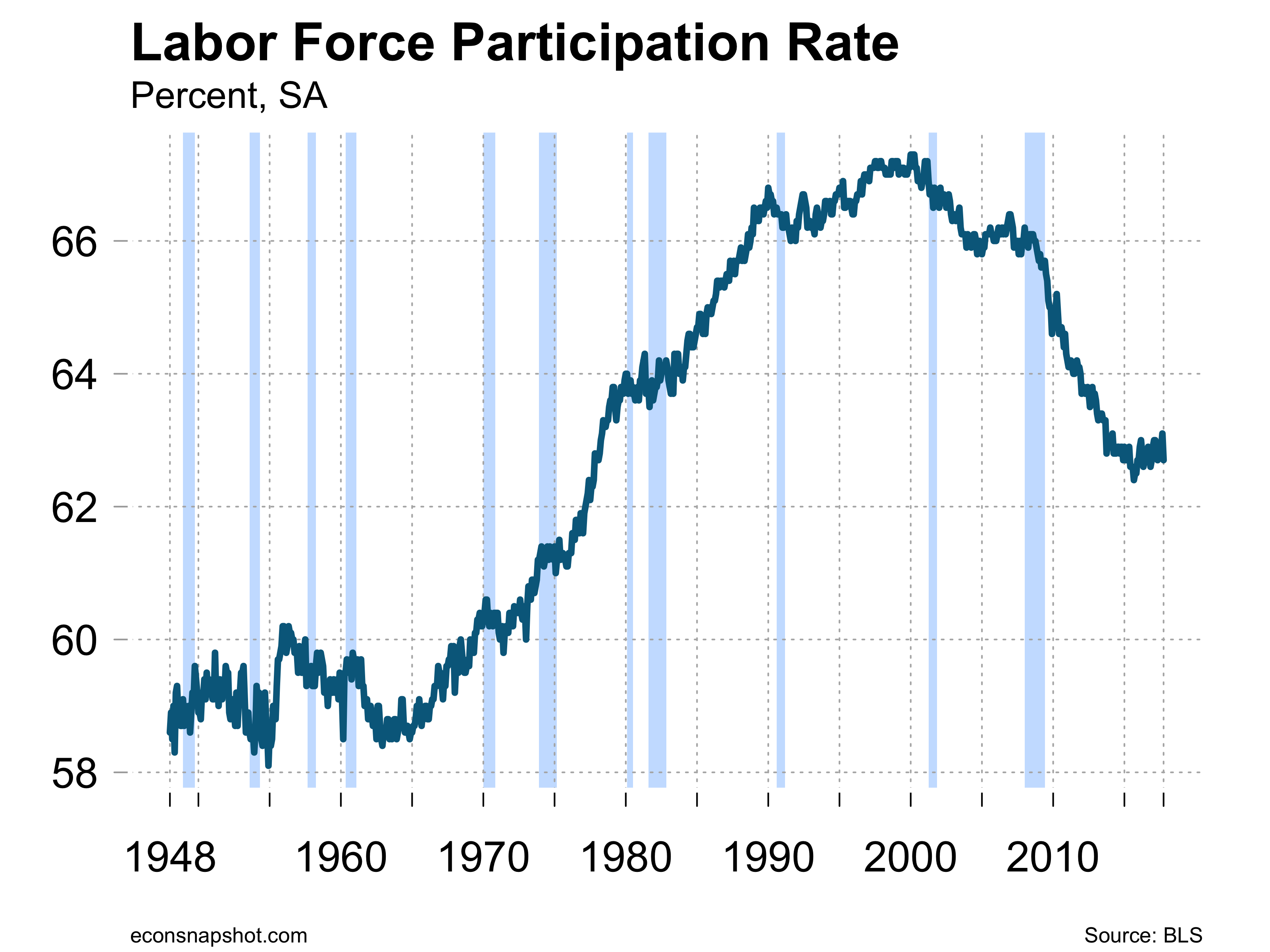
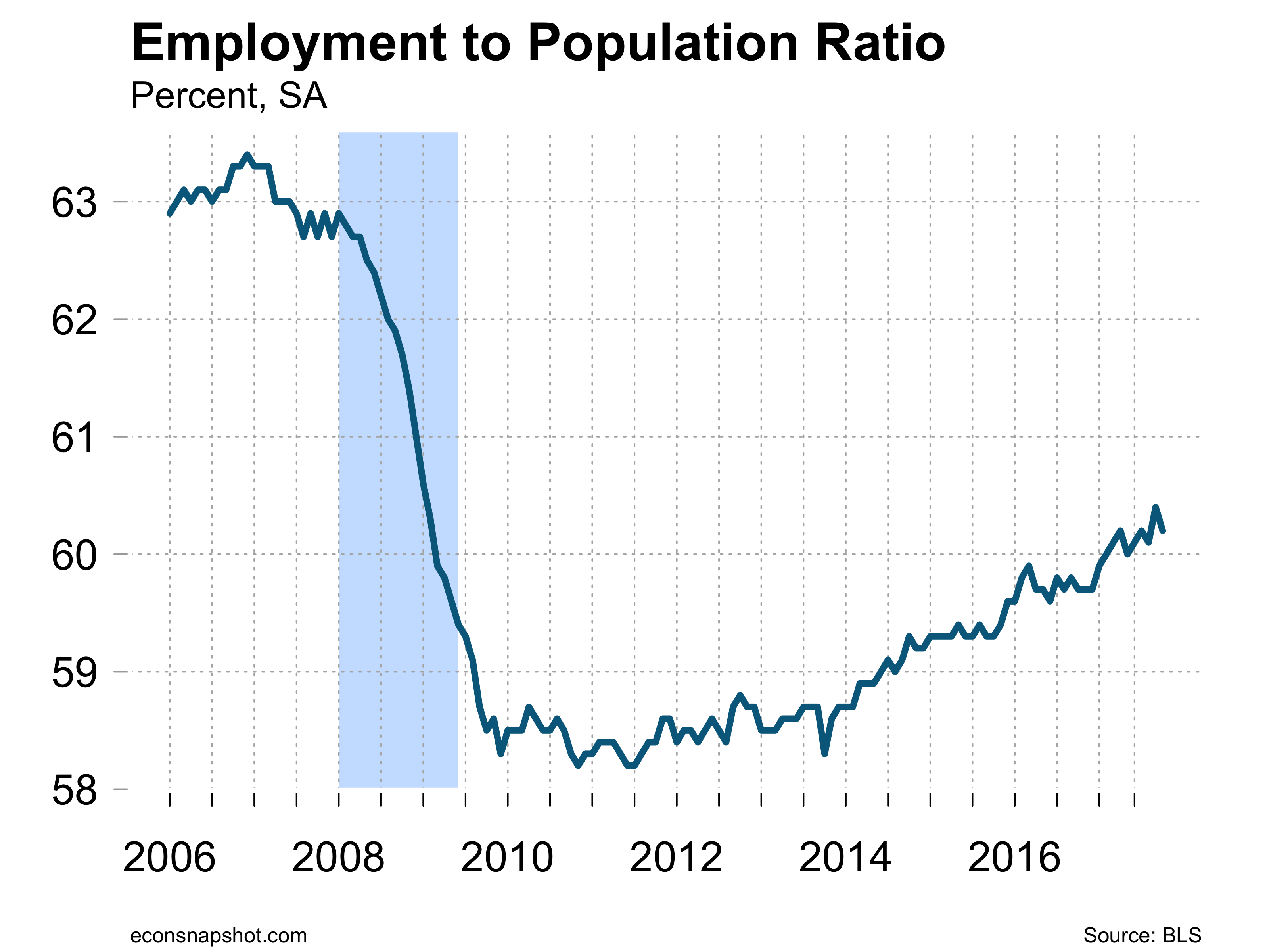
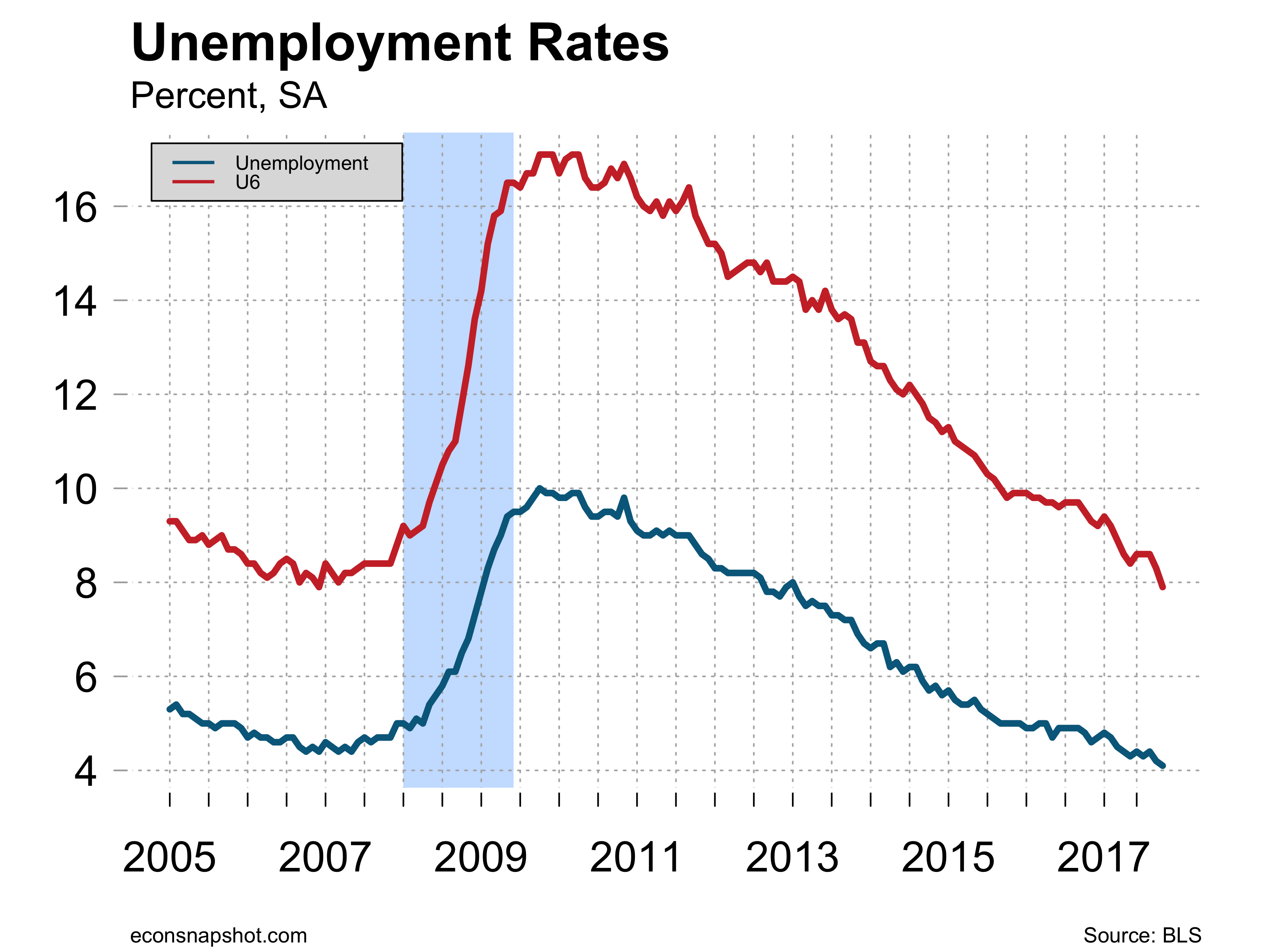
The household survey reveals a decline of 158,000 in the labor force with the participation rate falling from 63.0 to 62.9. The unemployment rate fell slightly from 4.14% to 4.07%.