A Dismal^2 Q1 Final GDP Report

by Zach Bethune, Thomas Cooley and Peter Rupert

Final Revision to Q1 GDP: UGH!

Yesterday the BEA announced another large downward revision to first quarter GDP growth from -1.0% to -2.9%. The final estimate was primarily attributed to downward revisions in consumption (3.1% to 1.0%) and exports (-6.0% to -8.9%). In addition, there was a major hit to the late-2013 inventory overbuild and construction.

gdprealchgm-2014-06-25

cons-2014-06-25

All of this, obviously, leaves the FOMC and the administration in a tough position. While many analysts recount weather-related setbacks and changes in depreciation allowances (such as I.R.C. 179), there is certainly real concern that the weakness is, well, weakness.  Before the downward revisions, the weak Q1 GDP figures were already on the Fed’s mind. From Janet Yellen’s congressional testimony on May 8 (emphasis added):

“Although real GDP growth is currently estimated to have paused in the first quarter of this year, I see that pause as mostly reflecting transitory factors, including the effects of the unusually cold and snowy winter weather. With the harsh winter behind us, many recent indicators suggest that a rebound in spending and production is already under way, putting the overall economy on track for solid growth in the current quarter. One cautionary note, though, is that readings on housing activity–a sector that has been recovering since 2011–have remained disappointing so far this year and will bear watching.”

Real private domestic investment, after having just reached its levels from December, 2007, has been stagnant of late.  Both nonresidential and residential investment are culprits, though both had upward revisions from -1.6% to -1.2% and -5.0% to -4.2%.  The numbers are nothing to cheer over, but there is also nothing in today’s report should change the Fed’s reading on the housing market from May.

nfi-2014-06-25

rfi-2014-06-25


More recently from Janet Yellen’s June 18th press conference (again emphasis added):

Although real GDP declined in the first quarter, this decline appears to have resulted mainly from transitory factors. Private domestic final demand—that is, spending by domestic households and businesses—continued to expand in the first quarter, and the limited set of indicators of spending and production in the second quarter have picked up. The Committee thus believes that economic activity is rebounding in the current quarter and will continue to expand at a moderate pace thereafter.

With yesterday’s large downward revisions to consumption, private domestic final demand is now estimated to have fallen in the first quarter, though more recent data are still in line with higher spending in the second quarter.

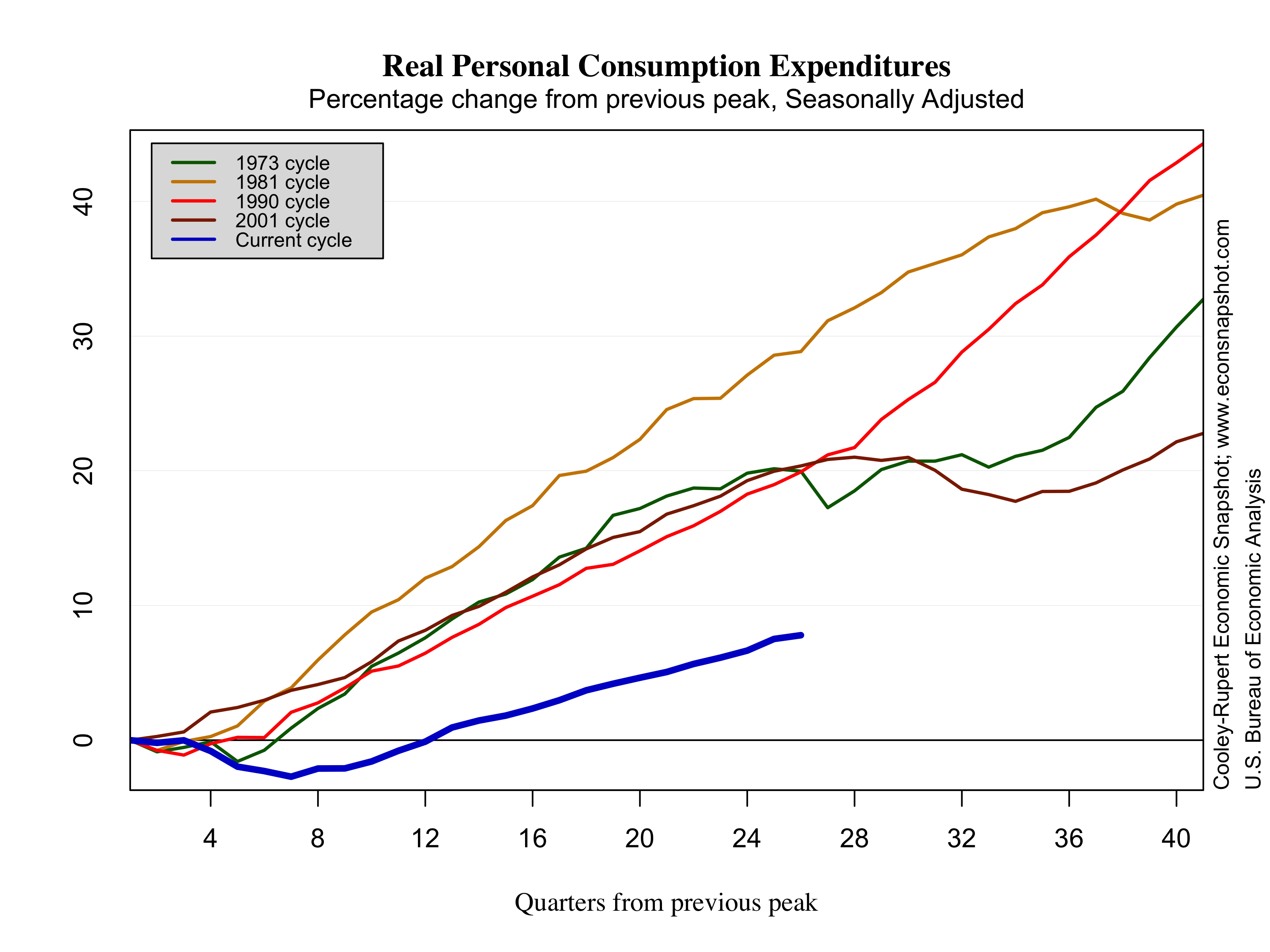
It’s not at all clear how much the revision will alter the Fed’s economic outlook or their stance on policy accommodation. The focus is still largely on improvements in the labor market, but a -2.9% Q1 growth rate is far from the FOMC’s latest central tendency projections for 2014 of 2.1%-2.3% growth. So what exactly does the growth rate of real GDP have to average over the next three quarters to be in line with the FOMC’s projection? The answer is 3.77-4.03%. While those rates are not impossible, it remains highly unlikely given the average growth during the recovery, as the figure below makes apparent.

gdprealchgm2-2014-06-25

More of the Same for Employment Growth? We Dig a Lot Deeper

by: Zach Bethune, Thomas Cooley, Peter Rupert

The establishment survey reports total non-farm employment increased by 217,000 in the month of May and revisions to the prior two months cut  employment by 6,000.   This seems like just another ho-hum increase in jobs in what has been a drawn out recovery.  But there is more to this story when one digs below the surface.  This is a long slow recovery from a sharp contraction and employment has just surpassed its pre-recession level. In the course of this recovery labor force participation has declined to a level not seen since the 1970’s, erasing many of the gains of the increase in female labor force participation.  One consequence of the long recovery is that the duration of unemployment has increased with nearly 35% of the unemployed, or 3.4 million workers, unemployed for 27 weeks or more. Weak labor market conditions and long duration unemployment discourage labor market participation. In this post, thanks to economists at the Bureau of Labor Statistics who shared their data with us, we can drill down  a little deeper and examine how the experience of workers who have been unemployed for long spells compares to the experience of those with shorter spells.

empchgm-2014-06-06


How do employment prospects differ by duration?

The graph below shows the rate at which unemployed workers transition to employment, broken into groups according to how long a worker has spent in unemployment.  Think of this as a job finding rate by duration of unemployment. For example the black line in the figure gives the job finding probability for those workers that have been in unemployment for less than 5 weeks. First, it is always true that workers that spend longer in unemployment have a lower probability of getting a job. Second, the job finding probability is pro-cyclical, it is harder to find a job in recessions and easier in booms.

UE-rate-duration-2014-06-06

Focusing on the current recovery, notice that these rates never fully recovered to the levels that prevailed before the 2001 recession – the first jobless recovery.  Not only did the labor market not regain its robustness after that contraction, the transition rate dropped dramatically in the great recession and has not recovered much for most durations of unemployment.

A positive sign is that the transitions to employment for short duration unemployed workers, particularly those that have been unemployed for less than 5 weeks, has ticked up in the most recent data – possibly significantly.  This is where the recovery of the labor market and increasing wage pressures will show up first since these workers are more likely to exit unemployment.  There are very slight increases for those unemployed for longer spells but almost no movement of those unemployed for greater than 27 weeks. When these transition probabilities show a marked upward movement the labor market recovery will be in full swing even though longer duration unemployed may be slow to benefit.

UN-rate-duration-2014-06-06

The transitions from unemployment to out of the labor force also tell a more nuanced story.  Clearly the long duration unemployed face declining prospects and are more likely to exit the labor force and these transitions have been rising dramatically. But decisions to exit the labor force are also affected by the duration of unemployment benefits and that shows up in slower transitions as benefits have increased. UU-rate-duration-2014-06-06

We can also look at the transitions from unemployment to unemployment, meaning the rate at which workers stayed unemployed in any given month. This is a reflection of the persistence of the unemployment.  Notice the rate at which workers stayed in unemployment is higher for all durations than in previous recessions meaning that unemployment is much more of an absorbing state.median-duration-2014-06-06

Finally, we can breakdown the median number of weeks that workers spend in unemployment, or the unemployment duration, into the duration for those workers who eventually found jobs and those that exited the labor force. Both have increased dramatically compared to previous recessions and the duration of those transitioning to employment is only slowly coming down.

The figures above highlight the devastating impact of this recession on those unemployed for long spells.


What do we learn by digging deeper?

Looking at the detailed transitions by group lets us see where exactly the labor market is improving by explaining the components that comprise the well known path of unemployment and labor force participation (below).  The long duration unemployed cast a long shadow over the labor market as a whole. Most of the policy action and most of the recovery is going to show up in the improved transition probability of the short duration unemployed.  We see that is finally beginning to show a few green shoots.

For an even more finely detailed look at employment by industry and occupation check out the superb interactive graphics developed by the New York Times.

unemprate-2014-06-06

lfp-level-2014-06-06