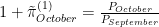
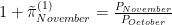
The December CPI (Consumer Price Index) report, released by the BLS (Bureau of Labor Statistics) is bad news on the inflation front. By almost any measure, CPI inflation is up. By our recently discussed “constant gain” measure of trend inflation, it rose by 0.4 percentage points for the overall CPI, and by 0.15 percentage points for core CPI (excluding food and energy). On a year-over-year basis, overall CPI rose 0.2 percentage points while core CPI fell by 0.1 points. The figures below show that the one-month annualized inflation rates are also up.
For monetary policy, what presumably matters is not what’s happening with CPI inflation but rather PCE (Personal Consumption Expenditures) price inflation since core PCE inflation is what the Fed looks at. Although it is probably the case that the CPI works to influence the policy makers. The PCE data won’t be released for another two weeks. However, given the broad similarity in the goods covered by the CPI and PCE deflator, it’s a reasonable guess that (core) PCE inflation will also be up. If so, the Fed will be faced with some difficult choices: Do they treat December as (maybe) an aberration and stand pat, or will they view December as the harbinger of another inflationary pulse? Or, cognizant of the long and variable lags associated with the effects of monetary policy, will the Fed leave rates unchanged since they’re already added enough tightening? Having said that, the “trend” line has not risen by much and for the core is basically flat. Therefore, from a long and variable lag perspective it seems doubtful that the Fed will alter their current stance at the meeting at the end of the month.
One of the challenges over the past couple of years has been measuring trend inflation. As shown in the figure below, monthly inflation rates are volatile; 12-month inflation rates are much smoother, but only slowly reflect changes in trend inflation. Previously, we’ve focused on the 3-month inflation rate.
As shown below, the 3-month inflation rate is approximately the average of three 1-month inflation rates. This means that each month, the 3-month inflation rate adds the current 1-month inflation rate, and drops the 1-month inflation rate from 4 months ago. Consequently, the 3-month inflation rate can drop precipitously if the inflation rate being dropped is relatively high.
A different way of putting the issue is that the calculation for the 3-month inflation rate assigns a weight of 1/3 to each of the past 3 months’ inflation rates, and a weight of 0 to inflation rates 4 or more months ago. Why such a discrete change in weights? Why not a more gradual decline in weights?
The remainder of this post gets into the guts of an alternative measure of trend inflation in which the weights on monthly inflation rates decline with their age. Readers uninterested in the details should feel free to jump to the end which presents our new measure of trend inflation.
The 3-month inflation rate as an average of 1-month inflation rates
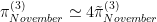
Consider the calculation of the gross 3-month (non-annualized) inflation rate for November,
where is the price level (for a given month), and the superscript indicates the horizon over which the inflation rate is computed (3 months in this case). The `tilde’ over indicates that the measure of inflation is not annualized. Similarly, 1-month (non-annualized) inflation rates are given by
From the above, it follows that
The gross 3-month inflation rate is the product of the three immediate past 1-month inflation rates. Taking the natural logarithm,
we obtain
where the approximation arises from for close to zero.
If we wish to work with annualized inflation rates, then
Again taking the natural logarithm, we obtain
The 1-month inflation rates will have “12” in the place of “4”. We now have
In other words, the 3-month annualized inflation rate for November is (approximately) the average of the three 1-month annualized inflation rates.
A related problem: computing an average
Given 3 observations on some variable, the sample average or mean is
Now, if we add a fourth observation,
However, computing as above discards the “work” done in calculating . From the calculation of ,
Substituting into the formula for ,
or,
This leads to a well-known formula for recursively computing an average:
where t is the number of observations. It says that the mean at date t is a weighted average of the previous mean, and the current (date t) observation.
This is all well and good if the population average is constant. But what if the population average changes periodically. If we knew when these changes in population average occur, we would simply discard all the old observations, and start computing the average afresh. When we don’t know when changes in the population average occur, an alternative approach is to apply a constant “gain” or weight to new observations:
where is the constant weight.
Application: Trend inflation
The discussion above suggests measuring trend inflation via
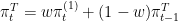
In words: trend inflation is a weighted average of the current one-month inflation rate (with weight w), and the previous trend inflation rate (with weight 1-w). Solving this equation backwards gives
That is to say, the measure of trend inflation at t is a weighted average of all past inflation rates, and that the weights decline geometrically with time. Put differently, there is a smooth drop off in the importance attached to previous inflation rates. By way of example, for w=1/3, the weight associated with the current inflation rate is 1/3 = 0.333; with the previous month’s inflation rate, 2/9 = 0.222; with the inflation rate 2 months ago, 4/27 = 0.148; and with inflation 12 months ago, roughly 0.00257 — very small.
Our new measure of trend inflation
The figure below plots our `constant-gain’ measure of trend core PCE inflation for a weight of 1/3 on the latest observation, along with the monthly, 3-month, and annual inflation rates. Relative to the 3-month inflation rate, this measure of trend inflation is somewhat smoother while still responding in a timely fashion to apparent changes in trend inflation.
Bottom line: core PCE (Personal Consumption Expenditure) inflation is down. The monthly annualized inflation rate fell from 1.8% in October to 0.7% in November; the year-over-year rate fell from 3.4% to 3.2%; and our preferred three month annualized rate fell from 2.3% to 2.2%. Ignoring the very noisy monthly rate, these declines are in keeping with our “prediction” of small changes in core PCE inflation based on the earlier CPI (Consumer Price Index) report for November.
Looking at overall PCE price inflation, the three month annualized rate plunged from 3.1% in October to 1.4% in November; the year-over-year rate fall was more modest, from 2.9% to 2.6%. These declines are in line with those of the earlier CPI report.
Given the continued decline in almost all measures of inflation it seems that the Fed will be looking closely at the “real” side of the economy. In fact, the recent revision of GDP by the BEA showed that the third (and final) estimate came in at 4.9%, down from 5.2% in the second estimate. According to the BEA the downward revision primarily reflected a decline in consumer spending, from 3.6% to 3.1%.
In its most recent announcement, the Fed noted,
Recent indicators suggest that growth of economic activity has slowed from its strong pace in the third quarter. Job gains have moderated since earlier in the year but remain strong, and the unemployment rate has remained low. Inflation has eased over the past year but remains elevated.
The latest revision to the third quarter tells us that the third quarter wasn’t quite as strong as previously reported. The Fed puts a lot of resources into nowcasting the US economy, so FOMC’s statement about slowing growth in the fourth quarter is probably a good read on the economy. The downward revision in the third quarter suggests that the fourth quarter may be even weaker than the Fed thought. With core PCE inflation edging closer to the Fed’s 2% target, and a weaker real side to the US economy, further hikes in the Fed funds rate seem unlikely.
According to the latest Bureau of Labor Statistics release, CPI (Consumer Price Index) inflation fell between October and November. While the one month annualized rate rose from 0.5% to 1.2%, the three month rate plunged from 4.4% to 2.2% and the 12 month rate was down marginally, from 3.2% to 3.1%.
Core CPI inflation was unchanged at the three month (3.4%) and 12 month (4%) horizons; the one month rate rose from 2.8% to 3.5%.
The FOMC (Federal Open Market Committee) focuses on inflation as measured by the core PCE deflator. However, November data for that measure of prices will not be released for two weeks. The scatter plot below shows that there’s a positive correlation between 3-month core CPI inflation and 3-month core PCE inflation. Given the marginal declines in 3-month and 12-month core CPI inflation, our best guess is that the corresponding core PCE inflation measures will also fall slightly. With the October 3-month core PCE inflation rate having come in at 2.4%, prospects look promising for core PCE inflation to settle in near the Fed’s 2% target.
The Federal Reserve held the policy rate steady and the median projections pointed to three rate cuts in 2024 and more the next few years, ending with: 4.6% in 2024, 3.6% in 2025 and 2.9% in 2026. The financial markets went bonkers: Dow up 500 points crossing the 37,000 mark to set a record.
On November 30, the Bureau of Economic Analysis (BEA) released PCE (Personal Consumption Expenditure) data for October 2023. The BEA notes a small monthly change in the PCE deflator (0.6% at an annual rate, down from 4.5% in September), and that the 12-month PCE inflation rate came in at 3.0% (down from 3.4% in September). These numbers largely mirror the earlier CPI (Consumer Price Index) release: the annualized monthly change fell from 4.8% to 0.5%; the 12-month rate from 3.7% to 3.2%. We prefer to look at the 3-month annualized inflation rate which also fell, from 3.7% to 3.2%; CPI inflation fell from 4.9% to 4.4%.
The cognoscenti know that the Fed’s preferred inflation measure is so-called core PCE inflation (taking out the food and energy components). By this measure, the monthly inflation rate fell from 3.8% to 2.0%, a larger decline than recorded by core CPI (3.9% to 2.8%). The 12-month inflation rate fell by 0.2 percentage points, to 3.5%; core CPI inflation fell by 0.1 percentage point to 3.0%. While our preferred 3-month annualized inflation rate fell, it was essentially unchanged at 2.4%. In contrast, the 3-month annualized change in core CPI rose in October, from 3.1% to 3.4%
In summary, the PCE inflation numbers for October confirm what was seen in the CPI inflation reported about two weeks earlier: inflation is down. How much depends on which series you focus upon. Keeping in mind that CPI inflation tends to run about 0.5 percentage points higher than PCE inflation, the data for October suggest that the US economy is approaching the Fed’s 2.0% inflation target.
Gross Domestic Product (Second Estimate)
On November 29 the BEA announced that real GDP for Q3 was revised up from 4.9% to 5.2%. While revisions to nonresidential fixed investment and state and local government spending were the leading causes of the increase, consumer spending was revised down.
Policy outlook
Given the continued decline in the inflation numbers and the continued strength in the output numbers, it appears the economy has digested the record increases in the Fed Funds rate without roiling the real side of the economy. There seems little doubt at this point that Fed policy is achieving its inflation reduction goal and may have reached the peak of the Fed Funds rate during this cycle. That is, nothing in the data points to the need for further increases in the rate and the market is suggesting some rate declines in 2024.
The recently released CPI (Consumer Price Index) numbers for September are a bit of a mixed bag for the inflation outlook. Our preferred 3-month annualized change in CPI rose from 4.0% in August to 4.9% in September. However, the monthly inflation rate fell from 7.8% to 4.9% at an annual rate. On a year-over-year basis, CPI inflation was essentially unchanged at 3.7%.
Those who prefer core CPI also confront a mix. On a 3-month basis, core CPI inflation rose form 2.4% to 3.1% (annualized) and the monthly inflation rate was up from 2.4% to 3.1%. On the other hand, the 12-month inflation rate was down from 4.4% to 4.1%.
Producer Price Index (PPI)
October 11 saw the release of PPI data for September. While the monthly rate of PPI inflation fell, from 9.4% to 6.3% at an annual rate, the 3-month rate rose from 5.6% to 7.7% while the 12-month change was up modestly, from 1.9% to 2.2%.
For what it’s worth, the monthly change in the personal consumption component of PPI fell from 39.2% to 16.9% (annualized) while its 3-month inflation rate rose from 15.2% to 19.3% (also annualized). On an annual basis, this measure of inflation rose from 1.4% to 2.1%.
Policy Implications
To be sure, there is good news from the CPI report: On a monthly basis, overall CPI inflation is down while the annual inflation rate is unchanged. Core CPI inflation is down at on an annual basis, but not at shorter horizons. However, both CPI and core CPI inflation are running hotter than the Fed’s 2% inflation target (granted, for (core) PCE inflation). PPI inflation tells much the same story as CPI inflation: down on a monthly basis, but up when measured over longer horizons. However, it’s not clear that PPI inflation signals future CPI inflation — particularly for the PPI for personal consumption. It seems unlikely that the PPI and CPI releases for September will change policyholders’ predilections.
On September 29, the BEA released data for the August PCE price index. On an annual basis, PCE inflation was up marginally, from 3.4% in July to 3.5% in August. More concerning: the annualized monthly inflation rate rose from 2.6% to 4.8%. Even our preferred 3 month measure is up, from 2.0 (the Fed’s stated target value) to 3.1%.
Of course, our loyal readers know that the Fed focuses on core PCE inflation which excludes the volatile food and energy components. By this measure, the outlook is decidedly brighter: The annual inflation is down from 4.3% in July to 3.9% in August. At an annual rate, the monthly inflation rate dropped from 2.6% to 1.8% (below the Fed’s target). Finally, the somewhat smoother 3 month inflation rate also fell, from 2.7% to 2.2%.
What are we to make of this? First, this reading on inflation is nearly a month old. CPI inflation, released 2 weeks ago, already told us that August inflation was up. So, the PCE numbers are hardly a surprise.
Second, while we’re not big fans of core or even supercore inflation measures, there is useful information to be had by looking at these other measures. In particular, the increase in overall inflation is driven in part by higher food and energy price inflation. To the extent that these increases are driven by transitory factors (the reason to look at core or our 3 month average in the first place), the increase in overall inflation in August may prove ephemeral.
Was it wise for the Fed to hold rates steady at their last meeting? Certainly the headline number makes it more difficult to discern the underlying trend in inflation; however, the core measures have all come down. Given that the Fed looks past some of the transitory measures, it seems the core measures have responded to the rate increases.
At an annualized rate, monthly inflation as measured by the Consumer Price Index (CPI) rose 7.8% in August, up from 2.0% in July. Our preferred measure of trend CPI inflation (the 3-month annualized) increased from 1.9% in July to 4.6% in August.
While we prefer to look at the overall CPI when looking to its trend, others prefer to look at core CPI inflation. Excluding food and energy, monthly inflation rose from 1.9% in July to 3.4% in August. However, the 3-month core CPI inflation rate actually fell, from 3.1% in July to 2.4% in August
What to make of all this? CPI inflation in August is up and well above the Fed’s 2% target for inflation. Comparing the overall CPI inflation with core CPI inflation shows that part of August’s increase in inflation is due to food and energy. The BLS specifically pointed to gasoline prices and the cost of shelter. Some commentators look at so-called `supercore’ CPI inflation, and that some of these supercore measures specifically exclude the cost of shelter. (What’s the end game for all these core measures? Will commentators be watching the price of bananas?)
August PPI
Producer Price Index (PPI) inflation for August similarly accelerated, from 4.9% in July to 9.3% in August (annualized monthly percent changes). The 3-month annualized PPI inflation rate also increased, from -0.1% (July) to 4.3% (August).
Looking instead at the PPI for personal consumption paints a more alarming picture: its monthly inflation rate rose from an annualized 4.3% in July to 40% in August! Its 3-month annualized counterpart also shows a marked increase, from -6.1% (July) to 15.4% (August).
It seems intuitive that producer prices should, eventually, be reflected in consumer prices. Looking across many years of data, the pattern that emerges is simply that inflation rates tend to move together. It seems difficult to make a case that higher PPI inflation is the harbinger of higher CPI inflation.
PCE for July
The PCE price index is released nearly a month after the CPI, and so August PCE inflation is not yet available. At an annualized rate, monthly PCE inflation rose slightly from 2.5% in June to 2.6% in July. On the other hand, the 3-month annualized PCE inflation rate fell from 2.5% (June) to 2.1% (July). Core PCE inflation shows a similar pattern.
Policy Outlook
Fed watchers know that its preferred measure of inflation is the PCE. The key question is: Will the large increases in CPI inflation in August also show up in the PCE inflation measures? It’s tempting to think that they must since the prices of individual items used in these indices are, presumably, essentially the same – the chief difference, then, being the weights associated with the prices of individual items. While PCE inflation generally tracks both CPI and core CPI inflation, these various measures of inflation exhibit considerable disparity.
Will the Fed take a pause, or continue raising its target for the Federal Funds Rate? If we knew the answer to this question, we’d probably be working on Wall Street. Answering this question probably means getting inside the heads of the voting members of the FOMC. Do they think that inflation is continuing to trend down? Or are the August CPI and PPI numbers the harbinger of an increase in inflation that needs to be nipped in the bud? Does the FOMC wish to avoid getting “behind the curve” as seems to have happened during the pandemic when they kept repeating that it was likely that the inflation was transitory due to supply chain issues?
The BEA release of the advance estimate of Q2 Real GDP showed an increase of 2.4% at a seasonally adjusted annual rate. The BEA noted:
The increase in real GDP reflected increases in consumer spending, nonresidential fixed investment, state and local government spending, private inventory investment, and federal government spending that were partly offset by decreases in exports and residential fixed investment. Imports, which are a subtraction in the calculation of GDP, decreased.
Bureau of Economic Analysis, July 27, 2023
The 1.6% increase in Personal Consumption Expenditures (PCE) represented nearly half of the contribution to overall growth, due to the fact that consumption is about 70% of total output. Real non-residential fixed investment increased 7.7% while real residential fixed investment declined 4.2%.
On a year-over-year basis, inflation as measured by the Personal Consumption Expenditures Price Index is the lowest since mid-2022, rising 3.0%, a full percentage point over the Fed’s 2% target. However, as emphasized in earlier posts to this blog, year-over-year measures are quite sluggish. Our preferred measure, the 3-month annualized inflation rate, is 2.5% in June, slightly higher than the 2.3% recorded in May. For what it’s worth, the 1-month annualized PCE inflation rate in June was 2.0%, up from May’s 1.5%.
As an aside, it seems curious to us that commentators are quite comfortable annualizing quarterly growth rates (as emphasized by the headline numbers for GDP growth), but are reticent to do the same with price data (for which headlines compute 12-month growth rates). Perhaps consistency is too much to ask.
What’s significant is that output growth accelerated from 2.0% in the first quarter of 2023 to 2.4% in the second quarter. In this context, the BEA’s discussion of the second quarter, quoted above, is strange. The BEA focused on the fact that GDP increased, listing off the major components that contributed to this increase (consumption, investment, government spending and imports) while noting those that detracted from the increase (exports and residential investment); see the following table.
Quarter 1
Quarter 2
Output
2.0%
2.4%
Consumption
4.2%
1.6%
Investment
-11.9%
5.7%
– Non-residential
0.6%
7.7%
– Structures
15.8%
9.7%
– Equipment
-8.9%
10.8%
– Intellectual Property
3.1%
3.9%
– Residential
-4.0%
-4.2%
Government
5.0%
2.6%
Exports
7.8%
-10.8%
Imports
2.0%
-7.8%
But why did output growth increase? The answer lies principally in the swings in investment and imports growth. Investment growth rose from -11.9% to 5.7%, transforming it from a drag on output growth to a contributor. Drilling deeper into investment, the growth rate of residential investment was largely unchanged (-4.0% to -4.2%). The big increase in non-residential investment growth was driven principally by investment in equipment, rising from -8.9% to 10.8%. To be sure, the growth in non-residential structures was very strong (9.7%), but it grew even faster in the first quarter (15.8%).
The growth rate of imports fell from 2.0% to -7.8%. However, since imports enter with a negative sign in the output identify, Y=C+I+G+X-M, the lower growth rate of imports contributed positively to output growth.
As noted by the BEA, growth of exports was negative in the second quarter (-10.8%) while it was positive in the first quarter (7.8%). While growth of consumption and government spending were both positive, their growth rates fell which has the effect of lowering quarter two output growth relative to the first quarter.
Overall, the strong growth in GDP coupled with the subdued (though still above the 2% target) price change shows a still-resilient real economy that is disregarding the increases in the Fed Funds rate. Based on available data, it is hard to make the case for a nascent recession in the U.S.
Personal Income
On Friday, the Bureau of Economic Analysis released personal income data. Real personal income growth fell from 8.5% in the first quarter to 2.5% in the second (both at annualized rates).
Disposable income data is also available on a monthly basis. The chart below shows that the first quarter was driven by very strong growth in January (21.9%) while the second quarter was hampered by negative growth in April (-0.4%).
Employment Cost Index
On Friday, the Bureau of Economic Analysis also released updated employment cost index data. Growth in the wages and salaries component fell from 4.9% in the first quarter to 4.1% in the second.
Overall, the current data suggest that the real economy continues to chug along at a respectable clip and the price numbers indicate that Fed policy is helping push down inflation. The Fed has indicated that the round of tightening is not yet over and the strength of the real economy gives no reason to alter that view.
The BEA announced May PCE (Personal Consumption Expenditure) data that reinforces the earlier CPI (Consumer Price Index) report: Inflation continues to creep down. Annualizing the month-over-month change in the PCE, inflation for May was 1.55%, well below the Fed’s 2% target. As we have commented before, these month-to-month changes contain a lot of noise and our preferred measure is the annualized 3 month change. By this measure, inflation for May was 2.45% – somewhat higher than the 2.2% reported earlier for the CPI. The headline year-over-year PCE inflation rate for May was 3.85%. As we have emphasized in previous posts, this year-over-year measure of inflation is slow to respond to changes in trend which means it will take some time for the year-over-year inflation rates to reflect the lower inflation rates that have come in over recent months.
Less rosy is the inflation picture coming from core PCE (that is, excluding food and energy). While the month-over-month rate was down in May – from 4.65% to 3.84% – the year-over-year and 3 month measures fell by roughly 0.1 percentage points. Presumably, the reason to look at core PCE inflation is that it provides a better gauge of underlying trend inflation than non-core PCE measures. But for our money, the 3 month PCE inflation rate does a good job capturing developments in trend inflation.
For June, expected inflation is now running below 2% at all horizons. Collectively, the results for CPI, PCE and expected inflation suggest that the tightening of monetary policy over the past year-and-a-half has brought down both actual and expected inflation. In this context, the Fed’s decision in June to pause its tightening of monetary policy seems like a good one, especially if one takes into account the well-known long and variable lags of the effects of monetary policy on the economy.
Finally, while we at Economic Snapshot usually do not comment on GDP (Gross Domestic Product) revisions, we are making an exception for the data released on Thursday by the BEA. The output revision was a very large 0.7 percentage points, from 1.27% to 2.00%. This upward revision of output can be attributed to upward revisions in consumption and exports, and a downward revision of imports (which has a positive effect on output since imports are subtracted from output). These effects were partially offset by small revisions in investment and government spending.
Second Revision
Third Revision
Difference
Output
1.27
2.00
+0.73
Consumption
2.65
2.93
+0.28
Investment
-2.10
-2.17
-0.07
Government
0.88
0.85
-0.03
Exports
0.66
1.00
+0.33
Imports
-0.75
-0.37
+0.38
GDP growth for the first quarter of 2023, and contributions to GDP growth by its major components.
The increase in real GDP was widespread according to the state GDP estimates. Real GDP increased in all 50 states in Q1. The largest increase came in North Dakota, 12.4% at annual rate and the lowest in Rhode Island and Alabama at 0.1%. Personal income increased in all but two states, Indiana (-1.0%) and Massachusetts (-0.9%).


 is the price level (for a given month), and the superscript indicates the horizon over which the inflation rate is computed (3 months in this case). The `tilde’ over
  indicates that the measure of inflation is not annualized. Similarly, 1-month (non-annualized) inflation rates are given by


 for
for  close to zero.
![\pi^{(3)}_{November} \simeq \frac{1}{3} \left[\pi^{(1)}_{September} + \pi^{(1)}_{October} + \pi^{(1)}_{November}\right]](https://s0.wp.com/latex.php?latex=%5Cpi%5E%7B%283%29%7D_%7BNovember%7D+%5Csimeq+%5Cfrac%7B1%7D%7B3%7D+%5Cleft%5B%5Cpi%5E%7B%281%29%7D_%7BSeptember%7D+%2B+%5Cpi%5E%7B%281%29%7D_%7BOctober%7D+%2B+%5Cpi%5E%7B%281%29%7D_%7BNovember%7D%5Cright%5D&bg=ffffff&fg=000&s=0&c=20201002)
![\overline x^{(3)} = \frac{1}{3} \left[x_{1} + x_{2} + x_{3}\right]](https://s0.wp.com/latex.php?latex=%5Coverline+x%5E%7B%283%29%7D+%3D+%5Cfrac%7B1%7D%7B3%7D+%5Cleft%5Bx_%7B1%7D+%2B+x_%7B2%7D+%2B+x_%7B3%7D%5Cright%5D&bg=ffffff&fg=000&s=0&c=20201002)
![\overline x^{(4)} = \frac{1}{4} \left[x_{1} + x_{2} + x_{3} + x_{4}\right]](https://s0.wp.com/latex.php?latex=%5Coverline+x%5E%7B%284%29%7D+%3D+%5Cfrac%7B1%7D%7B4%7D+%5Cleft%5Bx_%7B1%7D+%2B+x_%7B2%7D+%2B+x_%7B3%7D+%2B+x_%7B4%7D%5Cright%5D&bg=ffffff&fg=000&s=0&c=20201002)
 as above discards the “work” done in calculating
  . From the calculation of
  ,
,
![\overline x^{(4)} = \frac{1}{4} \left[ 3 \overline x^{(3)} + x_{4} \right]](https://s0.wp.com/latex.php?latex=%5Coverline+x%5E%7B%284%29%7D+%3D+%5Cfrac%7B1%7D%7B4%7D+%5Cleft%5B+3+%5Coverline+x%5E%7B%283%29%7D+%2B+x_%7B4%7D+%5Cright%5D&bg=ffffff&fg=000&s=0&c=20201002)


 is the constant weight.