June Employment Report Beats Expectations

Steady growth in employment

The BLS Employment Situation report for total nonfarm employment in June indicates a 195,000 increase in employment and upward revisions to April (from 149,000 to 199,000) and May (from 175,000 to 195,000). Expectations were in the 160,000 range.

empchgm-2013-07-05

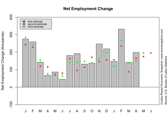
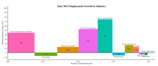
Private employment increased 202,000 while government employment fell 7,000. Most of the increase in employment came from the private service producing sector, rising 194,000. The largest increase there was in leisure and hospitality, increasing by 75,000. The following two charts show how employment has behaved over the month and year, respectively. The first graph depicts the employment change over the month by sector. As mentioned above, leisure and hospitality had the largest increase, 75k. The width of each bar represents the fraction of employment in that sector as of June, 2013. For example, the largest sector in terms of employment is Trade, Transportation and Utilities, representing 19% of total nonfarm employment; Leisure and Hospitality is 10.5% of employment. The year-over-year graph below shows, in percentage terms, the growth from June, 2012 to June, 2013. Over the past year Manufacturing posted the largest percentage gain, 9.3%; and Construction was the only sector with a yearly decline.

industry-empchg-2013-07-05

industry-empchg-y-y-2013-07-05

Overall, the level of employment in the private sector still lies below that seen in the previous peak, December, 2007. The employment-to-population ratio remains very low…the last time it was this low was back in the early 1980’s. Clearly, the labor market is still suffering.

emp-private-2013-07-05

eprlevel-2013-07-05

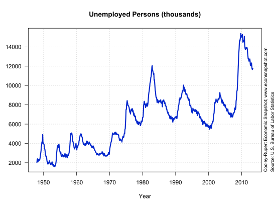
The number of unemployed persons (11.8 million) as well as the unemployment rate (7.6%) were little changed from the previous month.

unemplevel-2013-07-05
unemprate-2013-07-05

The labor force participation rate of 63.5% was up slightly from the month before, but it still remains far below the level in 2007.

lfp-level-2013-07-05

According to the Atlanta Fed’s job calculator, if the labor force participation remains at 63.5% and employment growth is similar to the last 3 months, say 197,000, then the unemployment should fall to 6.5% toward the end of 2014. Note that there have been indications, as mentioned in an earlier post, that the threshold for changes in monetary policy is 6.5%. This seems to jibe with other reports saying that the Fed Funds rate will remain at its current level until the end of 2014. Of course there are a lot of “ifs” there. For example, if the labor force participation rate rises to 65%, somewhere between where we are today and where it was in 2007, then the economy would need to see an increase of 380,000 jobs per month to get to 6.5% unemployment in 18 months.

Large Downward Revisions to GDP

The Bureau of Economic Analysis announced here that real GDP in the first quarter increased at a seasonally adjusted annual rate of 1.8%, revised down from the second estimate of 2.4% and the advance estimate of 2.5%. This revision, down 0.6 from the second estimate, is quite large historically. As can be seen here, the average revision from the second to the third estimate (without regard to sign) for real GDP from 1983-2009 is 0.2 with a standard deviation of 0.2.

The weakness of current real GDP growth compared to other recoveries can be seen in the graphs below. First, in the GDP Growth chart below, the current value of gdp growth, 1.8% is highlighted in red. The visual makes it pretty clear that the current recovery lies below that of the earlier periods going back to 1995. That is, the year-over-year change (the blue line) is mostly higher from 1995-1999 than it was 2002-2006; and 2002-2006 looks to be higher than 2009-2013.

gdprealchgm-2013-07-02

The graph below shows that over the period 1947-1983 average real gdp growth was 3.64%; since 1983 it has been 2.72%. The latter period has been referred to as the Great Moderation as it is evident that the volatility in gdp growth has been, well, more moderate compared to the earlier period. Evidently the Great Moderation has also witnessed a moderation in average growth.
gdpreal-chg-q-break-2013-07-02

The graphs below show how this recession and recovery compares to others. Typically, 22 quarters past the previous peak we are about 15% above the previous peak–in the current recovery we are less than 5% above. In all of the graphs below, what is evident is that the rate of growth for every statistic is lower than that of all previous recessions and recoveries since the 1970’s, i.e., the slope of the dark blue line is flatter than any of the other lines. This underscores the fact that the weakness of the recovery is pervasive.

rgdp-2013-06-26

The large decline in output growth from the second to third revision was due in large part to personal consumption expenditures that were revised down from the second estimate  (3.4% down to 2.6%), of which services saw a large downward revision (3.1% down to 1.7%).

The only component of GDP that does not look unusually sluggish is fixed private residential investment.cons-2013-06-26 It reflects the widely reported broad recovery in the housing markets.  But, any optimism should be tempered by the extraordinary collapse and the duration of the collapse in residential investment.

services-2013-06-26

imports-2013-06-26

inv-2013-06-26

rfi-2013-06-26

govcons-2013-06-26