A Quick Turnaround in Employment

By Thomas Cooley and Peter Rupert

The BLS announced nonfarm payroll employment increased by 2,509,000 in May. We won’t even mention what the expectations were heading into this report since no one really foresaw a rebound this quickly. The increase was the largest one-month increase in the history of the series after the largest one-month decline. The graphs below are, admittedly, quite bizarre. Most likely there are measurement issues and issues with seasonality. However, there can be no doubt that what we are observing today is far beyond the scope of anything we have seen in economic data…ever!

It isn’t time yet to declare a “V” shaped recovery, of course, but it is encouraging that the economy shows signs of adaptability as we begin to return to normal activity. It is still the case that most economists forecast that roughly 40% of jobs that were shut down will not come back.

Many of the jobs that were lost in April were ready to return once the government removed the restrictions. For example, service producing jobs increased 2,245,000 with leisure and hospitality rising 1,239,000. A friend of ours termed this a “synthetic” recession due to the fact that our economy did not put us in this mess…it was mandated by government in the interest of public health.

The rebound in employment was pretty broad based – jobs increased in most sectors.

Some of the increase in employment was the result of labor reallocation. Surveys indicate that for every 10 jobs destroyed since the onset of the pandemic, 3 new jobs were created. Retail jobs lost at Macy’s become new jobs at Walmart and Amazon. Reallocation is normal in recessions but we need way more than a three to one replacement rate to think about this as a recovery.

Average weekly hours soared from 34.2 to 34.7. With the return of many service sector workers, average hourly earnings fell from $30.04 to $29.75 due to the fact that these workers tend to be lower on the pay scale.

The household survey showed an increase in employment of 3,839,000 and an increase in the labor force of 1,746,000. The number of unemployed persons fell 2,093,000 leading to a decrease in the unemployment rate to 13.26 from 14.75.

Yesterday, initial claims showed lower, but still elevated, claims. It is useful to note that the actual number of claims are given by the not seasonally adjusted data, ICNSA, in the chart below. Given the clamp down in the labor market, many of the seasonally adjusted series will be somewhat misleading since the “seasonal” component is likely not useful in this current context. Nonetheless, both series show the same patterns.

The flow from employed to unemployed in April was staggering and the turnaround was also staggering. The not seasonally adjusted data is shown given the affects of seasonal adjustment on the current data.

Labor market “churn” is a distinguishing feature of the U.S. economy and the recent data bear this out. The surprising speed of this reallocation should not lull us into thinking that the economy will snap right back however. The retail sector was already on life support as were parts of leisure and hospitality. The pandemic is simply pushing them along faster. It also reveals weaknesses in other sectors like commercial real estate and higher education. As people discover new ways to organize work and learning the old business models are likely to be replaced.

These parts of labor force reallocation are going to take a long time to be realized and this suggests that recovery may seem swift initially but will have a very long tail.

The Job Market Keeps Humming in November

By Thomas Cooley and Peter Rupert

The BLS released the November Employment Situation Report and it continued to show a robust economy that added +266,000 new jobs last month. Further, job growth for the past two months was revised upwards by +41,000 jobs. The end of the GM strike boosted employment in the auto sector by +41,300, but job growth was widespread and robust. There was a +60,200 increase in health care and social assistance.

Average weekly hours stayed at 34.4 for the fourth consecutive month. Average hourly earnings across all private non-farm jobs increased slightly and year on year average hourly earning increased by 3.1%. This is modest given the tightness in the labor market but well above PCE inflation.

In the household survey the BLS announced that the labor force participation rate fell from 63.3 to 63.2. Importantly, the participation rate for prime age workers (25-64) remained at 82.8%, its highest level sine 2009. The employment to population ratio remained unchanged last month.

The strong job market and steady wage improvement should continue to support the consumer spending that has kept the economy growing steadily. As with recent history, there is nothing evident here to support continued Fed easing at the next FOMC meeting. But recent Fed decision making seems to have been driven more by the view that the neutral rate of interest – the rate that supports the economy at full employment and maximum output without inflation – has fallen significantly. Nonetheless the market would be surprised by further Fed easing in the near future given the strength of the US labor market.

GDP Growth Moderates Slightly, Labor Market Strong, but the Fed Cuts Anyway

by Thomas Cooley and Peter Rupert

The BEA Announced the Advanced Estimate of Third Quarter GDP and it showed an economy still growing but moderating to 1.9%. Consumers continued to power the economy with personal consumption expenditures increasing by 2.9% and residential fixed investment increasing by 5%.

While consumers have remained positive and keep the economy humming, the worry for some time has been the about the impact of weakness in our trading partners and the ongoing trade wars on business and particularly on business investment. The latter reflects something about firms views of the future state of the economy. Business fixed investment slowed in the third quarter, although less than it did in the previous quarter. Inventories increased in the quarter and it may be that these will hold back production in future quarters.

Labor Report

The BLS announced that non-farm payroll employment from the establishment data increased 128,000 for October. On top of that there were very large upward revisions to August (up 51,000) and September (up 44,000) of a total of 95,000, making the labor market much stronger than originally reported.

The private sector added 131,000 while government shrank by 3,000. The decline in government employment was led largely by a federal government cut of 17,000, many of which were 2020 census workers. In addition, there was a 41,600 decline in the motor vehicles and parts category reflecting the recent UAW strike. Retail trade has shown two consecutive months of an increase, rising 6,700 in September and 6,100 in October.

Average weekly hours hours kept steady at 34.4 despite the decline in manufacturing hours. Average hourly earning were also up slightly.

The household survey also showed serious labor market strength with the labor force rising 325,000 and employment up 241,000. The labor force participation rate increased from 63.2 to 63.3. The unemployment rate inched up slightly from 3.52% to 3.56%.

Big Picture

It is not clear what is driving Fed decision-making and the communications have been woeful. Chairman Powell cited the desire for insurance against the impact of trade worries. It is unclear that such insurance works or why it would affect the investment decisions of firms. The Fed also signaled that it is finished with rate cutting for a while. Once again there is no hint at what “rules” they are following.

In a serendipitous bit of timing, the BEA’s Advanced snapshot of the U.S. economy in the third quarter was released on the same day that Fed announced it’s policy decisions from the October FOMC meeting. In a sign of concern they decided to cut rates yet again in spite of the signs of a strong U.S. economy. So much for “data driven” Fed decisions?

Warning Signs! First Quarter GDP Revisions and Disastrous May Jobs Report Show a Weakening Economy

The second estimate of GDP for the first quarter of 2012 and its components shows a much weaker economy than previously thought. After robust growth in real GDP at an annual rate of 3% in the fourth quarter of 2011 the economy slowed markedly to a 1.9% rate in the first quarter. Most of the change was due to downward revisions to state and local government spending and to personal consumption, particularly durables. These were somewhat offset by upward revisions to non-residential fixed investment and exports.

The somewhat negative report from the BEA was reinforced by the Institute for Supply Management’s release of the Purchasing Managers Index, a closely watched barometer of manufacturing activity. It showed a sharp decline to its lowest level since 2009.

Continue reading “Warning Signs! First Quarter GDP Revisions and Disastrous May Jobs Report Show a Weakening Economy”

Snapshot – Labor Market Update: The April Employment Report

Welcome to the Cooley-Rupert Economic Snapshot, our view of the current economic environment. This is the latest version of our snapshot of the U.S. Economy based on the new employment numbers released on Friday by the Bureau of Labor Statistics. The complete Snapshot based on the preliminary estimates of first quarter GDP from the Bureau of Economic Analysis can be found in our previous post.

As in all of our snapshots we present the data in a way that we find particularly useful for assessing where we are in the business cycle and tracking the U.S. economic recovery. The paths of all the series presented are plotted relative to their value at the peak of the respective business cycles. We use the business cycle dates identified by the National Bureau of Economic Research.

You can also find the most recent version of the entire snapshot in pdf form here. As always we welcome any suggestions for additional data that you would like to see and suggestions for how to improve the presentation of the data.

A Disappointing and Sluggish Labor Market

The latest Employment Situation report from the Bureau of Labor Statistics shows non-farm payroll employment rose by a only 115,000 jobs in April. This was very disappointing compared to 154,000 jobs added in March (a slight upward revision) and an average of over 250,000 jobs per month for the prior three months. This will provide little updraft to the stagnant labor market. The number unemployed ticked down slightly to 12.5 million but the unemployment rate remained essentially unchanged at 8.1% because the labor force participation rate trended down further to 63.6%. In twelve months roughly 2.7 million people have left the labor force. Many economists have been hoping the labor market would add about 210,000 jobs consistent with the trend earlier this year.  For comparison, as we did last month, we plot employment as reported by ADP, an association of payroll processors. Many observers view this as a useful early indicator of the BLS numbers.
Continue reading “Snapshot – Labor Market Update: The April Employment Report”

Snapshot – The Employment Report For February – Continued Job Growth, Higher Particpation

Welcome to the Cooley-Rupert Economic Snapshot, our view of the current economic environment. This is the latest version of our snapshot of the U.S. Economy based on the new employment numbers released today by the Bureau of Labor Statistics. The complete Snapshot based on the latest revisions to fourth quarter GDP from the Bureau of Economic Analysis can be found in our previous post.

As in all of our snapshots we present the data in a way that we find particularly useful for assessing where we are in the business cycle and tracking the U.S. economic recovery. The paths of all the series presented are plotted relative to their value at the peak of the respective business cycles. We use the business cycle dates identified by the National Bureau of Economic Research.

You can also find the most recent version of the entire snapshot in pdf form here. As always we welcome any suggestions for additional data that you would like to see and suggestions for how to improve the presentation of the data.

The Labor Market

The latest Employment Situation report from the Bureau of Labor Statistics shows non-farm payroll employment rose by 227,000 jobs in February. Prior payrolls were revised upwards for January and December. These indicate a continued improvement in labor market conditions but at the same modest pace of recent months. The total number of unemployed remained essentially constant. This reflects the fact that labor force participation increased in February, perhaps an encouraging sign. The household survey showed an increase in labor force participation of about 0.2%, while participation declined through much of 2011. The new participants kept the number of unemployed at the same high level but the number of unemployed because of job loss declined. For comparison, as we did last month, we plot employment as reported by ADP, an association of payroll processors. Many observers view this as a useful early indicator of the BLS numbers.
Continue reading “Snapshot – The Employment Report For February – Continued Job Growth, Higher Particpation”

Snapshot – Fourth Quarter GDP Estimates – Growth Improves, Concerns Remain

Welcome to the Cooley-Rupert Economic Snapshot, our view of the current economic environment. This is the latest version of our snapshot of the U.S. Economy based on the preliminary fourth quarter data on National Income and Product from the Bureau of Economic Analysis and the Federal Reserve. As in previous snapshots we present the data in a way that we find particularly useful for assessing where we are in the business cycle and tracking the U.S. economic recovery. The paths of all the series presented are plotted relative to the their value at the peak of the respective business cycles. We use the business cycle dates identified by the National Bureau of Economic Research.

We present the data in four sections. The first summarizes the path of Gross Domestic Product and its components. This post primarily updates GDP and its components based on preliminary estimates of fourth quarter activity from the BEA. We also include the most recent labor market data and the summary of activity in credit markets. The final section summarizes the features of industrial production and inflation.

As always we welcome any suggestions for additional data that you would like to see and suggestions for how to improve the presentation of the data. Click here to go to the latest snapshot in one pdf document. Or, read on–

How bad is this recession and how should we assess the recovery?

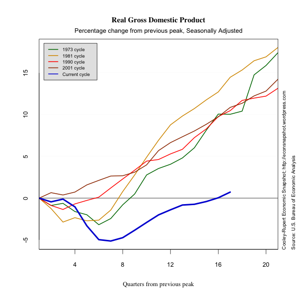
The preliminary estimates of fourth quarter GDP and its components show that the economy picked up a little momentum with GDP increasing at an annual rate of 2.8% compared to the rather anemic 1.8% growth rate in the third quarter. We should caution that preliminary estimates have been revised downward in both of the previous two quarters, so the 2.8 percent figure could be optimistic. The figure below shows that the recovery has now brought GDP above the previous peak.

Several things become apparent when looking at the above picture. First, the length of the downturn of the current cycle was close to what it has been in previous cycles. However the depth was much more severe bringing real GDP more than 5% below its peak level.  Second, and more discouraging, the length of the recovery has been much longer and the pace much slower.  It has taken 16 quarters for real GDP to reach its previous peak level.  In all other post-war cycles, the longest GDP has taken to reach previous peak was 8 quarters during the 1973 cycle. It is obvious why this last episode has been called the “The Great Recession,”  but we may want to add to that “The Abysmal Recovery.”

While it is useful to know the beginning and ending dates of a cycle, there is no standard by which to characterize the severity (for lack of a better word), i.e., the length and depth. In other words, we lack a metric to compare the various cycles.

As an example, absent the financial crisis and the recession, the U.S. economy would have continued to grow. Figuring out the rate at which it would have grown is somewhat of an issue but if we assume the economy would have continued to grow at average post 1950 rate for the U.S. economy then real GDP for the fourth quarter of 2011 would have been $15.018 trillion compared to $13.422 trillion in constant (2005) dollars. When one is assessing the severity of this recession it is not enough to measure the gap relative to a previous peak.

Below we present a graph of potential growth paths from the peaks of each cycle since 1950. As in the example above, we present an estimate of the cost at each quarter as the sum of the percentage losses in GDP relative to its long term growth path from the previous peak. This is seen in the following table. This measurement is certainly an upper bound on the cost.


Continue reading “Snapshot – Fourth Quarter GDP Estimates – Growth Improves, Concerns Remain”